The Systems & Workflow Magic Podcast Featuring Tracey Albrecht

Are you a new business owner wondering how to create a design that not only looks great but also stands the test of time? In today’s competitive market, achieving a consistent and cohesive design is essential for your brand’s success.

Today we will guide you through the strategies to develop a system of design that leads to a cohesive brand. By focusing on cohesion, you can ensure that your brand remains consistent and impactful across all your design platforms, helping you to build a strong foundation for your business.

Recently, we had the pleasure of being featured on Dolly DeLong on her The Systems & Workflows Magic Podcast, where we discussed these very topics.

Join us as we explore the steps to creating a design that truly stands out. You can keep reading to learn how to implement these strategies for your own business, or you can listen to the full episode here.

How To Create a Cohesive System of Design

Let’s go over how you can create a cohesive system of design for your business with these topics:

Lay the Foundation: Begin Building A System of Design

As you begin to establish your system of design, it’s important to lay the correct foundation. The first step in our streamlined logo design process is the same for both our in-person clients and also our Logo RX clients and is called the 5 W’s. The 5 W’s were created to help our clients lay a solid design foundation for their business. Once you have all 5 W’s confirmed and written down on paper, then you can move on to the next level of the design process.

Foundation Step 1: The 5 W’s of Logo Design

As you begin to build the foundation of your logo or branding, or even product branding, you will need to consider these 5 W’s. This foundation step of your system of design does not include any actual design work. This step is just about considering, collecting, and writing down information. As you start working on the 5 W’s, take no more than 45 minutes to complete your answers for all 5 of the W’s.

WHO: Who are Your Ideal Clients?

Who are your ideal clients is a great place to start. Think about who you want your perfect target audience to be and what their needs and preferences are. Go ahead and write that down.

WHAT: What Do You Want People to Say About Your Company?

Moving on to what do you want people to say about your company? Determine the key messages and values your brand should convey. As you reflect on your company’s mission and vision, think about the emotions you want your brand to evoke in your potential customers. What thoughts and emotions should your brand trigger in your audience?

WHERE: Where Will You Use Your Logo?

Next, you need to think about where you will use your logo. Identify all the places where your logo will be displayed (e.g., website, social media, signage). Ensure the logo design is versatile and adaptable to various mediums. Some of the best logos are very simple and easy to recognize in different formats.

WHEN: When You Think About Your Company, What Comes To Mind?

Moving on, it’s time to think about your company values, and how you can integrate those values into your branding. You’ll want to ensure consistency between your values and how you visually want to represent those values.

WHY: Why It’s Important to Have a Professional-Looking Logo?

Finally, it’s time to look at why it’s important to have a professional-looking logo. Take a moment to recognize the impact of a professional logo on your business’s credibility. Consider the next steps in your business and how your branding supports these goals. Then take some time to evaluate the benefits of hiring a professional versus DIY options.

If you want to learn even more about the 5 W’s of design, read this post, 5 Things You Need to Know Before Designing a Logo.

Step 2 – Brainstorming: Gather All Your Ideas

As we continue on with our system of design, let’s move on to step 2, the brainstorming step. In this step you will spend a lot of time gathering all your ideas. It’s up to you where you want to gather these ideas, either a Google doc, or a Pinterest board, or even just pen and paper.

Fonts are First

If you have a company name and tagline, start by writing them out on paper. If you don’t have either of these yet, it’s a great time to start writing out any ideas you do have for the name and tagline.

Next, start looking at font combinations that you like and remember to also keep in mind all you decided during our Foundation Step. Refer back to the 5 W’s and keep them in the forefront of your mind as you look at fonts.

It’s important to note that you don’t want to just choose a font that you like, but instead, you want to choose a font that encompasses the 5 W’s and how you want your company to be represented to your potential customers.

Choose a Color Palette

After you have picked the right font combination, it’s time to choose colors. Colors are so much fun, but you can also spend more time choosing colors than is necessary. Just keep that in mind when you are playing with color palettes. Here are a few things to consider when you are trying to pick colors.

Colors can trigger different brain responses, so before you choose a color just because you personally like it, you’ll want to consider the psychological responses that some colors can trigger. For example, blue is a calming color and red can cause people to feel aggressive.

Take time to consider your ideal customer and what they are looking for and would hope to achieve with your business and then make color choices based off of that. If you want to attract a certain clientele, make sure your logo color choices won’t repel them. For example, if your business is targeting men in the financial advisory sector, you probably don’t want to choose a super feminine font and use a lot of pink and purple tones in your logo.

If you want to attract a certain client, you’ve got to research what color palettes speak to them. Don’t get stuck with trying to be trendy and realize your logo doesn’t look professional at all.

If you want to learn more about colors and what each one means, read this post: Drawing In Clients, a Guide to Creating an Irresistible Brand Color Palette .

Find Imagery

Next, you’ll want to find imagery that flows well with your branding. If you want to incorporate an icon or some imagery into your logo, now is the time to start looking for one. Jump on Google and do some image searches and collect the images that you like.

You can even spend some time looking at what your competition’s logos look like. You don’t want to steal their ideas, but it’s always a good idea to see what others are doing because often it can spur some great ideas of your own.

Step 3 – Coherency: Requires a Gauge To Get It Right

Listen To Your Customers

As you continue to create a system of design for your business, it’s important to listen to your customers. The best gauge you have on if you are getting stuff right, is your perfect client.

Have a handful of at least 10 customers that you poll in order to find out their preferences. Offer them a poll and give them a few logo design choices and see which one they like best. Ask for their feedback. If your perfect customer is repelled by the design you have made – whether it’s the colors or the fonts, it’s important to listen to that feedback.

The wrong colors can have a major impact on your brand and how your customers perceive your brand identity. Your brand might appear to be a cookie shop when you are really a hair salon. Another example of poor choice of color is using only feminine colors in branding when your business serves everyone—not just women.

Just carefully consider the message your colors convey to ensure they accurately reflect your brand’s identity and appeal to your target audience.

Rebranding Is Not Detrimental

If you’ve made it this far in this post and you know it’s time for a rebrand, it’s ok! Rebranding is not a detrimental decision. Sometimes it’s the best gift you can give your business.

Giving your business the gift of cohesiveness will give you confidence in return. Knowing your brand looks good will boost your ego to get out there and sell even more! You want to get to the point where you know you can sell stuff because you are positive your brand looks good.

Step 4 – Formulate: The LOGO Formula

Our next step in our system of design is to formulate a plan for your logo, and the plan we like to use is called the LOGO Formula. Each step of the LOGO Formula will teach you how to create a logo, just like we teach our clients at Soapbox Studio every day.

L=Layout

Starting with layout is the first step of the LOGO Formula. Layout is maneuvering around the type and fonts. Start by writing out your company name and tagline on a blank page in Canva or Illustrator. As you start playing with fonts that you liked from your brainstorming step, you can change the words into all uppercase, or all lowercase. Try different variations until you find some you like.

O=Organize

Our next step is to organize those elements and try different layouts. You can try tilting the letters or repositioning them by pulling out the first letter of each word. Move around the elements on your page and organize them in different ways.

G=Graphics

Next, you will need to work with the graphics and imagery you collected in the brainstorming step. You’ll start by using the low-resolution version of your images and then once you fall in love with your logo you can purchase the high-resolution version of the images you’ve chosen. Make sure you choose imagery that you have copyrights for – and by all means, do not choose free stock images.

O=Optimize

Finally, you will want to optimize and tighten everything up. This is the last step of evaluation you will do before you finalize your logo. Pull everything together from fonts to colors to images and then take a step back and evaluate what the work you’ve done. That’s it! Your logo is done.

These are the exact steps we take with each of our logo design clients. Normally this process takes a few hours. If you put the work into the front end of the process by completing the 5 W’s and the Brainstorming step, then your actual logo design time will go so much faster and smoother. If you decide to hire a designer to do the work, handing them this pre-work will make their job much faster and require less billable time.

Step 5 – Consistency: Clear Client Journey Across All Platforms

Ensuring a Seamless Experience

It’s important to make sure your customer has a clear and consistent client journey across all your platforms. Starting with your website, moving to your socials, and everything else, no matter what part of your business a potential customer sees, it should all be consistent.

Creating a brand guide to go along with your logo is a great way to make sure you have consistency across all your platforms. A brand guide will include your logo, but also your brand colors, fonts, font sizes, and imagery. It’s a great resource to give to anyone who works with your brand.

If you hire a designer to help you design your website, you can give them your brand guide to make sure the site is designed per your determined guidelines. If you hire help for any part of your system of design, they will be so happy you have a brand guide to follow for consistency.

Over time your branding consistency will pay off because your customers will begin to recognize your brand. They will see something and know for sure it’s from you and your brand and that’s when you know you have nailed this final step in your system of design.

If you know you need to work on your logo or branding and want help, feel free to check our packages. We’d love to help!

Building a Strong Brand Identity Through a Cohesive System of Design

In today’s competitive market, establishing a cohesive system of design is crucial for any new business owner aiming for long-term success. A well-structured design system not only enhances the aesthetic appeal of your brand but also ensures consistency across all platforms, building a strong foundation for your business.

By focusing on core elements such as your logo, color palettes, and typography, you can create a unified and recognizable brand identity.

By following the necessary steps to develop and implement a cohesive design system, including laying the foundation, brainstorming ideas, gauging coherency, working within the LOGO Formula, and maintaining consistency throughout your branding efforts, you will create an amazing brand identity.

Choosing the best classic colors for your brand can be overwhelming, especially if you need help knowing where to start or why classic colors are beneficial.

Why Choose Classic Colors For Your Brand?

Let’s start with the burning question: Why should you choose classic colors for your brand? The short answer is that they not only convey professionalism, trust, and relatability to your ideal audience but also provide a sense of timelessness and endurance.

These timeless hues help establish a solid and consistent brand identity that resonates with a broad range of customers, giving you confidence that your brand will stand the test of time.

If you find choosing a classic color palette challenging, keep reading for five easy steps.

How to Choose Classic Colors For Your Brand

Let’s go over the strategy of choosing classic colors for your brand with these topics:

Possible Pitfalls When Choosing Brand Colors

What is a Classic Color
Examples of Classic Color Palettes
Steps To Choose Classic Colors For Your Brand

Get Started – Choose Your Classic Colors

Possible Pitfalls When Choosing Brand Colors

While choosing brand colors is an exciting and creative process, it’s important to be aware of potential pitfalls to ensure it remains enjoyable and effective. By understanding these common mistakes, you can steer clear of them and make the process smoother and more successful.

Choosing the Wrong Colors for Your Ideal Audience

One of the most crucial aspects of choosing brand colors is to consider the preferences and expectations of your target audience. Colors have the power to evoke emotions and influence perceptions, making it essential to select colors that resonate with your ideal customers. This understanding is key to creating a brand that connects with your audience – you can learn more about this by reading this post: Crafting Credibility: The Secrets Of Good Graphic Design For Business.

The wrong colors can have a major impact on your brand and how your customers perceive your brand identity. Your brand might appear to be a cookie shop when you are really a hair salon. Another example of poor choice of color is using only feminine colors in branding when your business serves everyone—not just women.

Just carefully consider the message your colors convey to ensure they accurately reflect your brand’s identity and appeal to your target audience.

Not Having Contrast in Your Palette

Ensuring that your brand color palette has contrast is a big deal. What does it mean to have contrast in your palette? Contrast simply means not using all the same tones. There is a noticeable difference in brightness, hue, or saturation between different elements in your design.

If the contrast is too low, your potential client will not be able to read it clearly. There are websites like Constrast Checker that can check the contrast of your colors.

You can also use black and white in your color palette, especially on your website, to help alleviate accessibility issues.

Choosing Too Many Colors

While incorporating various colors into your brand can seem exciting and vibrant, it’s crucial to exercise restraint to avoid diluting your brand’s impact. When you use too many colors, your brand identity can become forgettable, which is the opposite of what you want to achieve.

how to choose classic colors

Limiting your color palette to no more than five main colors is a practical guideline to maintain coherence and memorability. This manageable selection ensures your brand remains visually consistent across various platforms and materials. Each color should serve a distinct purpose, whether it’s for primary branding elements, accents, or backgrounds.

If you are drawn to more than five colors you’d like to incorporate, consider using mdigi.tools to refine your classic color palette. This tool allows you to adjust the brightness or darkness of your chosen colors, providing subtle variations that offer contrast while maintaining overall cohesiveness.

By adhering to a concise color palette and utilizing tools to refine your selections, you can create a visually striking brand identity that leaves a lasting impression on your audience. Remember, it’s not about how many colors you use but how effectively you use them to communicate your brand’s message and values.

Choosing Only Trendy Colors

While it can be tempting to hop on the latest color trends, exercising caution and restraint is essential. Relying solely on trendy colors poses a significant risk to your brand identity because these trends are transient and subject to change with each passing season or fad.

Opting for trendy colors may give your brand a contemporary and fashionable appearance in the short term. However, your brand’s visual identity may become outdated and irrelevant as trends evolve. This frequent need for updates can lead to inconsistency and confusion among your audience.

Instead, prioritize selecting colors that transcend fleeting trends and stand the test of time. Your brand colors should evoke a sense of trust, professionalism, and reliability, regardless of the current fashion. Choosing timeless colors establishes a strong foundation for your brand identity that remains relevant and resonant over the long term.

Use trendy colors sparingly as accents or secondary elements, allowing your core colors to anchor your brand identity firmly.

What is a Classic Color?

Classic colors are timeless and enduring, maintaining relevance and appeal across generations and trends. Unlike trendy hues that come and go with changing fashion, classic colors possess a timeless quality that transcends fleeting fads.

Typically, classic colors are foundational shades that evoke a sense of stability, sophistication, and reliability. They are the backbone of your brand’s visual identity, providing a solid base to build your brand image.

Among the most widely recognized classic colors are black, blue, green, red, and gold. These hues have endured and continue to be embraced in various contexts, from fashion and design to branding and marketing.

Examples of Classic Color Palettes


Classic Palette #1 – Fun/Food

best classic colors for your brand

Our first classic color palette expresses a vibrant business, from food and drink to news and information. Taking a look at each individual color you will see different attributes.

#BB2009 – A bold and vibrant shade of red, giving a strong, energetic feel.

#F54D14 – A bright, warm orange that adds a lively and dynamic touch.

#F4B001 – A rich, sunny yellow, which brings a cheerful and optimistic vibe.

#F7E4E6 – A soft, pastel pink that provides a gentle and soothing contrast to the bolder colors.

#20688E – A deep, cool blue that offers a refreshing balance to the warm tones.

#221D1A – A dark, earthy brown, adding depth and grounding to the overall palette.

These colors together create a harmonious and visually appealing combination, perfect for a variety of businesses. The skateboard, sunglasses, and striped socks in the image utilize this palette, illustrating how these colors can be effectively used in practical, classic ways.

Classic Palette #2 – Finance/Business

classic color palette

This color palette is perfectly suited for the wealth and finance industry, conveying professionalism, stability, and trust. Let’s look closer at each color.

#345B36 – A deep green that signifies growth, stability, and prosperity.

#A6A6A6 – A neutral gray that adds a sense of balance, calmness, and professionalism.

#E5E7E9 – A very light gray, almost white, which conveys clarity, simplicity, and sophistication.

#8FCOE8 – A soft blue that evokes trust, dependability, and tranquility.

#2A4E6C – A muted blue that suggests strength, reliability, and intelligence.

#0D1D2E – A dark navy blue, giving a sense of authority, confidence, and formality.

These colors together create a refined and elegant palette, ideal for the financial sector. The deep greens and blues project a sense of reliability and trust, essential in the industry, while the grays and light blue add balance and clarity, making this combination visually appealing and highly functional for corporate branding and professional presentations.

The use of such a palette can help instill confidence in clients and stakeholders, reinforcing the stability and credibility of the financial institution.

Classic Palette #3 – Architecture

classic color palette

This color palette is ideal for an architecture or business company, reflecting a professional and sophisticated aesthetic. The palette consists of six distinct colors:

#C1282E – A bold red that conveys strength, determination, and professionalism. It can be used for accents to draw attention and highlight important elements.

#04399Z – A deep, rich blue that exudes trust, stability, and intelligence. This color works well as a primary color for backgrounds or large elements.

#7494BC – A soft, muted blue that adds a touch of calmness and reliability. It’s perfect for secondary elements or backgrounds to complement the primary colors.

#BAB5AD – A neutral light gray that brings a sense of balance and neutrality. It serves as a great background or base color to ensure other colors stand out.

#89857F – A darker gray that introduces depth and sophistication. It can be used for text, outlines, or smaller details to provide contrast.

#000000 – A classic black that is essential for sharpness and definition. It’s ideal for text, borders, and any elements that require high visibility and clarity.

These colors together create a cohesive and polished look that is perfect for an architectural or business context. The bold red and rich blue establish a strong visual identity, while the muted blue, light gray, and darker gray offer a balanced and professional backdrop.

The black provides the necessary contrast to ensure readability and clarity, making this palette versatile for both digital and print applications.

Classic Palette #4 – Tech

good classic color palette
This color palette is ideal for a technology company, reflecting a modern and sleek aesthetic. The palette consists of six distinct colors:

#1B6897 – A deep, vibrant blue that conveys trust, reliability, and professionalism. It can be used for primary elements to create a strong visual presence.

#4990B8 – A medium blue that exudes calmness and stability. It works well for secondary elements and provides a harmonious complement to the deeper blue.

#B7D8EF – A light blue that adds a sense of openness and freshness. It is perfect for backgrounds or large areas to maintain a clean and modern look.

#E5EEFB – An even lighter blue that brings a touch of softness and neutrality. It can be used for backgrounds or accents to create a sense of space and clarity.

#A6A6A6 – A neutral gray that adds balance and sophistication. This color is ideal for text, borders, or other elements where subtle contrast is needed.

#000000 – A classic black that ensures sharpness and definition. It’s essential for text, icons, and any elements requiring high visibility and clarity.

These colors together create a cohesive and contemporary look that is perfect for a technology context. The deep and medium blues establish a trustworthy and professional identity, while the light and very light blues provide a clean and modern backdrop.

The neutral gray offers balance and sophistication, and the black ensures high visibility and sharpness. This palette is versatile for both digital interfaces and print materials, making it ideal for a technology company’s branding and communication needs.

Classic Palette #5 – Natural Living

natural classic color palette

This color palette is ideal for a health and wellness, homesteading, or natural food company, reflecting a vibrant and earthy aesthetic. The palette consists of six distinct colors:

#765E3C – A rich brown that conveys stability, reliability, and a connection to the earth. It can be used for primary elements to ground the design and add warmth.

#AC8F70 – A soft, muted beige that exudes calmness and approachability. This color works well for secondary elements, providing a harmonious and natural feel.

#EBE481 – A light, pastel yellow that adds a touch of freshness and energy. It is perfect for accents or backgrounds to create a bright and welcoming atmosphere.

#91CB3E – A vibrant lime green that symbolizes growth, health, and vitality. This color is great for highlighting important elements and adding a pop of color.

#4C934C – A medium green that introduces balance and harmony. It can be used for larger areas or backgrounds to maintain a natural and soothing look.

#19381F – A deep, forest green that ensures depth and sophistication. It’s ideal for text, borders, or elements requiring high contrast and readability.

These colors together create a cohesive and refreshing look that is perfect for a health and wellness, homesteading, or natural food context. The rich brown and muted beige establish a grounded and approachable foundation, while the pastel yellow and lime green inject energy and vitality.

The medium green offers balance and harmony, and the deep forest green ensures readability and sharpness. This palette is versatile for both digital interfaces and print materials, making it ideal for branding and communication needs in the health and wellness, homesteading, or natural food industries.

Steps to Choose Classic Colors For Your Brand

The steps to choose the best classic colors for your brand are not only effective but also easy and straightforward, providing you with a reassuring guide through the process.

Step 1: Identify Your Business

Start by empowering yourself with a clear understanding of your business. Spend a little time making a list of what your company does. This foundational step is crucial because understanding your business’s core activities, values, and mission will guide all your subsequent branding decisions, including color choices.

Clearly defining your business helps ensure that every element of your brand, including colors, aligns with and reinforces your brand identity, giving you the power to shape your brand’s perception.

After you have a clear understanding of your business, think about the colors that are already associated with your brand. Evaluate these existing colors and consider incorporating them into your new palette instead of fighting them.

Additionally, color theory should be researched to understand better how different colors interact and the emotions they evoke. For more in-depth guidance on color theory, read this comprehensive post: Finding the Right Colors for Your Brand.

Step 2: Understand Your Ideal Customer

To effectively choose the best classic brand colors, it’s crucial to understand your ideal customer. Start by considering color preferences from the perspective of your target audience, not just your personal favorites. This ensures that your color choices resonate with your clients and don’t inadvertently repel them.

Choose colors that align with your product and industry to help your customers easily understand your brand. For instance, green might be ideal for a business in the food industry focused on salads, while pastel colors would be fitting for a company making custom baby blankets.

Additionally, consider the cultural and emotional impacts of your color choices, as different colors can evoke various meanings and associations in different cultures.

Testing your color palette and gathering feedback from a sample of your target audience can provide valuable insights into how your colors are perceived. By aligning your color choices with your audience’s preferences and the nature of your product, you can create a color palette that enhances brand recognition and appeal.

Step 3: Analyze Your Competition

Researching your competition’s colors is essential for developing your brand’s color palette. Start by identifying your main competitors and analyzing their branding to note the primary and secondary colors they use across various platforms. This analysis will help you identify industry trends and understand which colors are commonly associated with specific messages or emotions in your industry.

Recognizing these trends can guide you in selecting colors that convey the desired attributes of professionalism, trust, or innovation relevant to your brand.

While understanding industry standards is essential, differentiating your brand is equally crucial. Look for opportunities to stand out by choosing unique color combinations or shades that set your brand apart.

Step 4: Brainstorm Harmonious Colors

When brainstorming harmonious colors for your brand, first, let’s briefly examine what colors mean. Each color evokes different emotions and associations, significantly impacting how your brand is perceived.

For example, blue often conveys trust, professionalism, and calmness, making it a popular choice for corporate and tech brands. Red is associated with energy, passion, and urgency, which can be effective for brands looking to evoke excitement or stimulate action.

Green symbolizes health, tranquility, and nature, making it ideal for eco-friendly and wellness brands. Yellow represents happiness, optimism, and warmth, which can be great for brands aiming to appear friendly and approachable. Understanding these basic color meanings can help you craft a color palette that aligns with your brand’s core values and message.

However, to create a truly effective color palette, it’s crucial to research color meanings and how they specifically relate to your brand and industry.

Spend more time studying color theory, including how different colors interact and their psychological effects on your target audience. You can learn more about the psychology of color by reading this post: Drawing in Clients: A Complete Guide to Creating an Irresistible Brand Color Palette.

Step 5: Develop Your Color Palette

Developing your color palette is crucial in solidifying your brand’s visual identity. Experiment with color options using online tools like Developing your color palette is crucial in solidifying your brand’s visual identity. Experiment with color options using online tools like https://mdigi.tools/lighten-color. This tool allow you to adjust shades, create harmonious combinations, and visualize how different colors interact. They are invaluable for refining your choices and ensuring that the colors you select complement each other well.

If you find the process overwhelming or want a professional touch, consider hiring a designer or branding expert. Professional help can provide insights and expertise that ensure your color palette is visually appealing and strategically aligned with your brand’s identity and goals.

Soapbox designers can help interpret color theory and industry standards to craft a palette that stands out while resonating with your target audience – get in touch with us here.

Get Started – Choose Your Classic Colors

Now, it’s time to start choosing the best classic colors for your brand! To start creating your palette, choose your first classic color. This foundational step sets the tone for the rest of your color scheme. Your first color should embody your brand’s core values and personality. Once selected, use a color-picking tool to explore complementary and harmonious shades.

Remember the meanings and psychological impacts of colors and what works best for your industry. Based on this initial choice, add your second color. Continue this process, adding up to two or three more colors, until you’ve created a cohesive and balanced color scheme that you love and effectively represents your brand. You can ensure a solid and memorable visual identity by methodically developing your color palette with these tools and strategies.

If you have ever wondered if good graphic design matters for your business, the answer is yes! Good graphic design plays a very important role in the overall success of your business because it’s true what they say: people “judge a book by its cover,” and potential clients judge a business by the way it visually looks online or in print.

Not only do potential customers judge your business by its looks, but the look of your brand significantly impacts customer engagement and brand reputation.

Your business brand image conveys your overall brand identity and business values and has the potential to attract your ideal client. Professional graphic design for your business is crucial for attracting potential customers and subtly repelling those who do not align with your offerings.

The Secrets of Good Graphic Design For Business

Let’s go over the secrets of good graphic design for your business with these topics:

What Graphic Design Is and Is Not

Graphic Design IS:

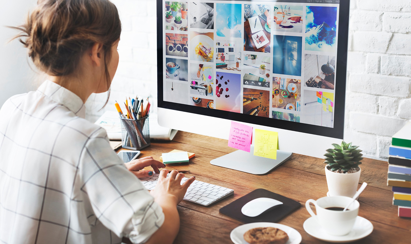
It’s easy to get confused about what graphic design IS. At its core, graphic design is indeed an art form—a dynamic blend of creativity, visual communication, attraction, and problem-solving.

It’s the art of visually organizing information and ideas in a way that is not only aesthetically pleasing but also functional and meaningful. Quality graphic design extends beyond mere aesthetics; to attract the right clientele, engaging the services of a professional designer is essential.

Professional designers possess a wealth of knowledge and expertise in visual communication, enabling them to craft designs that effectively convey messages, evoke emotions, and resonate with your target audience.

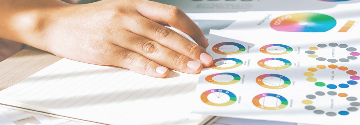
Their understanding of color theory, typography, layout principles, and industry trends allows them to create visually appealing and cohesive designs. These designs will leave a lasting impression and make it easy for potential customers to understand what your business is all about and what you are selling.

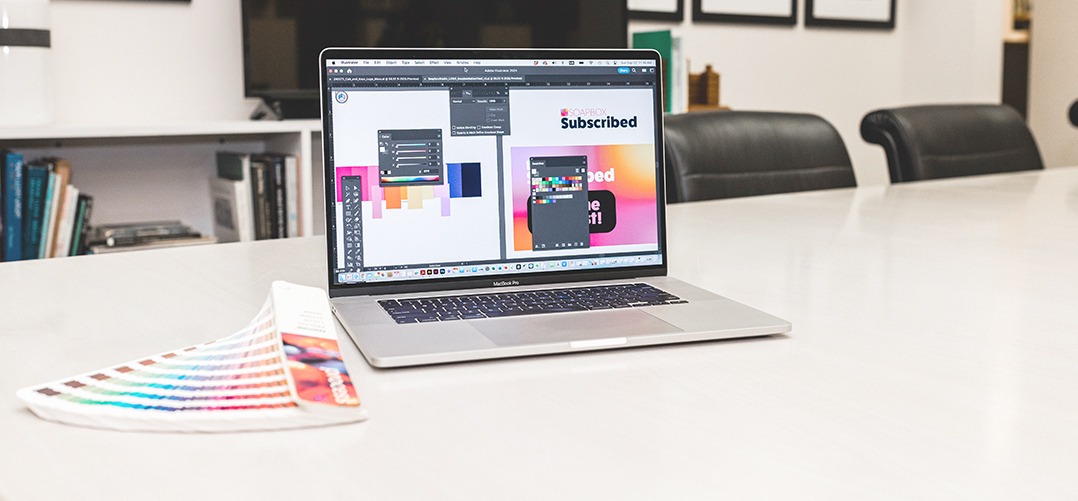
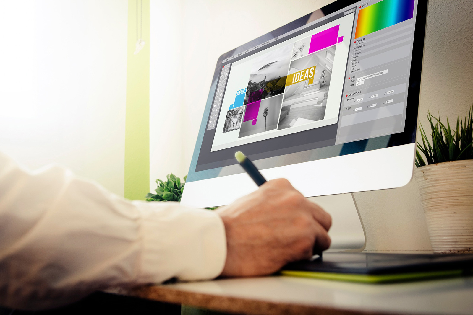
Additionally, professional designers have access to specialized industry tools and software, enabling them to execute their creative vision with precision and efficiency. Adobe Illustrator and Adobe Photoshop are two programs that Soapbox Studio designers use on a daily basis.

Graphic Design Is NOT:

On the flip side, it’s important to understand what makes graphic design so specialized. First of all, graphic design is NOT easy. It takes a lot of practice, training, skill, and attention to detail. All Soapbox Studio designers have their bachelor’s degrees, and the combined experience of our lead designers on staff is over 50 years!

Graphic Design is also NOT just pretty images and fonts; it plays a crucial role in shaping a brand’s image. Design is about strategically leveraging design elements to communicate a brand’s values, personality, and message.

Through the careful selection of colors, font pairing, imagery, and layout, graphic design helps to establish a cohesive and memorable brand identity that resonates with the target audience.

Graphic Design is NOT just about choosing a template in Canva or a similar program and then choosing another template when you are bored with the first one. Good graphic design for your business is strategic and should blend cohesively with your brand guide and company image through thoughtful intention, always with the business’s client in mind.


Understanding the Different Types of Design For Your Business
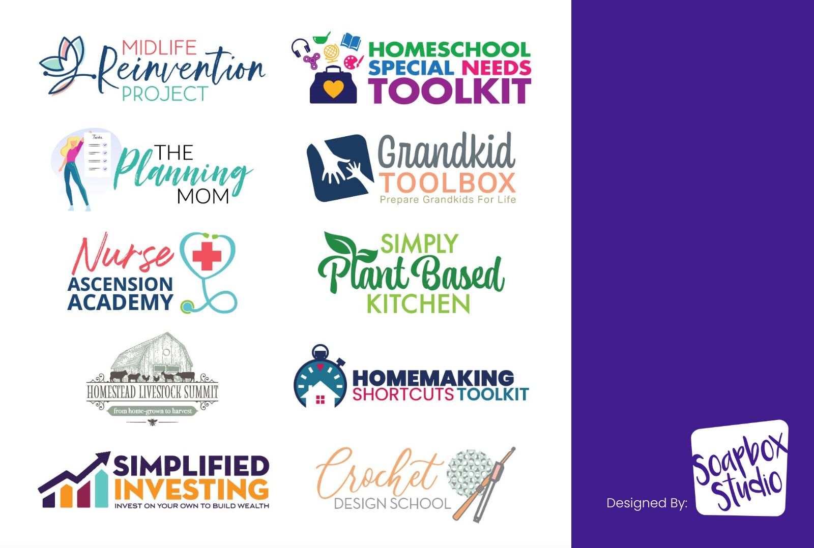
Branding

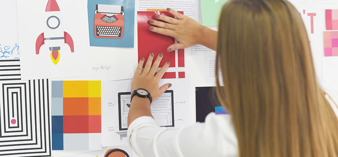
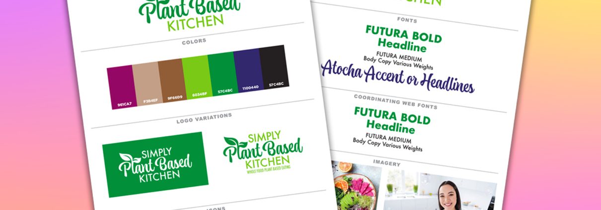
To understand the different types of design your business can utilize, it’s important to learn what each type includes. First, there is branding, which includes your logo, brand guide, company color schemes, signature fonts, and samples of the type of imagery.

At the forefront of branding is your logo, the visual symbol that is the cornerstone of your brand identity. Alongside your logo, a well-defined brand guide provides a roadmap for maintaining consistency and cohesion across all brand touchpoints. Then, you will convey your brand’s tone and style from the company’s color schemes and signature fonts. Each component is crucial in reinforcing your brand’s identity and fostering recognition and trust among your audience.

The secret to credibility is using a professional brand guide. If you don’t already have one, have Soapbox Studio create one for you, or take a look at our Logo Rx package if you need a logo designed. You’ll want to use it whenever you hire a graphic designer to create designs for your business.

Pass it along to anyone working on your visuals or promotions. Keeping a cohesive look throughout your business establishes you as a rock-solid company.

Website

Our next type of graphic design for your business is your website. In today’s digital age, your website serves as the digital hub for your brand, making it one of the most important elements of your online presence. It’s not just a collection of web pages; it’s a dynamic platform that showcases your products, services, and brand identity to the world.

A professional website takes time to build and pull together all the foundation pieces that make it a great home for your business. It’s where you will showcase what you offer and who you are to everyone on the internet.

Adding cool pictures and graphics helps make it look even better. But it’s not just about looks; your website is also a powerful tool for growing your business. By making it easy for people to find you on search engines, giving them clear ways to get in touch, making purchases or payments, and using smart marketing tricks, your website can turn visitors into customers. So, investing in a top-notch website is key to making a big impact and getting ahead online.

Marketing

Our next type of graphic design for your business. Marketing encompasses diverse strategies and tactics to promote your products or services and attract customers.

From eye-catching advertisements to visually striking graphics across various channels, such as slide decks, email campaigns, and print materials, graphic design plays a pivotal role in capturing the attention of potential customers and conveying your message effectively through cohesive marketing.

Social Media Graphics

Let’s explore the next type of graphic design your business can implore – social media graphics. In today’s digital age, social media platforms have become indispensable tools for businesses to connect with their audience, build brand awareness, and drive engagement.

Social media graphics encompass various visual content specifically tailored for these platforms, including posts, stories, banners, profile images, and advertisements.

Effective social media graphics are designed to inform and capture the attention of your target audience as they scroll through their feeds. To ensure maximum impact, they should be visually appealing, on-brand, and optimized for each platform’s unique specifications.

Published Content

Our next form of graphic design for business is published content. Newsletters, flyers, books, annual reports, and any other design you publish fall into this category.

Well-designed published content should capture readers’ interest with eye-catching visuals like featured images and infographics. Similarly, effective email newsletter design, with visually appealing layouts and compelling graphics, boosts engagement and drives conversions by optimizing readability across devices.

Digital Products

Your digital products are also a vital type of graphic design for your business. The digital products your business might create are workbooks, guides, checklists, lead magnets, slide decks, and more.

These products encompass a wide range of digital assets and experiences designed to enhance user engagement, streamline processes, and deliver value to customers.

Digital products have become an integral part of modern business strategies, and graphic design plays a crucial role in shaping their effectiveness and appeal. These digital assets serve various purposes, from educating and engaging audiences to generating leads and driving conversions. The better your digital products look, the more you will sell.

Video

Our final type of graphic design for your business is video. Video could be in a category all on its own, but has emerged as a powerful medium for communication, storytelling, and engagement. From short promotional clips to in-depth tutorials, video content offers businesses a dynamic and versatile platform to connect with their audience in a meaningful way.

Video graphic design encompasses a wide range of elements, including title graphics, visual effects, motion graphics, typography, branding elements, and more. These elements come together to create visually compelling and cohesive video content that will capture your customers’ attention and effectively communicate your brand message.


Utilizing Graphic Design For Business Success

Now that you understand the different types of graphic design for your business let’s explore how to utilize them successfully.

The best way to utilize graphic design in your business is to take a three-fold approach. You’ll want to make sure you have effective design strategies in place in these three areas of your business: print, web, and digital.

Effective Use of Print Design

First, let’s consider the realm of print design. Despite the digital age’s dominance, print materials remain a powerful tool for businesses to connect with their audience in tangible and memorable ways.

From business cards and brochures to posters and packaging, print design offers numerous opportunities to showcase your brand identity and convey your message effectively.

By investing in a professional print designer, businesses can leave behind the homemade look and provide a lasting, credible impression on customers and prospects, driving brand recognition and loyalty.

How To Best Use Web Design

Next, we have web design, which plays a central role in shaping your online presence and customer experience. Your website serves as the digital hub for your business, making it essential to prioritize user-friendly design, intuitive navigation, and visually engaging content.

From responsive layouts and compelling imagery to seamless functionality and intuitive navigation, effective web design is essential for capturing your visitor’s attention, driving engagement, and encouraging conversions.

A top-notch website serves as a tool for potential customers to learn everything they need to know about your business and inspires them to go down a path that will end in reaching out and further engaging your business.

The Best Use of Digital Design

Finally, digital design encompasses a wide range of assets and experiences that businesses leverage to connect with their audience in the digital realm. This includes social media graphics, slide templates and presentations, digital ads, and multimedia content such as videos and animations.

By adopting a strategic approach to utilizing digital design, businesses can create visually compelling and impactful digital experiences that resonate with their audience, drive engagement, and, ultimately, achieve their business objectives.

Professional design should be used purposefully across all three of these strategies, and when it is, magic happens! Your brand will automatically be elevated into a business you can be confident and proud of, which naturally boosts your sales.

How Graphic Design Can Increase Your Business Credibility

We talked a little bit about how professional graphic design can increase your business credibility, but let’s dive a bit deeper. The key to effective graphic design lies in creating visuals that not only appeal to your personal preferences but also resonate with your client.

It’s crucial to create designs that catch the eye and appeal to what people naturally like. Instead of going with personal preferences, consider what your audience enjoys. Professional design is vital because even if your clients can’t explain why they like it, they’ll notice and avoid anything that looks amateurish.

Through cohesive visual elements such as logos, color schemes, typography, and imagery, graphic design helps establish a consistent and recognizable brand image across all touchpoints.

Consistency in branding instills confidence and trust in your audience, signaling professionalism, reliability, and attention to detail.

As customers encounter your brand consistently across various platforms and communications, they develop a sense of familiarity and reliability, which in turn strengthens your business’s credibility. This credibility drives conversions and customer engagement and fosters deep customer loyalty.

Fostering deep customer loyalty is another significant benefit of credibility established through graphic design. When customers trust your brand and have positive experiences with your products or services, they are more likely to become loyal advocates who continue to support and promote your business over time.


Secrets of Effective Graphic Design

Not only is it crucially important to build customer loyalty and business credibility through strategic design uses, but it’s also helpful to learn the secrets to effective graphic design.

Secret #1: Keep It Simple

Secret #1 is to remember when in doubt, to keep your designs simple. Don’t use more than a few fonts in a design; if it’s a publication, 3 is plenty. The headline can be a display font, body copy font, and subhead font. In a logo, if you are not a professional, don’t use more than 2 fonts. Simple is key.

Too many fonts or graphics look confusing or even messy and unprofessional. When your customers are confused, they will not buy what you are offering, so make sure the designs you choose to represent your brand are simple and clear.

Secret #2: Limit Font Types

When you are working with fonts, make sure you limit the number of typefaces in each design piece. Also, remember that script fonts are hard to read, so it’s best to use them sparingly across your marketing. Don’t use scripts or handwritten fonts in all caps or increase the letter spacing on them. It’s a telltale sign of an amateur designer.

Secret #3: Utilize White Space

White space in a design is not a bad thing; in fact, it’s a good use of design. Every design needs a place for the eye to rest, and often, the best place for that is white space. By strategically using white space, give your customer a chance to pause and truly ingest what you are offering. Keep a good flow of content without overwhelming the viewer.

Secret #4: Use Consistent Branding

There is nothing more confusing to your customers than inconsistent branding. Your customer may become confused if your print design materials and your online presence don’t cohesively match.

And remember, confused customers do not buy what you are offering. It’s important to ensure that all design elements used in your branding and marketing are consistent and cohesive and utilize the same imagery, fonts, color scheme, and overall look and feel.

Secret #5: Use Professional or Quality Photos

If your business uses many stock images in its marketing, you may consider investing in a stock imagery service like Adobe Stock. Digital asset services will provide you with high-quality, legal-use images that you can use in various areas of your marketing.

If you have photos of yourself or your staff, invest in a photographer or someone skilled at photography who can do a professional photo shoot for you, even if it’s simply headshots for your website and social platforms.

One thing that can ruin your business’s credibility in one glance is poor-quality images of your business, staff, or the owner. No one wants to see the arm of a loved one attached, but attempted to be cropped out. Go the extra step to present your business as the professional that you are.

To learn our other great graphic design tips, read this post: Graphic Design Tips for Entrepreneurs.


How Do You Know It’s Time To Hire A Professional Designer?

You may be wondering if it’s time to go ahead and just hire a professional graphic designer to sell your products and offerings to your potential customers effectively. Let’s go over the two crucial facts that will help you determine whether it’s time to get professional help with your designs.

If Your Design Is Suffering

Knowing when to hire a professional designer is crucial for ensuring the success and effectiveness of your design projects. There are several key indicators that can signal it’s time to bring in professional expertise.

It’s time to hire a professional designer if your design efforts are falling short and your designs are not meeting your expectations or the needs of your audience. If a client seems confused about any part of your services, take a look at the design as well as the copy. Does design play a role in the confusion?

While it’s commendable to try to tackle design tasks on your own, there comes a point where you may need more than your skills and resources to achieve the desired results.

You might also want to seriously consider hiring when the stakes are high, such as for important branding initiatives, marketing campaigns, ads or product launches. Investing in professional design services becomes even more critical. Your brand image and reputation are on the line, and cutting corners on design could have significant consequences.

Effective design plays a pivotal role in capturing attention, generating excitement, and driving sales when introducing a new product to the market. Professional designers can help create compelling product packaging, eye-catching promotional materials, and engaging marketing assets that effectively communicate the value proposition of your new product.

First impressions are crucial in business, as they often determine how customers perceive your brand and whether they engage further with your products or services.

Your brand’s visual elements immediately impact potential customers, whether it’s your website, logo, business cards, or marketing materials. By investing in professional design, you can ensure that your brand makes a positive and memorable first impression.

When the Benefits Outweigh the Cost

While hiring a professional designer involves an investment, it’s essential to consider the long-term benefits and return on investment. Professional designers possess design expertise and specialized knowledge and skills in graphic design, enabling them to create visually compelling and effective designs that communicate your message effectively.

They also have unique skills and are trained to think creatively and outside the box, allowing them to come up with unique and innovative design solutions that set your brand apart from the competition.

Professionals can easily create unique designs that are custom and one-of-a-kind, tailored to your brand’s identity, values, and objectives. Unlike generic templates or DIY design tools, professional designers can develop unique and distinctive designs that reflect your brand’s personality and resonate with your target audience.

Graphic design professionals also understand design principles. They have a deep understanding of typography, color theory, layout, and composition. This knowledge allows them to create designs that are visually appealing, easy to navigate, and effectively communicate your message.

Get Your Time Back and More

Attempting to create designs yourself can be time-consuming and frustrating, especially if you lack the necessary skills and expertise. By hiring a professional designer, you can save time and energy that can be better spent on other aspects of your business while ensuring that your design projects are completed efficiently and to a high standard.

Professional design plays a crucial role in shaping your brand’s identity and perception. By investing in professional design services, you can elevate the quality of your branding materials, reinforce your brand’s visual identity, and create a consistent and cohesive brand experience across all touchpoints.

Well-designed branding and marketing materials can leave a lasting impression on your audience, fostering trust, credibility, and loyalty toward your brand. Professional design helps create memorable and engaging experiences for your customers, strengthening their connection with your brand and increasing their likelihood of repeat business and referrals.

And finally, hiring a professional allows you to charge more for your services. High-quality design reflects professionalism, quality, and attention to detail, which can justify higher prices for your products or services. Investing in professional design allows you to position your brand as premium and charge higher prices, ultimately increasing your profitability and competitiveness in the market.

Elevating Business Success Through Good Design

The importance of good graphic design for your business cannot be overstated. As the saying goes, people do judge a book by its cover, and the same holds for businesses. Your brand’s visual identity is the first point of contact with potential customers, shaping their perception of your business and influencing their purchasing decisions.

Not only does effective graphic design enhance the aesthetic appeal of your materials, but it also plays a crucial role in conveying your brand’s identity, values, and message. By investing in professional design services, you can create visually compelling and cohesive branding materials that leave a lasting impression on your audience, foster trust and credibility, and ultimately drive business success.

Whether you’re launching a new product, making a strong first impression, or seeking to elevate your brand’s credibility, knowing when to hire a professional designer is essential. When the benefits of professional design outweigh the cost, and when your design needs surpass your own capabilities, it’s time to prioritize investing in professional design expertise. By partnering with a skilled designer, you can unlock the full potential of your brand and set your business on the path to success in today’s competitive marketplace.

If you are ready to partner with a professional designer, check out our packages at Soapbox Studio or our Contact Us form and find out how we can help you craft credibility through quality graphic design in your business.

When considering your branding color palette, have you ever wondered why colors matter? Does your audience care if your logo is yellow or pink? Choosing your branding color palette is a very important decision that all business owners will need to make, especially if you want to ensure your brand conveys the right message to your audience instead of repelling them.

In order to draw your clients in and create an irresistible brand color palette, you’ll first need to learn why color matters so much, the psychology of color and what colors actually mean, what a color scheme is, what you should include in your color palette, and how to choose the best color palette for your brand.

Before we begin, if you’d like to watch a YouTube video instead about brand color palettes:

Creating an Irresistible Brand Color Palette

Let’s go over these topics as we learn more about how to create an irresistible brand color palette that will have your audience begging for even more from your brand:

Why Color Matters For Your Brand

I know it can seem silly to place so much importance on color, but in reality, color plays a vital role in establishing your brand identity. Colors are valuable to your brand, and thinking strategically about your brand color palette is important.

Colors possess the power to influence prospective customers, either positively, prompting them to make a purchase, or negatively, leading them to exit instead.

Your branding color palette has the ability to establish brand loyalty, making your audience feel compelled to stick with you. Choosing the wrong color can cause your customers to overlook you and your brand.

What to Consider When Choosing Your Brand Colors

When you are choosing your brand color palette, you’ll want to consider these things:

  • What colors align with your brand values?
  • What colors convey the essence of your company?
  • What do you want your potential customers to think when they see your branding?

These are all good things to take into consideration when you are trying to decide what colors should represent your brand identity. But before you can choose colors, it’s best to know what each color actually means by learning the psychology of color.

Psychology of Color

The emotional impact of colors is significant. Specific colors can evoke trust, reliability, affection, or happiness. While others may be linked to boredom, anger, sadness, greed, or panic. Recognizing this psychological aspect can help you build credibility with your intended audience.

Let’s briefly discuss some of the main colors and go over the positive and negative feelings associated with each color.

Red

The color red evokes positive feelings of power, confidence, ambition, passion, and strength. Some of the negative feelings associated with the color red are danger, anger, and aggression. Red brings out the strongest emotions of all the colors.

Orange

Orange is a color that portrays positive feelings of attention, happiness, adventure, sporty, playfulness, and spirituality. Some negative feelings that the color orange can bring out are crassness, pessimism, and being cheap. Orange is one of those colors that a lot of sports teams love to use.

Yellow

Yellow is one of those colors you either love or hate and often promotes positive feelings of warmth, the sun, energy, cheerfulness, positivity, and being alert. On the negative side, yellow tends to be abrasive, frustrating, and cause visual fatigue.

Green

Green is the color that represents wellness, and interestingly, consumers will buy more products with green packaging because it feels healthier. The color green promotes health, balance, growth, and money. On the flip side, its negatives are envy and illness.

Blue

Blue is one of the most popular colors, which is why it’s no surprise that you’ll find a lot of logos that have blue in them. The color blue represents calmness, productivity, stability, and sincerity. Some of the negative feelings associated with the color blue are feelings of sadness and loneliness, and is also one of the least appetizing colors out there.

Purple

Purple is a very polarizing color and tends to lean more toward femininity. The color purple often makes us feel creative, regal, imaginative, and brave. On the negative side, purple can evoke feelings of sadness and frustration.

Pink

Pink is a great color when targeting a female audience and often promotes feelings of romance, joy, vibrance, and freshness. Negatively, pink can make you feel girly, childlike, or vulnerable.

Brown

The color brown is the least favorite color for both men and women but is a very popular color for clothing. Brown can positively encourage feelings of security, reliability, and nature. On the negative side, brown can feel dull and lonely.

While all colors have different characteristics, it’s important to note what your target audience might be drawn to. It’s also just as important to be aware of what might turn them off when thinking and planning your branding color palette.

How to Choose A Color Palette For Your Brand

As you are trying to decide on a branding color palette, it’s important to understand color schemes. A color scheme is a thoughtfully chosen and organized set of colors you can use in your branding.

Professional designers leverage color schemes based on principles of color theory to ensure a harmonious and visually appealing outcome. It’s all about picking the right colors that play well together and give off the right feel.

Let’s go over the different color schemes and how they work so you can ensure you are choosing colors that complement each other.

There are 6 different color schemes that you can work with when you are choosing a brand color palette:

Monochromatic

Monochromatic (or mono) is a color scheme based on only one single color tint. It uses only variations (shades) of a single hue. When you choose a Monochromatic color scheme, it’s like sticking to one color and playing with different shades of it. It’s all about nailing variations of a single color.

Analogous

Analogous colors mean the color grouping has similarities and is next to each other on the color wheel. These color scheme types have close relationships with one another. Analogous colors are like BFFs on the color wheel. They’re the shades that just click and have a solid connection like they’re in the same color crew.

Triadic

A triadic color scheme consists of three colors. Unlike colors that sit next to or directly across each other, triadic colors are equidistant on the color wheel. When you join these colors, they form a triangle.

Triadic is all about the power of three! Pick three colors that are equally spaced on the color wheel, forming a triangle. They’re like the trio that brings that perfect balance.

Complementary

Complementary is a color scheme using one base color and its complement, the color on the opposite side of the color wheel. The base color is main and dominant, while the complementary color is used only as an accent.

Complementary is when you team up a main color with its partner in crime, the one on the opposite side of the color wheel. It’s like the dynamic duo, with the main color taking the spotlight and the complement adding that extra pop.

Split Complementary

A split Complementary color scheme uses two colors across the color wheel, with those two colors lying on either side of the complementary color. Split-complementary is like choosing a base color and grabbing its two sidekicks from across the color wheel. They create a team with a bit of contrast that keeps things interesting.

Square

The square color scheme is a four-color combination. The square color scheme is like a fab four! Start with a base color, and then add three more that are spaced 90 degrees apart on the color wheel. It’s like building a colorful square squad.

If you are unsure where to start when picking a brand color palette, choosing a color scheme is a great place to begin because you can be sure the colors in these groupings will look good together.

How To Expand Your Current Brand Color Palette

If you already have a brand color palette and you want to expand your color palette for new products or services you offer, a really easy way to do this is to look at the color wheel and create variations from your existing palette.

In order to create color variations, let’s first look at the different types of variants and how you would go about making them.

Color Variations

Hue: Pure Color

The hue is the pure, unaltered color itself. It represents the distinct quality of a color without any additions or modifications. For example, red, blue, and green are different hues.

Tint: Pure Color + White

Tint is created by adding white to the original hue. This lightens the color, resulting in a softer and pastel-like version. For instance, if you add white to red, you get various shades of pink.

Tone: Pure Color + Black & White

A tone is achieved by adding both black and white to the original hue. This process desaturates the color, creating a more muted and subdued version. It falls between the intensity of the pure hue and the lightness of the tint.

Shade: Pure Color + Black

A shade is produced by adding black to the original hue. This darkens the color, creating a deeper and richer version. For example, if you add black to blue, you obtain various shades of navy or indigo.

Tools You Can Use To Experiment With Your Color Palette

Try out this tool, mdigi.tools, to play with shades and tints. All you have to do is type in the HEX color code of any one of your brand colors and it will give you the shades and tints of that hue. This is an easy and fun way to expand your color palette.

Another fun tool to use when you want to play with different color variants is coolors.co. It’s a great way to look at different colors you might not have considered. You can also check out Pinterest for color ideas too.

What Does A Brand Color Palette Include?

After you have made some decisions on which colors your potential audience will be drawn to and what colors best represent your brand, you’ll want to create a color palette, and the best place to represent your palette is inside a brand guide.

Your brand guide should include your primary colors, secondary colors and accent colors, as well as your fonts and your logo.

With The LOGO RX, we can help with all aspects of your branding, from the logo to the brand guide. If you don’t have the time to do it yourself or you simply want someone to help you come up with the best color combinations for your brand color palette, then the LOGO RX is just what you need.

Crafting An Irresistible Brand

Creating an irresistible brand color palette is not just about picking pretty colors; it’s about strategically crafting a visual identity that resonates with your audience.

The significance of color in brand identity cannot be overstated, as it influences how potential customers perceive and connect with your brand.

By delving into the psychology of color, understanding different color schemes, and mastering the art of expanding your brand color palette, you can confidently choose colors that not only draw in clients but also establish a lasting and positive brand image.

A positive brand image is created when your brand colors emulate credibility, stability, and confidence. So, whether you’re starting from scratch or looking to revamp your existing palette, take the time to explore the world of colors and let your brand shine.

If you know your branding needs an overhaul and the whole process of choosing the best colors for your brand seems overwhelming – we can help.

If you are ready to hand over your branding to us, we will give you the logo of your dreams! When you purchase THE LOGO RX, you are one step closer to the logo of your dreams.

Our proven design process will guide you through answering questions about your business that will give us the information we need to create a fantastic logo just for you. So you can put your energy into making money. Check out our design packages here!

In today’s competitive world, branding has become a critical component of success for businesses and individuals. While we often associate branding with logos, taglines, and marketing strategies, visuals are another equally powerful tool that can significantly enhance your brand’s trust and your confidence, and impact personal and businesses performance. In this post, we will explore the profound influence of visuals on brand trust and confidence and how this boost can positively affect your future personal achievements. So, let’s dive in and discover the remarkable connection between visuals, confidence, trust and personal performance!

Visual Communication and Brand Confidence

Visual communication is a timeless and powerful tool throughout history to convey messages and ideas. It can uniquely transcend language barriers and communicate directly to our emotions, making it a universally understood expression. We are inherently drawn to visual stimuli, and our brains are wired to process images much faster than text or spoken words. This innate inclination towards visual information makes it an incredibly effective means of communication, particularly in branding and marketing.

When branding, visual communication is vital in establishing a solid and memorable identity for a company or organization. By harnessing the power of visuals, businesses can effectively communicate their brand’s values, personality, and essence to their target audience. Through carefully curated visual language, including colors, fonts, and imagery, a brand can evoke specific emotions and create a lasting impression that resonates with people on a deeper level.

In the age of social media and digital marketing, where attention spans are shorter, and competition for engagement is fierce, the power of visual communication becomes even more critical. Compelling visuals can captivate an audience’s attention, making a brand stand out in a crowded online landscape. Your visuals are more likely to be remembered, shared, and leave a lasting impression, increasing brand recognition and fostering a stronger connection with the target audience.

Building Brand Trust and Confidence

In branding, establishing brand confidence is crucial for gaining potential customers’ or clients’ trust and loyalty. Visual elements are pivotal in this process, shaping perceptions and creating a lasting impression. When individuals encounter a visually cohesive and appealing brand, they are more likely to perceive it as professional, trustworthy, and reliable.

Consistency in visual communication is vital to building brand confidence. The visual properties, such as fonts, colors, and imagery, are consistent across various platforms and touchpoints, creating a sense of familiarity. It reinforces the brand’s identity in the minds of the audience. A consistent identity serves as a visual anchor that customers can rely on, enhancing their confidence in the brand.

A well-designed logo is a fundamental element of visual communication that contributes to brand trust and confidence. A logo serves as the visual representation of a brand, encapsulating its values, personality, and essence. When a logo is thoughtfully designed, visually appealing, and aligned with the brand’s identity, it becomes a powerful symbol that instantly conveys professionalism and reliability. Seeing a recognizable logo can evoke a sense of trust in potential customers, making them more inclined to choose your brand over competitors.

Beyond the logo, other components, such as a visually stunning website and eye-catching social media graphics, also significantly build brand confidence. In the modern digital age, a website is often the first point of contact between a brand and its potential customers. A visually appealing and well-designed website creates a positive first impression and conveys the brand’s commitment to quality and professionalism. It signals that the brand is invested in delivering a seamless and enjoyable user experience, which instills confidence in visitors.

Similarly, social media platforms have become powerful channels for brand communication. Eye-catching graphics and visuals on social media help brands capture attention and engage with their audience. Delivering appealing content that aligns with the brand’s identity can reinforce their professionalism and build trust with their followers. This can translate into increased brand confidence and a higher likelihood of individuals choosing the brand over its competitors.

The Psychology of Visuals and Confidence

Psychology has long recognized the strong connection between visuals and human emotions. Understanding this connection allows brands to tap into the power of visuals to shape how their audience perceives them. By strategically utilizing visual elements, brands can influence the emotional response of their audience and ultimately build confidence.

Colors, in particular, profoundly impact human psychology and can evoke different emotional associations. Each color carries its psychological meaning and can elicit specific feelings and reactions. For example, warm colors like red and orange are often associated with energy, excitement, and passion. They can create a sense of urgency or enthusiasm, making them ideal for brands that want to evoke these emotions in their audience. On the contrary, cool colors like blue and green are often associated with calmness, trust, and nature. They can convey a sense of reliability and tranquility.

Strategically selecting colors that align with a brand’s personality, values, and emotions they want to evoke, can create a visual language that resonates with their target audience. Consistency in using these colors across various touchpoints reinforces the emotional associations and enhances the audience’s perception of the brand.

The Ripple Effect: Boosting Personal Performance

The impact of brand confidence extends beyond its influence on customers; it also has a remarkable effect on personal performance. When your brand exudes confidence through its visuals, it attracts customers and inspires you and your team to reach new heights of personal and professional achievement. A visually appealing and cohesive brand can give you a sense of pride, instill self-assurance, and motivate you to deliver your best work.

When you witness the positive response to your visuals and see how they resonate with your target audience, it creates a sense of validation and satisfaction. This newfound confidence in your brand’s image permeates every aspect of your professional life. It shapes your mindset, influences your behavior, and boosts your overall performance.

Another way brand confidence impacts personal performance is through enhanced stakeholder engagement. When your brand exudes confidence and professionalism, it creates a positive impression on stakeholders, including clients, partners, and investors. A cohesive brand is a powerful tool for building trust and credibility. It enhances your ability to communicate effectively, negotiate confidently, and build strong relationships. This, in turn, opens doors to new opportunities, collaborations, and partnerships that align with your vision and contribute to your personal growth and success.

Reinforcing Brand Confidence Through Performance

Brand confidence and personal performance are deeply interconnected, forming a continuous cycle that propels success. Your visuals play a crucial role in instilling confidence in your audience, and their positive response, in turn, boosts your confidence and drives your performance to new heights. This cycle establishes a positive feedback loop, where each success reinforces the other, leading to more remarkable achievements.

When your visuals evoke a sense of professionalism, trustworthiness, and reliability, they create a foundation of confidence in the minds of your audience. As your audience responds positively to your brand through increased engagement, sales, or positive feedback, their validation fuels your confidence.

That confidence acts as a catalyst for personal performance. Seeing your brand resonate with your target audience and gaining their trust inspires you to push your boundaries and strive for even more significant achievements. It instills a belief in your abilities and fuels your motivation to deliver high-quality work consistently.

This cycle works hand in hand to drive growth and success. The more confidence your audience has in your brand, the more they will engage with your products or services, refer others to your brand and become loyal advocates. This increased support and engagement allow you to excel and demonstrate your expertise, amplifying brand confidence.

It is important to note that this cycle requires consistency and a commitment to delivering high-quality work. By consistently meeting or exceeding expectations, you reinforce your brand’s positive image and maintain your audience’s confidence.

Take Confident Action

Visual communication is a powerful tool that plays a vital role in branding, building brand confidence, and enhancing personal performance. By effectively utilizing visuals, brands can establish a solid and memorable identity, conveying their values and personality to the target audience. Consistency in visual communication reinforces identity and creates familiarity, fostering confidence. Moreover, the psychology of visuals allows brands to evoke emotional responses and build a positive perception strategically.

Brand confidence, in turn, boosts personal performance and opens doors to new opportunities, driving growth and success. The symbiotic relationship between brand confidence and personal performance creates a virtuous cycle that propels individuals and brands towards incredible achievements and long-term success.

If you need a little VIP treatment to up-level your brand and in turn your brand confidence, our VIP Days will be a massive asset to you. Graphic design VIP Days can be a valuable investment for companies that want to create custom designs in a tight timeframe so your business can stand out and look professional. If you’re tired of the constant back and forth in a traditional model and don’t have months to spend tweaking revisions, this option is a great way to accomplish every task on your graphic design to-do list in a single day. In just one afternoon, you’ll have professional, ready-to-use graphics. If your business needs this, contact Soapbox Studio to book your VIP Day now. Claim your spot and enjoy the VIP Day treatment!