Finding the Right Colors for your Company Brand

Colors shape our understanding of what’s true, what’s valuable, what’s important, and what we like. We have favorite colors. There are colors that make us feel certain emotions. There are colors that remind us of good or bad memories. So naturally, in finding the right colors for your company brand, color choice is important.
Brand Identity
Since a logo design is so integral to establishing your brand identity, colors will play a vital role in the process. As you think about your brand, you should think strategically about which colors may align with the values and essence of your company. Not only do colors have the power to persuade buyers or establish loyalty, but in choosing the wrong color, there is also a potential that your target market may overlook your brand completely.
Brainstorm Your Logo Creation Today!
This guide will walk you through the steps I use as a professional designer, to create beautiful logos for all my clients. I am sharing my steps for FREE, so you can use this secret sauce on your own logos.
For example, a friend of mine recently commented on a restaurant she saw. They served fried food and meat, but their main brand color was green. My friend commented on how the color green paired with this type of restaurant felt very unappetizing to her, where it might have felt more appropriate for a salad shop or health food store. In this instance, the brand color repelled her from becoming a customer of that restaurant.
To identify the perfect colors to select for your brand, we have compiled everything you need to know about color theory for company brand guides.
Color Theory
Color theory refers to the study of which colors pair well together, the visual and emotional impact of specific colors or combinations, and the way hues and tones communicate. You may decide that your brand would be best suited in the color red. However, you must specify whether a rustic deep red or a bright vibrant red is more suitable. These questions can feel overwhelming for someone who is not well versed in the graphic design industry, so we’ve included a detailed explanation below to help you know what questions to ask.
The Psychology of Color
We can’t discuss color theory for very long before psychology comes up. Colors have a huge influence on our emotions. Certain colors can be tied to feelings of trust, reliability, affection, or happiness. While other colors may be tied to feelings of boredom, anger, sadness, greed, or panic. Understanding this psychology can help you to establish credibility with your target audience.
Cool Colors vs. Warm Colors
Cool colors tend to be blue, green, purple, neutral, and gray. Warm colors include red, pink, yellow, orange, and brown. However, the tone or hue of each color can have cooler or warmer undertones that can make even a warm color look cool or vice versa. Cool colors tend to give feelings of peace, tranquility, and nature. Warm colors give feelings of affection and excitement or vibrancy (which can incorporate negative things like rage or betrayal), but can also contain much more heightened positive feelings. Do you want your brand identity to feel calm and natural or lively and exciting? A mattress company would want to use relaxing colors while a skydiving company would probably use more vibrant hues.
Red, Orange, and Yellow
The psychology of these warm tones, in general, signifies more energetic feelings, but each color in itself has its own visual effect. Red symbolizes power, confidence, ambition, passion, energy, and warmth. More negatively, it can also symbolize danger, anger, and aggression. If you want to use the color that evokes the strongest emotion, red is the perfect choice. Orange is happy, attention-grabbing, playful, sporty, enthusiastic, and spiritual. Though it can sometimes make people think your products are inexpensive, it can also make people think of sunsets and beautiful lighting. Orange is also a common color used among sports teams. Yellow represents sun, warmth, energy, cheerfulness, positivity, and alertness. The color can be abrasive, though, and instigate visual frustration or fatigue. Yellow tends to be a color that people either love or hate, so it should be used with intention.
Green & Blue
Green is a very natural color that brings up images of growing trees or plants. It signifies health, balance, growth, money, nature, safety, and clarity. Occasionally it can also make people think of greed, jealousy, envy, or illness. However, especially in the wellness industry, people prefer green packaging because it makes them feel healthier. Blue is calm, productive, stable, peaceful, inspiring, and sincere. It can also denote tones of sadness, loneliness, or gloom. It tends to be one of the most unappetizing colors to use for food companies or restaurant branding. Though it is a great non-threatening color, it also tends to be one of the most popular colors used, so be wary of oversaturation.
Purple & Pink
Purple makes people feel creative, regal, imaginative, brave, courageous, and emphasizes fantasy. This color can also invoke emotions like frustration or sadness, and it can be a polarizing color since some consider it to be more feminine. Pink is similar in its association with the feminine, or the affinity for girly things. However, pink can also be romantic, nurturing, joyful, calming, vibrant, and fresh. It can be seen as childlike or vulnerable but can be very effective with a female audience.
Brown, Black, & White
Neutrals do not always make a big emotional impact, but they are very good to use for contrast or to keep things classic and basic. Brown is natural, earthy, conservative, reliable, serious, and represents security. Black is dark, bold, classic, luxurious, and often used for text. White is light, bright, pure, clean, and can be great to provide negative space. These neutrals are wonderful to use in text, bold and simple lines, or very modern logo styles. Metallics like gold, silver, and bronze can be used as accents to communicate luxury or draw the eye.
Feminine vs. Masculine Colors
There are certain colors and tones that are culturally viewed as feminine or masculine colors. And just the association with gender can form your audience’s view of the product. Feminine things are often more associated with beauty, vulnerability, simplicity, nurturing, fashion, gracefulness, elegance, and resilience. Masculine things are seen as rugged, large, strong, confident, durable, cool, suave, and bold. These stereotypes can work for your brand or against it, but they are important to keep in mind especially if your color palette is going to emphasize one. Is your target audience a specific gender? How can you cater to their needs and interests through your branding? If your target audience isn’t specifically gendered, would it suit your brand to use more neutral colors, or might it be beneficial to create mental connotations tied into these colors?
Colors Suited to Your Industry
As we’ve stated, every color can invoke subconscious impressions. This can be especially true in specific industries. The wellness industry leans heavily on calming colors like blues, greens, or neutrals. However, very passionate invigorating colors like red might not be as popular. Comparatively, shades of red, orange, and yellow would be very popular in the food industry, especially when cooler colors feel unappetizing. Blue tends to be a popular color for travel companies and credit cards. Black is a prevalent color in the automotive industry, the apparel industry, and the entertainment industry. To select the most appropriate colors for your logo, this kind of research for industry specific norms will make all the difference.
The Color Wheel & Complementary Colors
As you’re finding colors for your logo and branding, it might be helpful to look at an extensive color wheel like this one
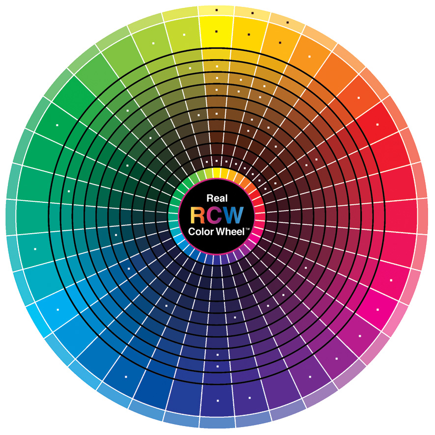
Upon first glance, you might be able to tell what colors you’re most drawn to, or most align with your company’s mission. Beyond that, the visual exercise of utilizing this color wheel can help you identify which shades or hues of a specific color might be preferable to you. And since most brands use more than one color, a color wheel can help you see which colors look good together. The colors right next to each other will pair well based on their similar undertones. You can also select complementary colors, which are often opposite each other on the wheel. These colors are different, but pair well together and are pleasing to the eye.
Picking a Palette
As you select multiple palettes, a graphic designer would likely work with you to find the right color palette for your brand. This often includes the main colors in your logo or branding, but can also include lighter, darker, or more neutral shades that you might use on your website or marketing materials. If this process feels foreign to you, there are dozens of tools that can help. One that we find incredibly useful is coolors.co. This website has hundreds of palettes to browse through and also has suggestions to help you see what you like. You can build your own palette or save palettes others have made, so you have something to go back to as you work on your own branding materials.
Overall, while choosing colors for your logo can be overwhelming, having a broader knowledge of color theory can help. If you can identify what you want your target audience to feel about your brand, it can be fairly straightforward which colors will invoke those emotions. With the right colors, your brand will pop, and your customers will be drawn to you. Knowing what you know now, you can utilize the power of color to curate a brand guide that’s unforgettable.