Human graphic designer vs AI logo demonstrating why human creativity stands out

Human graphic designer vs AI logo is one of the first decisions you’ll face when launching or growing a business. Your logo is the face of your brand, the first impression people notice, and the foundation for every other visual choice you make.

To make it easy to follow, here’s what we’ll cover in this post. You’ll see the most common pitfalls of AI-generated logos, why a human graphic designer vs AI logo is the smarter investment, and how The Logo Rx provides a professional, strategic solution to help your brand stand out. Use this post to learn how to make the right choice for your business and ensure your visuals truly reflect your story.

Table of Contents

  1. The Promise of AI Logos & Their Hidden Problems
  2. Why a Human Graphic Designer vs AI Logo Delivers Real Results
  3. Real Talk: The Cost Comparison
  4. The Intangible But Critical Factor: Trust
  5. Final Word

So, when it’s time to create a logo, many entrepreneurs face a critical decision: human graphic designer vs AI logo. Do I use an AI logo generator for speed and low cost, or do I invest in a professionally designed brand identity package like The Logo Rx.

If you’ve been tempted by the idea of letting AI crank out a logo in seconds, you’re not alone. But here’s the truth: while AI may seem like the fast and easy option, it comes with pitfalls that can actually cost you more time, credibility, and clients in the long run.

Let’s break down why a human graphic designer is the smarter investment, and why your brand deserves better than an algorithm.

The Promise of AI Logos & Their Hidden Problems

AI logo tools are everywhere. For $20 or less, you can type in your business name, select a few “style” preferences, and instantly download a handful of logo options. Sounds like a win, right?

The reality is more complicated. Here are the most common problems with AI-generated logos:

  • They’re generic. AI tools pull from existing styles and stock elements, mixing and matching shapes, fonts, and icons that dozens (if not hundreds) of other businesses have already used. Your logo won’t be unique, and it may even look identical to another brand’s.
  • They lack strategy. AI can generate shapes and color combinations, but it doesn’t know you, your business goals, your audience, your values, or the emotional impact you need your brand to create.
  • They create inconsistency. Even if you get a halfway decent logo, AI doesn’t deliver the full ecosystem you need: coordinated fonts, brand colors, layout variations, and usage guidelines. Without those, you’ll struggle to create consistency across your website, social media, and print materials.
  • They undermine credibility. Customers can tell when a logo feels cookie-cutter. Subconsciously, they equate generic branding with amateur businesses. That hurts your ability to build trust, attract higher-paying clients, and position yourself as the go-to professional in your space.

This is why choosing a human graphic designer vs AI logo is often a smarter investment.

Why a Human Graphic Designer vs AI Logo Delivers Real Results

At Soapbox Studio, we have a team of humans, talented graphic designers with 30 years of experience, and we created The Logo Rx because we saw too many business owners stuck in the “DIY trap.” They spent hours in Canva, experimenting with random fonts, or settling for AI designs that didn’t represent their brilliance.

Here’s why The Logo Rx is the antidote:

1. Human Expertise + 50 Years of Combined Experience

When you work with Soapbox Studio and use The Logo Rx, you’re not working with a robot. You’re working with human designers who have more than five decades of combined experience designing professional logos and brand identities.

We know how to listen to your story, understand your goals, and translate that into visuals that actually resonate. AI might be able to guess at “bold” or “elegant,” but it can’t interpret nuance the way an experienced designer can.

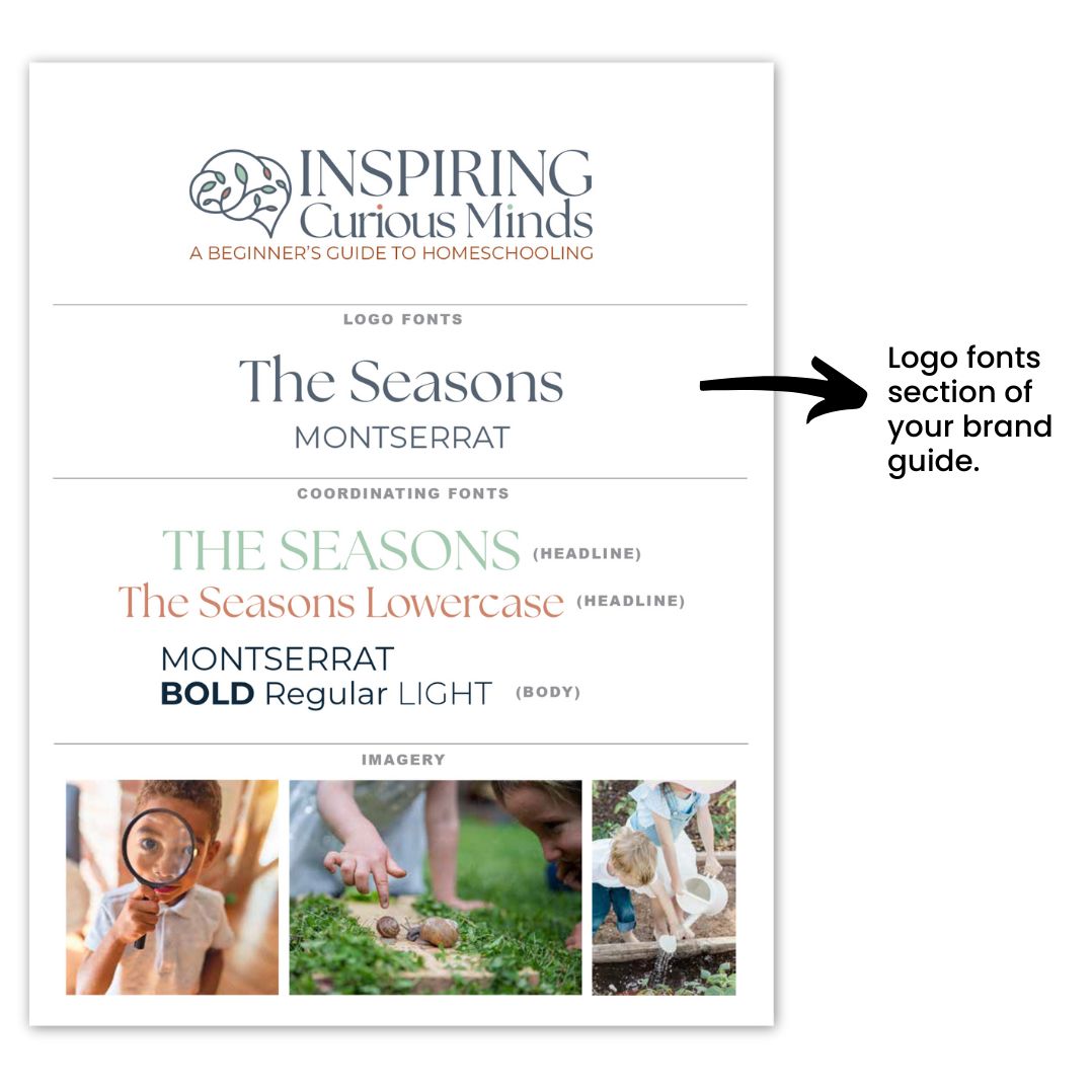
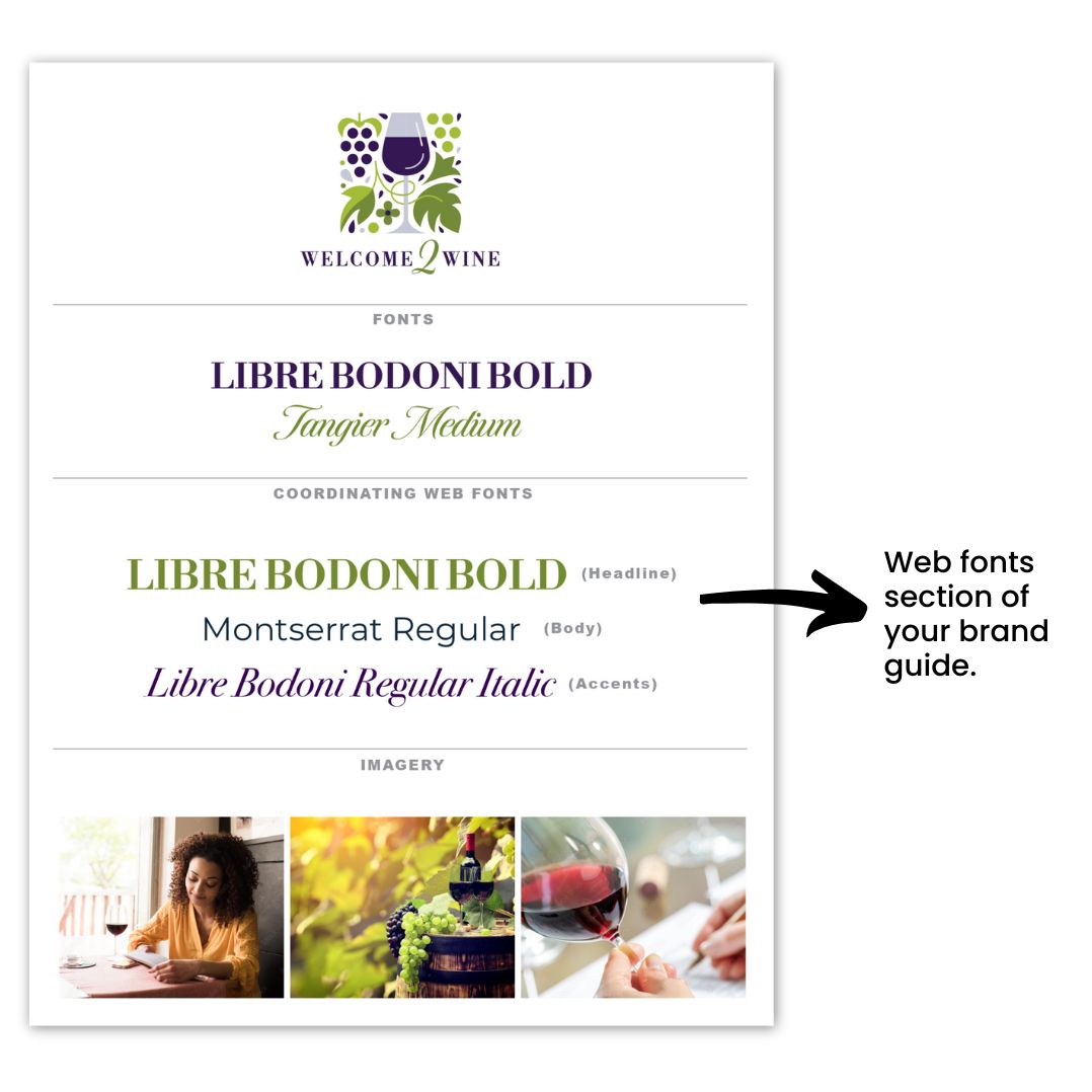
Comparison of human graphic designer vs AI logo showing creative design differences

2. A Logo That Reflects You

Every logo created with The Logo Rx design starts with our guided brainstorming process: Who are you serving? What’s your mission? What do you want people to feel when they see your brand?

Instead of spitting out random icons, we take these insights and craft a design that feels unmistakably “you.” The result is a logo that reflects your personality, your values, and your positioning in the market, not a generic placeholder.

3. Beyond a Logo: A Complete Brand Identity

An AI logo generator will hand you one file, maybe two. That’s it.

The Logo Rx, on the other hand, gives you a complete toolkit:

  • A polished, professional logo (with variations for digital and print)
  • A curated color palette that connects with your audience’s psychology
  • Font pairings that keep your message consistent
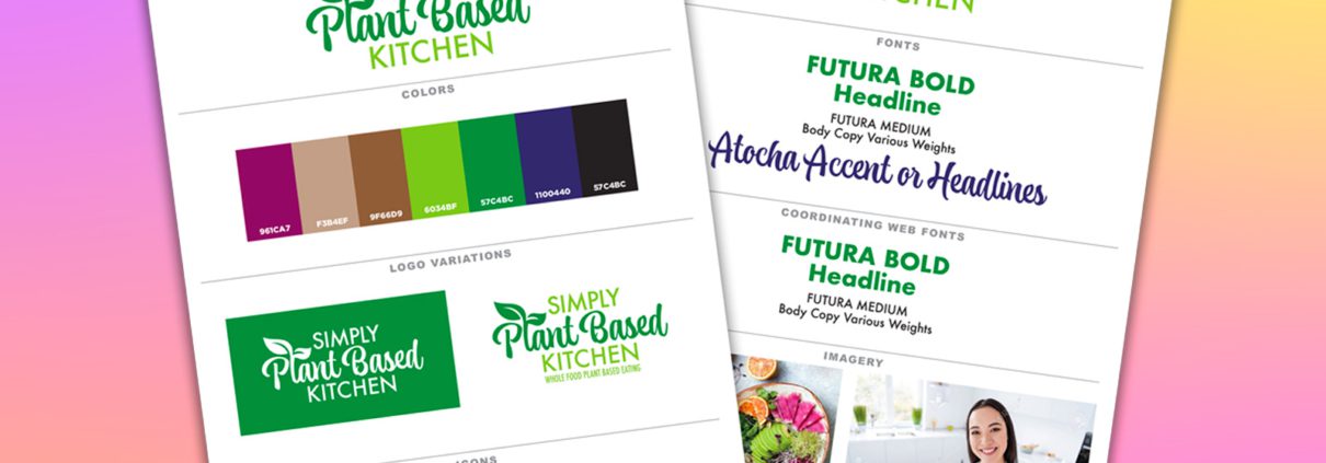
  • A brand guide that shows you exactly how to use it all
  • All the file types you’ll ever need, whether for your website, Instagram, or embroidered polos

This isn’t just a logo. It’s your brand’s prescription for looking credible everywhere you show up.

4. Confidence You Can Feel (and Your Clients Can See)

Here’s what our clients tell us again and again: once they have the Logo Rx package, they show up differently.

They post on social media without hesitation. It’s easier to pitch their services with authority. They price their offers with more confidence.

Why? Because they finally feel like their visuals match the quality of their work. That’s something AI cannot give you. This is a design rooted in your identity, backed by a professional process, that you feel proud to put your name on.

If you want to read more about how to build confidence in your brand, read this post – Build Brand Trust and Confidence: Best Proven Strategies.

5. Future-Proofed Design

AI tools are notorious for delivering one-off files that don’t scale. Need a transparent PNG? A horizontal version of your logo? A vector file for your printer? Good luck.

With The Logo Rx you’ll get every version you could possibly need, formatted correctly from the start. That saves you from headaches later and ensures your brand is ready to grow with you.

Real Talk: The Cost Comparison

Let’s address the elephant in the room: PRICE.

AI logos cost anywhere from free to $50. The Logo Rx is an investment.

But here’s what business owners often overlook:

  • The cost of lost opportunities. A weak logo can turn away clients before you even get a chance to pitch them. One lost contract or sale could cost you far more than investing in a professional logo.
  • The cost of inconsistency. Without a brand guide, you’ll spend hours tinkering with Canva templates that never look cohesive. Time equals money, and DIY branding burns both.
  • The cost of rebranding. Many business owners who start with AI logos end up rebranding within a year because their logo doesn’t scale. That means paying twice: once for the AI, once for the professional designer.

With The Logo Rx, you get it right the first time. Think of it as preventative medicine for your brand. One smart investment now saves you from bigger expenses later.

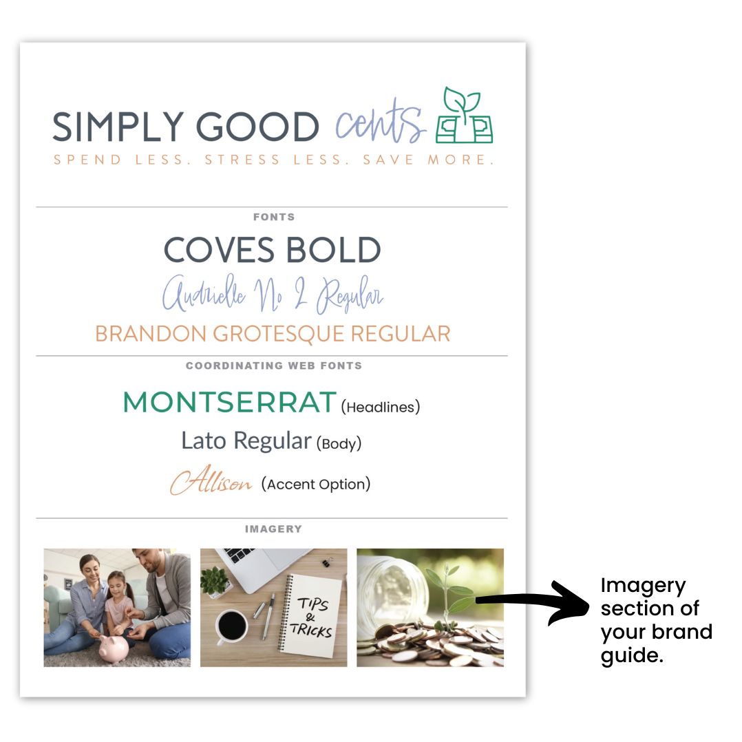
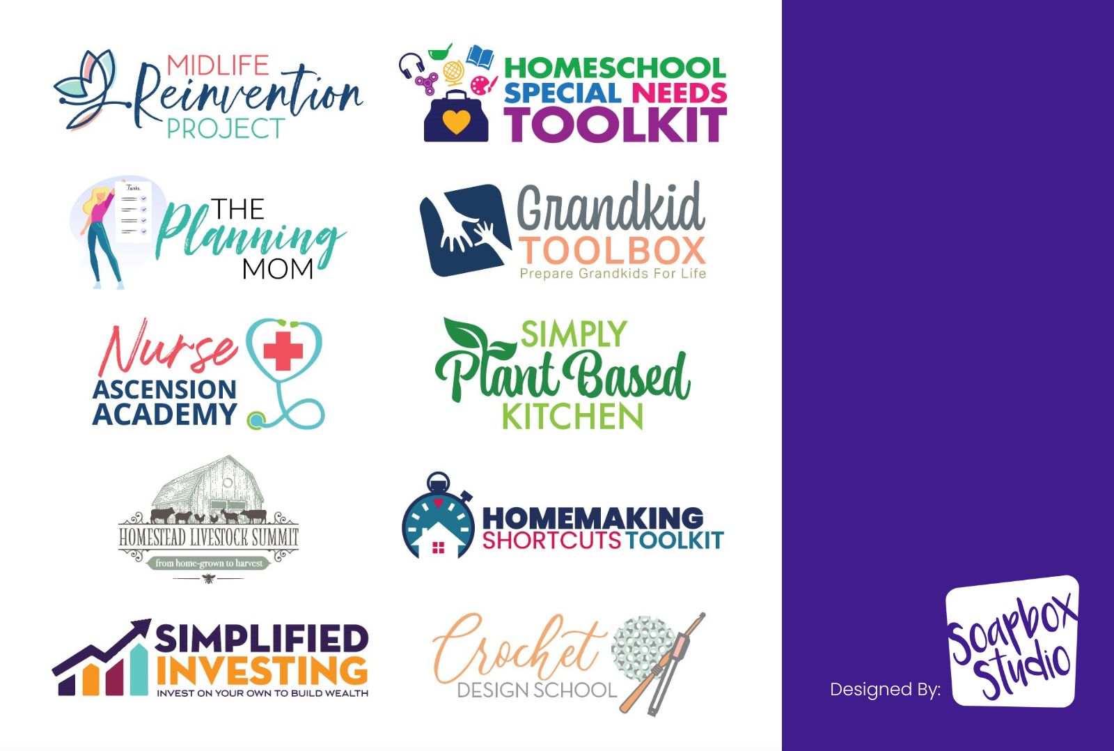
Side-by-side example of human graphic designer vs AI logo for brand identity

The Intangible But Critical Factor: Trust

At the end of the day, logos are about more than fonts and colors. They’re about trust.

When your audience sees your logo, they’re making snap judgments:

  • Does this business look established?
  • Do they feel professional?
  • Can I trust them with my money?

An AI logo might look “fine,” but “fine” won’t convince your dream clients to hand over their credit card. A professionally designed identity, crafted with strategy and care, positions you as the expert they’re looking for.

Final Word

Your logo is the face of your business, and the choice of a human graphic designer vs AI logo can make all the difference in how people see you. AI might be fast, but it cannot capture your story, understand your audience, or design a logo that truly reflects your brand.

Choosing a human designer ensures your logo is unique, strategic, and built to help your business grow with confidence. That’s exactly what  The Logo Rx provides: a professionally crafted brand identity that tells your story and sets you apart from the generic designs AI produces.

Ultimately, the decision to work with a human graphic designer vs AI logo can define how your brand is perceived and remembered.

Design might not be the first thing you think about when planning your summit, but it should be. Because let’s be real: even the best speaker lineup won’t matter if your visuals send the message that your event was thrown together last minute.

After years of watching summit hosts pour their heart into the content and tech side of things (and still struggle to convert), I was thrilled when Krista Miller, the creator of Summit In a Box and host of the Summit Host Hangout podcast, invited me on the podcast to talk about the part that often gets overlooked: design.

In this Summit Host Hangout podcast episode, Polished Summit Design Without Breaking the Bank, I’m sharing how the look of your summit can either attract your dream speakers and paying attendees, or quietly sabotage your results. You’ll walk away with practical ways to upgrade your visuals (even if you’re not a designer), build trust with your audience, and help your summit feel polished, professional, and high-value from the first click.

I’m Tracey Albrecht, founder and lead designer at Soapbox Studio, where we specialize in branding and design for online entrepreneurs and digital events. Below, I’m breaking down the key takeaways from my conversation with Krista, and of course, the full interview is available at the end of this post.

Meet Tracey Albrecht

Krista: Welcome to the Summit Host Hangout Podcast. I’m so excited to be talking about something a little different today – design and branding for your summit. We haven’t talked about visuals since 2019, and it’s time. When a summit flops, design is one of the first things I look at. I’m thrilled to have Tracey Albrecht from Soapbox Studio here with us. Welcome, Tracey!

Tracey: Hi! Thanks so much for having me.

Krista: I hesitated to bring another designer on, but after partnering with you recently and seeing how you worked with our summit hosts, I knew we needed to have this conversation. People loved your session, because this topic is so  important.

Tracey: I’m excited to be here. I’ve loved drawing and creating since I was a kid. Before computers, I just wanted to be an artist. Now I get to live that dream every day and help business owners feel more confident with a polished look. In the past five years, we’ve focused on online business owners. Many start with a DIY logo in Canva, and that’s fine for the beginning but it doesn’t always attract the right audience. Eventually, you outgrow DIY and need something more professional.

Why Polished Summit Design Matters

Krista: That’s perfect. I totally agree with you. When you’re ready to attract a higher level of client or customer, your visuals have to match that level. A logo can make such a strong first impression. The more experienced your audience is with hiring or working with online businesses, the quicker they are to make snap judgments. They’ll decide in an instant whether or not they’re willing to spend thousands of dollars with you based on how professional your overall design and branding  looks.

Tracey: Yes. Amateur branding costs you money. I’ve had clients say getting a professional logo changed everything – they felt legit. One said, “I got my logo on a hat – now I’m official!”

Krista: I love that. So let’s talk summit design mistakes. What are the biggest ones you see?

Common Summit Design Mistakes

Tracey: One major mistake is creating a summit logo that doesn’t match your main brand. It feels disconnected. Another is using low-resolution images or having too many visuals cluttering the registration page. Then there’s using too many fonts or colors. All of it creates visual chaos and confuses your audience.

Krista: I see that too – people use templates but don’t customize them. Or they use clashing stock photos. And then wonder why the page doesn’t convert.

Tracey: Right. Your summit should still look like it’s from your brand. Keep things consistent. Ask yourself: would your audience be drawn to this design? If not, it’s time to simplify.

Why Design Impacts Conversions

Krista: Why do you think these design details matter so much?

Tracey: Because they determine whether someone registers. I’ve skipped summits that looked too messy. One had this awkward speaker collage that made me question the event’s quality. We all get so many opportunities to sign up for things – if it looks amateur, we pass. And that means fewer signups and sales.

DIY Tips for Polished Summit Design

Krista: So true. And not everyone can hire a designer right away. What’s your advice for the DIYers?

Tracey: Keep it simple. Use your existing brand fonts and colors. Maybe add one extra color if needed. Don’t use complicated icons. Stick to templates if they’re available – just make sure to update them with your own visuals. And give your text some breathing room. Avoid cramming text up to the edges.

What Makes a Design Look Polished

Krista: What makes a design look polished?

Tracey: Polished design is clean and simple. It has hierarchy, space, and consistency. Unpolished design usually has too many icons, cluttered elements, or inconsistent fonts. Use just one or two fonts, and vary the weight to create interest. Use overlays on photos to keep text readable.

Krista: Yes! Photos with overlays in your brand color can be a great workaround. It helps the page feel personal without needing the perfect image.

Tracey: Exactly. We do that a lot. It helps images blend with your brand. And if you use templates, be sure to customize them so they don’t all look the same.

Krista: I also see a lot of designs with no whitespace. Everything is pushed to the edge – it feels stressful to look at.

Tracey: That’s a big one. Breathing room is so important. It helps guide the eye and gives your message space to land.

Affordable Design Help for Summit Hosts

Krista: I hope people are feeling encouraged that simpler is better. You can always hire a designer when you’re ready. Speaking of – can you tell us about your logo design packages?

Tracey: Absolutely. We’ve streamlined the process so much. Clients fill out a form with all the key info: business name, colors, fonts, audience, and style preferences. It’s fast and efficient, and we’re able to offer it at a price point that makes sense for online business owners. We’ve done hundreds of logos this way.

Krista: And it’s so affordable – not four digits! Plus, you also have a free brainstorming guide?

Tracey: Yes! The guide is great for anyone starting out. It includes font pairings and prompts to help clarify your logo vision. Even if you’re not ready to hire us, it’s a solid first step.

Krista: Thank you for making design feel approachable and doable. I appreciate you so much, Tracey!

Tracey: Thank you! I love helping people feel proud of their brand.

Hear the Full Interview

Want to hear the full conversation? Krista and I dive deeper into all of this in the episode, Design Mistakes That Are Costing You Summit Registrations. You’ll hear more real examples, mistakes to avoid, and tips for getting your summit visuals on track—even if you’re not a designer.

▶️ Click here to listen to the full episode on Apple, Spotify, YouTube

Or read the show notes here.


create your brand

What sets successful businesses apart from the rest? It’s not just their products or services—it’s how you create your brand to make a lasting impression in today’s fast-paced, visually driven world.

But let’s clear something up: a brand isn’t just a logo. It’s how people perceive your business, their emotions when they encounter your content, and their trust in you. Think of your brand as your business’s personality—it’s how you show up and connect with your audience on a deeper level.

When you create your brand thoughtfully and intentionally, it becomes a tool to build credibility and trust. By focusing on visuals—your colors, fonts, and imagery—and ensuring they resonate with your target audience, you’ll lay the foundation for a brand that connects and inspires.

Before we move on, let’s learn how to create your brand as you build your business with these topics: 

Your Target Audience Matters

To create your brand effectively, you need to start with the people who matter most: your audience. Your target audience isn’t just a broad group—it’s the individuals who resonate with what you offer and are most likely to connect with your business. Understanding them is the foundation of any strong brand.

Why? Everything about your brand, from the colors you choose to the tone of your messaging, should reflect the preferences and needs of your audience. For example, a modern, vibrant color palette might appeal to a younger, tech-savvy crowd, while a more muted and sophisticated design could resonate with a professional, corporate audience.

When you take the time to define who you’re speaking to, you’re not just creating a brand—you’re crafting an experience that feels personal, relevant, and trustworthy. And that connection is what keeps people coming back.

What Is a Brand?

Before diving into the steps to create your brand, it’s important to understand what a brand truly is—and why having a professional, cohesive brand from the start matters so much.

At its core, a brand is people’s perception of your business. It’s shaped by your identity, values, and the overall experience you provide. A brand is both tangible and intangible, encompassing:

  • Visual Identity: This includes your logo, color palette, fonts, imagery, and overall design style. These visual elements are often the first thing people notice about your business.
  • Messaging: Your tone of voice, tagline, and the key messages you communicate help define how your audience relates to your business.
  • Customer Experience: From customer service to product quality and emotional connections, every interaction someone has with your business contributes to your brand.

A strong brand makes your business unique, recognizable, and memorable. It’s the impression you leave on your customers after every interaction, and it’s built through consistently delivering on your promises and aligning with your values.

By starting with a well-thought-out approach, you can create your brand in a way that looks professional, builds trust, and sets the stage for long-term success.

Why It’s Important to Have a Professional-Looking Brand

When you set out to create your brand, the importance of making it professional-looking cannot be overstated. A polished, cohesive brand does more than just look good—it works for you in ways that elevate your business and set you apart. Here’s why:

Confidence

A professional-looking brand gives you confidence. Time and time again, our clients tell us that having a polished logo and cohesive visual identity transforms how they feel about selling their products or services.

confidence in your branding

That confidence translates into how you present your business, making it easier to connect with your audience, who, in turn, want to give you their business.

Trust

In a world overflowing with scammers and spammers, trust is everything. People are naturally cautious, and like it or not, first impressions matter. A professional brand instantly sets you apart, signaling that you’re credible and committed to your work—not just another fly-by-night operation. By taking the time to thoughtfully create your brand, you show your audience that you’re serious about providing value, not just chasing a quick buck. 

Loyalty

A well-designed brand doesn’t just look good—it builds trust and loyalty. In a marketplace where customers are bombarded with options, they gravitate toward brands that feel dependable and professional. 

Consistency in your branding fosters familiarity, making it easier for people to connect with you on a deeper level. When your audience trusts your brand, they’re not only more likely to return for your products or services but also to refer you to others, knowing you’ll deliver on your promises. Trust is the foundation of lasting customer relationships—and a strong brand is where it starts.

Stability

Would you trust a business that looks like it just opened its doors yesterday? Would you even have given it a second glance? A professional brand helps you project stability and experience, even if your business is new.

how to create your brand

It reassures your audience that you’re reliable and ready to meet their needs.

Increased Revenue

Here’s the bottom line: a professional-looking brand can lead to higher sales. Many of our clients have seen increased revenue after investing in their branding. Confidence, trust, loyalty, and stability work together to create a brand that attracts customers and convinces them to buy.

As you create your brand, ask yourself:

  • Who are your ideal clients, and what do they need from you?
  • What do you want people to say about your business?
  • Where will your branding appear—on a website, social media, or products?
  • When you think of your business values, what comes to mind?

Answering these questions can help guide you toward a brand that feels authentic, resonates with your audience, and sets the foundation for your business’s success.

5 Steps to Build a Brand While Building Your Business

Creating your brand while simultaneously growing your business might seem daunting, but it’s achievable with the proper steps. By focusing on foundational elements, you can develop a brand that evolves alongside your business and strengthens your connection with your audience. Here’s how to get started:

Step 1: Brainstorm

Every great brand begins with clarity. Start by reflecting on your mission, vision, and values—what does your business stand for? Next, identify your target audience and consider how you want them to feel when interacting with your brand. Finally, list adjectives or phrases that describe your brand’s personality, such as bold, approachable, or elegant. These insights will shape every decision as you create your brand.

brainstorming your brand

If you are looking for a tool to help you brainstorm, you’ll love our Brainstorming Guide.

Step 2: Name & Tagline

Your business name and tagline are the cornerstones of your brand identity. Choose a name that reflects your mission and resonates with your audience. Then, craft a short, memorable tagline communicating your business offers. Both should align with your brand’s tone and personality to ensure they leave a lasting impression.

Step 3: Fonts

Fonts may seem like a small detail, but they significantly impact how your brand is perceived. Select fonts that are professional, easy to read, and reflective of your brand’s personality. Use a primary font for headlines and a complementary font for body text, and keep it simple. Avoid the font Comic Sans, and other overused fonts at all costs, and focus on creating a look that is yours.

Step 4: Imagery

Your imagery plays a vital role in how your audience experiences your brand. Define a style that aligns with your brand’s personality, whether it’s modern illustrations, lifestyle photography, or minimalistic icons. Build a library of visuals that will be used consistently across your website, social media, and marketing materials. Choose images that evoke the right emotions and appeal to your audience.

Step 5: Colors

Your color palette is one of the most powerful tools to create your brand. Choose colors that resonate with your audience (not necessarily your favorites) and reflect your brand’s values. A well-balanced palette typically includes 1–2 main colors you will use most often, 1–2 secondary colors, and a neutral tone or shades and tints of those other main colors for versatility.

create your brand by color

Don’t forget to consider accessibility—ensure your text is easy to read against your background colors. If you want a little more help with picking brand colors, then you’ll love this post: Drawing in Clients: A Guide To Creating An Irresistible Brand Color Palette

Building a brand doesn’t have to be overwhelming. By following these steps, you’ll create a brand that not only looks professional but also grows with your business and captures the hearts of your audience.

When you are ready to put together a brand guide for you business, make sure to read this post which will help explain how to create a professional yet simple brand guide: This Is The Way To Create A Simplified Brand Guide.

Build Your Brand, Build Your Business

Creating your brand is an essential part of growing your business. A professional, audience-focused brand helps you build confidence, earn trust, and establish loyalty—all while setting the foundation for long-term success. By focusing on your target audience, defining your brand’s unique identity, and consistently delivering on your values, you can create a brand that truly resonates.

Remember, building a brand doesn’t happen overnight. Start small by focusing on one element—like refining your logo, selecting your fonts, or choosing your color palette—and build from there. Each step you take brings you closer to a cohesive and memorable brand.

If you are looking for more help on building your business, read this post: 5 Must- Have Elements You Need To Start A New Business.

If you’re stuck or unsure where to begin, you don’t have to navigate it alone. At Soapbox Studio, we’re here to guide you every step of the way, helping you transform your vision into a brand that feels like home for your business. Now’s the time to take that first step and start creating your brand—your future self will thank you!

In today’s competitive world, building trust and brand confidence is vital for your business. Branding has become a critical component of success for businesses and individuals. While we often associate branding with logos, taglines, and marketing strategies, visuals are another equally powerful tool. Your logo can significantly enhance your brand’s trust and your confidence, and impact personal and businesses performance.

In this post, we will explore the profound influence of visuals on brand trust and confidence and how this boost can positively affect your future personal achievements. So, let’s dive in and discover the remarkable connection between visuals, confidence, trust and personal performance!

Let’s explore brand trust and confidence with these topics:

Visual Communication and Brand Confidence

Visual communication is a timeless and powerful tool throughout history to convey messages and ideas. It can uniquely transcend language barriers and communicate directly to our emotions, making it a universally understood expression.

We are inherently drawn to visual stimuli, and our brains are wired to process images much faster than text or spoken words. This innate inclination towards visual information makes it an incredibly effective means of communication, particularly in branding and marketing.

When branding, visual communication is vital in establishing a solid and memorable identity for a company or organization. By harnessing the power of visuals, businesses can effectively communicate their brand’s values, personality, and essence to their target audience.

Through carefully curated visual language, including colors, fonts, and imagery, a brand can evoke specific emotions and create a lasting impression that resonates with people on a deeper level.

In the age of social media and digital marketing, where attention spans are shorter, and competition for engagement is fierce, the power of visual communication becomes even more critical. Compelling visuals can captivate an audience’s attention, making a brand stand out in a crowded online landscape.

Your visuals are more likely to be remembered, shared, and leave a lasting impression, increasing brand recognition and fostering a stronger connection with the target audience.

Building Brand Trust and Confidence

In branding, establishing brand confidence is crucial for gaining potential customers’ or clients’ trust and loyalty. Visual elements are pivotal in this process, shaping perceptions and creating a lasting impression.

When individuals encounter a visually cohesive and appealing brand, they are more likely to perceive it as professional, trustworthy, and reliable. Consistency in visual communication is vital to building brand confidence.

The visual properties, such as fonts, colors, and imagery, are consistent across various platforms and products, creating a sense of familiarity. It reinforces the brand’s identity in the minds of the audience. A consistent identity serves as a visual anchor that customers can rely on, enhancing their confidence in the brand.


A well-designed logo is a fundamental element of visual communication that contributes to brand trust and confidence. A logo serves as the visual representation of a brand, encapsulating its values, personality, and essence.

When a logo is thoughtfully designed, visually appealing, and aligned with the brand’s identity, it becomes a powerful symbol that instantly conveys professionalism and reliability. Seeing a recognizable logo can evoke a sense of trust in potential customers, making them more inclined to choose your brand over competitors.

Beyond the logo, other components, such as a visually stunning website and eye-catching social media graphics, also significantly build brand confidence. In the modern digital age, a website is often the first point of contact between a brand and its potential customers.

A visually appealing and well-designed website creates a positive first impression and conveys the brand’s commitment to quality and professionalism. It signals that the brand is invested in delivering a seamless and enjoyable user experience, which instills confidence in visitors.

Similarly, social media platforms have become powerful channels for brand communication. Eye-catching graphics and visuals on social media help brands capture attention and engage with their audience.

brand visuals

Delivering appealing content that aligns with the brand’s identity can reinforce their professionalism and build trust with their followers. This can translate into increased brand confidence and a higher likelihood of individuals choosing the brand over its competitors.

The Psychology of Visuals and Confidence

Another way to build brand trust and confidence is through the psychology of visuals. Psychology has long recognized the strong connection between visuals and human emotions.

Understanding this connection allows brands to tap into the power of visuals to shape how their audience perceives them. By strategically utilizing visual elements, brands can influence the emotional response of their audience and ultimately build confidence.

Colors, in particular, profoundly impact human psychology and can evoke different emotional associations. Each color carries its psychological meaning and can elicit specific feelings and reactions. For example, warm colors like red and orange are often associated with energy, excitement, and passion.

brand trust and confiden

They can create a sense of urgency or enthusiasm, making them ideal for brands that want to evoke these emotions in their audience. On the contrary, cool colors like blue and green are often associated with calmness, trust, and nature. They can convey a sense of reliability and tranquility.

Strategically selecting colors that align with a brand’s personality, values, and emotions they want to evoke, can create a visual language that resonates with their target audience. Consistency in using these colors across various touchpoints reinforces the emotional associations and enhances the audience’s perception of the brand.

If you want to read more about colors and how to choose the best colors for your brand, read this post: How To Choose the Best Classic Colors For Your Brand.

The Ripple Effect: Boosting Personal Performance

The impact of brand confidence extends beyond its influence on customers; it also has a remarkable effect on personal performance. When your brand exudes confidence through its visuals, it attracts customers and inspires you and your team to reach new heights of personal and professional achievement.

A visually appealing and cohesive brand can give you a sense of pride, instill self-assurance, and motivate you to deliver your best work.When you witness the positive response to your visuals and see how they resonate with your target audience, it creates a sense of validation and satisfaction.

This newfound confidence in your brand’s image permeates every aspect of your professional life. It shapes your mindset, influences your behavior, and boosts your overall performance.

brand trust and confidence

Another way brand confidence impacts personal performance is through enhanced stakeholder engagement. When your brand exudes confidence and professionalism, it creates a positive impression on stakeholders, including clients, partners, and investors. A cohesive brand is a powerful tool for building trust and credibility.

It enhances your ability to communicate effectively, negotiate confidently, and build strong relationships. This, in turn, opens doors to new opportunities, collaborations, and partnerships that align with your vision and contribute to your personal growth and success.

Reinforcing Brand Confidence Through Performance

Brand confidence and personal performance are deeply interconnected, forming a continuous cycle that propels success. Your visuals play a crucial role in instilling confidence in your audience, and their positive response, in turn, boosts your confidence and drives your performance to new heights.

This cycle establishes a positive feedback loop, where each success reinforces the other, leading to more remarkable achievements.

When your visuals evoke a sense of professionalism, trustworthiness, and reliability, they create a foundation of confidence in the minds of your audience. As your audience responds positively to your brand through increased engagement, sales, or positive feedback, their validation fuels your confidence.

That confidence acts as a catalyst for personal performance. Seeing your brand resonate with your target audience and gaining their trust inspires you to push your boundaries and strive for even more significant achievements. It instills a belief in your abilities and fuels your motivation to deliver high-quality work consistently.

This cycle works hand in hand to drive growth and success. The more confidence your audience has in your brand, the more they will engage with your products or services, refer others to your brand and become loyal advocates. This increased support and engagement allow you to excel and demonstrate your expertise, amplifying brand confidence.

It is important to note that this cycle requires consistency and a commitment to delivering high-quality work. By consistently meeting or exceeding expectations, you reinforce your brand’s positive image and maintain your audience’s confidence.

Take Confident Action

Visual communication is a powerful tool that plays a vital role in branding, building brand confidence, and enhancing personal performance. By effectively utilizing visuals, brands can establish a solid and memorable identity, conveying their values and personality to the target audience.

Consistency in visual communication reinforces identity and creates familiarity, fostering confidence. Moreover, the psychology of visuals allows brands to evoke emotional responses and build a positive perception strategically.

Brand confidence, in turn, boosts personal performance and opens doors to new opportunities, driving growth and success. The symbiotic relationship between brand confidence and personal performance creates a virtuous cycle that propels individuals and brands towards incredible achievements and long-term success.

If you need a little VIP treatment to up-level your brand and in turn your brand confidence, our VIP Days will be a massive asset to you. Graphic design VIP Days can be a valuable investment for companies that want to create custom designs in a tight timeframe so your business can stand out and look professional.

If you’re tired of the constant back and forth in a traditional model and don’t have months to spend tweaking revisions, this option is a great way to accomplish every task on your graphic design to-do list in a single day. In just one afternoon, you’ll have professional, ready-to-use graphics.

If your business needs this, contact Soapbox Studio to book your VIP Day now. Claim your spot and enjoy the VIP Day treatment!

Are you a new business owner needing a simplified brand guide, but because you want to DIY your branding, are unsure where to start?

If you need a little guidance to nail it, you’re in the right place. In this post, we’ll show you how to easily create a simplified brand guide that you can confidently share with vendors, employees, and subcontractors.

With this brand guide in hand, you’ll ensure your branding stays on point and consistent across all your marketing channels, creating a polished, cohesive look that represents your business at its best—every time.

Why a Simplified Brand Guide is Better

Creating a brand guide can feel like a daunting task, but as a small business owner, it’s essential to keep things simple. You don’t need a 50-page document outlining every possible scenario where your brand could appear.

If you’re not managing a large-scale corporation with thousands of employees, a full-blown, comprehensive brand guide isn’t necessary. Fortune 500 companies might need extensive manuals to maintain brand consistency across multiple departments and offices, but as a small business owner, simplicity is key. Your brand guide should provide enough direction to keep things cohesive, while remaining flexible and easy to follow.

In fact, making your brand guide overly complicated can lead to confusion and be more of a burden than a helpful tool. A simplified brand guide can save you time, effort, and even money, allowing you to stay focused on what matters most—growing your business.

A simplified brand guide is perfect for small business owners who plan to DIY their branding but still need a framework to ensure consistency. The goal is to create a guide that’s both practical and user-friendly, so your brand always shows up the way you want it to.

Our Process To Create a Simplified Brand Guide

Let’s walk through the steps to create a simplified brand guide by covering these key topics:

What Your Brand Guide Should Include

Keeping your brand guide simple is essential, especially when you’re just starting out. A streamlined guide helps you stay organized and consistent without overwhelming you or your team. Ideally, your simplified brand guide should be no more than two pages in the beginning. As your business evolves, it can naturally expand, incorporating additional elements as you grow or introduce new products and services.

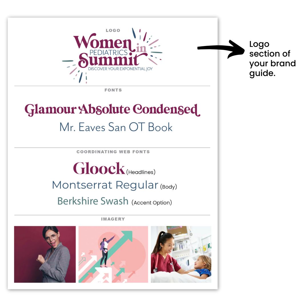
At the core, your brand guide should feature a few key components. First, include your main logo, which serves as the visual cornerstone of your brand. Alongside this, you’ll want to specify your color palette, ensuring your brand has a consistent and recognizable look across all platforms.

Don’t forget to include the fonts used in your logo, as well as any coordinating web fonts you’ll rely on for digital communication. Additionally, variations of your logo—whether in different color schemes or orientations—should be included, giving you flexibility while maintaining consistency.

Finally, icons and inspirational images that represent the style and mood of your brand will also help provide a visual reference for anyone working with your brand assets.

Now that you know what your brand guide should include, let’s dive deeper into each element, starting with the logo. Your logo is the heart of your brand—it’s the first impression customers get, the symbol that represents your business, and the foundation upon which the rest of your brand identity is built.

Getting your logo right is crucial… it sets the tone for everything else, from your website design to your packaging and social media presence. A well-designed logo not only makes your business instantly recognizable, but it also communicates your values and message at a glance.

Think of it as the face of your brand. Whether your brand is fun and playful or professional and sleek, your logo should reflect that personality and create a connection with your target audience.

Your logo is more than just a graphic; it’s a visual shortcut to your brand’s story. Whether you’re working with a designer or crafting it yourself, aim for simplicity, versatility, and timelessness.

The best logos are memorable, easy to understand, and work across various mediums and sizes—from business cards to your website. A strong logo will guide your future branding choices and provide assurance that your brand has a clear and cohesive visual identity from day one.

If you want to learn more about what makes a good logo design, read this post.

guide

Choose Colors Wisely

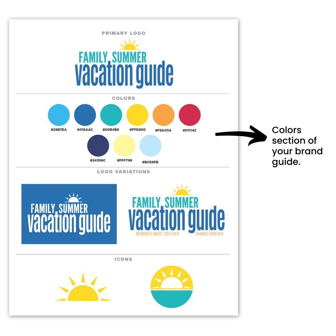
Choosing your brand colors is essential for creating a simplified brand guide. Start with a main color palette that includes 5-7 coordinating colors, with at least 5 as your initial focus. As your business expands, you may require additional colors to represent specific products or services, but this range gives you a strong foundation for your branding efforts.

It’s important to understand the meanings and associations behind different colors, as they can significantly influence how your brand is perceived. For instance, blue often conveys feelings of calm and productivity, while orange can evoke feelings of happiness and enthusiasm. By choosing the right colors that align with your company’s values and message, you can create a stronger emotional connection with your audience.

You can read more about what colors mean and how to find the right colors for your brand by reading this post.

Additionally, ensure your color palette includes sufficient contrast to prevent accessibility issues online. A well-thought-out color scheme not only enhances the aesthetic appeal of your brand but also ensures that all users can engage with your content effectively. If you want to know more about how colors are perceived in business, take a moment to watch this video.

simplified brand guide

Understand Logo Variations & Why You Need Them

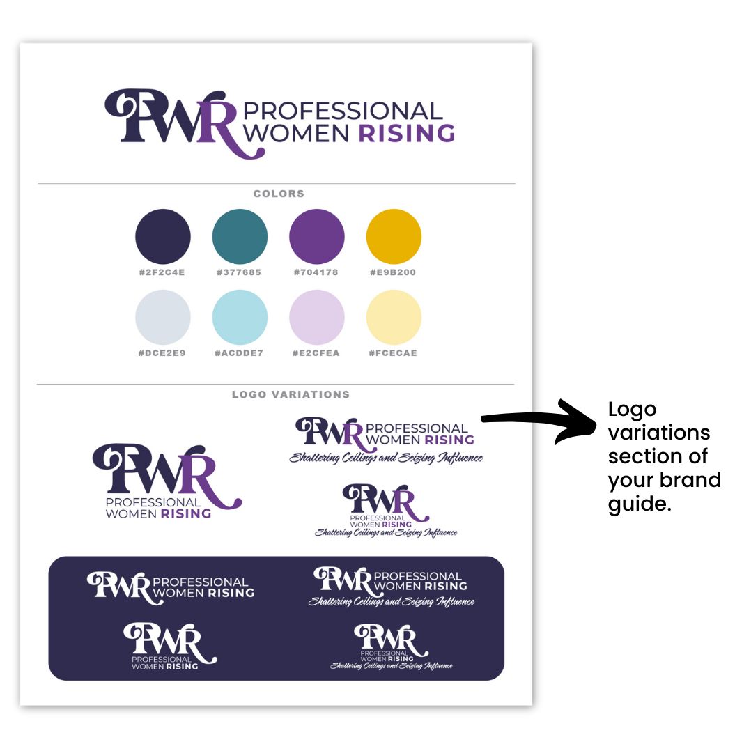
The next component to creating a simplified brand guide is to understand and recognize the different types of logo variations and why they are essential for your brand. We recommend you  include one-color, full-color, and a white version, as well as options with and without a tagline.

The one-color version is typically black or a very dark shade in your color palette. , Although this variation isn’t always necessary, it can be beneficial to have in your toolkit.

Understanding how to use each logo variation is key to maintaining a consistent brand presence across various platforms and materials. For instance, your full-color logo is ideal for most applications, while the one-color version can be used for simplicity and clarity in certain contexts.

Additionally, having an all-white version—sometimes referred to as a reversed logo—is crucial for use on dark backgrounds, ensuring your brand remains visible and recognizable in any setting. By leveraging these logo variations effectively, you can adapt your branding to different environments while preserving its integrity.

brand guide

Necessary Icons for Your Brand

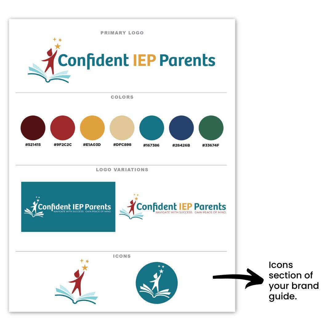
The next part of your simplified brand guide is your icons. Icons play a vital role in reinforcing your brand identity and are often used for favicons, profile images, and various other applications.

Typically, these icons are derived from your logo, transformed into a simplified icon format that remains recognizable at smaller sizes. This ensures that your brand is consistently represented across different platforms, even when space is limited.

When creating your icons, it’s important to ensure they align with your overall branding. Ideally, your icons should be variations of your logo or incorporate elements such as a piece of the logo or even the first letter of your brand name. By maintaining visual coherence between your icons and logo, you strengthen your brand’s recognition and create a more unified brand experience for your audience.

brand guide

Be Strategic When Picking Logo Fonts

When selecting fonts for your logo, it’s important to strike a balance between readability and making a statement. Your logo font should be easy to read at a glance, but it should also convey your brand’s personality.

However, it’s easy to go overboard with font choices, which is why it’s best to limit yourself to no more than two fonts in your logo (three fonts if absolutely necessary). This keeps the design visually appealing and prevents it from looking cluttered or confusing.

Your primary logo font will likely carry the most weight, representing the bulk of your brand’s personality, while a secondary font can be used for supporting text or taglines. This balance allows you to add depth to your logo without sacrificing clarity. For instance, pairing a bold, eye-catching font with a simpler, cleaner font can create an effective contrast while maintaining harmony in your design.

Remember, your logo is often displayed in various sizes and formats, so readability is key. A font that looks great in large print may not be as legible in smaller applications like business cards or social media profiles. Opt for fonts that are versatile and can be easily scaled without losing their impact or clarity. Your logo fonts will be a cornerstone of your brand identity, so it’s worth taking the time to select fonts that not only look great but also are cohesive with your brand identity.

simplified brand guide

Select Coordinating Web Fonts With Care

Selecting coordinating webs fonts is crucial, especially in ensuring they coordinate with your logo fonts. Choosing web-ready fonts—preferably Google or web-safe fonts—is essential for proper display across all browsers and devices.

If you opt for a custom font that isn’t web-ready, it may be replaced by a default web-safe font, leading to a look that doesn’t align with your brand’s identity. To avoid this, it’s best to select fonts designed for online use, ensuring a consistent representation of your brand across digital platforms.

Aim for two, or at most three, coordinating web fonts that align seamlessly with your logo fonts. Typically, you’ll want a bold or distinctive font for titles and headlines to draw attention, while your body or copy font should prioritize readability. Ensure that these fonts complement your logo fonts in style and tone, creating a harmonious visual experience for your audience.

Additionally, utilize the varied weights—such as light, regular, bold, and italic—within the same font family. This approach allows you to create visual contrast while maintaining a cohesive look throughout your website.

brand guide

Pick Imagery That Represents Your Brand

Choosing the right imagery is vitally important for showcasing what your business represents inside your simplified brand guide. These images act as a visual representation, effectively communicating your brand’s identity and values.

They can also be the exact images you plan to use across your marketing materials, so it’s important to select them thoughtfully.

We recommend curating a collection of 2-4 images that truly exude what your business is all about. These visuals should capture the feel and aesthetic that resonate with your ideal client, drawing them in and making a lasting impression.

Whether it’s through vibrant photography, engaging graphics, or powerful  illustrations, these images should align with your brand identity and create an emotional connection with your audience.

By choosing images that reflect your brand’s core message and appeal to your target market, you’ll enhance your overall branding strategy and create a more compelling narrative for your business.

brand guide

Tips To Create a Professional Brand Guide

Creating a professional brand guide doesn’t have to be overwhelming if you follow all that you learned so far today and keep these three tips in mind:

Tip 1: Keep it Simple

Aim for a concise guide that spans just 1 or 2 pages. This simplicity will make it easier for you and others to reference your brand guidelines without getting lost in excessive details.

Tip 2: Include Key Elements

Ensure your brand guide encompasses the following items: your logo, selected fonts, imagery, color palette, logo variations, and icons. These components will serve as the foundation for your brand identity and provide clear direction for consistent usage.

Tip 3: Utilize Professional Resources

Consider obtaining a professional brand guide template to streamline the process. Templates can help you organize your brand elements effectively and maintain a polished look. You can find great templates available inside our Soapbox Subscribed membership, so be sure to check it out!

Once you’ve settled on the key elements of your brand guide, you’ll find that it becomes much easier to maintain consistency across all your marketing materials.

However, if you need additional support in developing or refining your brand guide, our Soapbox Subscribed membership is here to help. We provide the guidance and resources necessary to keep your brand cohesive and polished, allowing you to focus on what you do best—all in less time than you might be spending now! Join us today and let’s elevate your brand together!

As an entrepreneur, are you looking for some tested graphic design tips? Since aesthetics mean so much to today’s generation of consumers, even the most low-tech entrepreneur could use a few design tips. We’ve got you covered.

As a graphic design company with over 50 years of combined experience designing websites and graphics for entrepreneurs and business owners, we know what it takes to keep up with today’s trends. These are our top seven tips to keep your graphics looking clean and professional in today’s marketplace.

Let’s go over these 7 tested graphic design tips:

1. Keep It Simple

People often believe that graphic design tips need to be complex to look professional. This simply isn’t true. Keeping your designs minimalistic makes them easier to use in a variety of contexts while maintaining that clean crisp look that draws the eye.

Think about the simple shapes, lines, colors, and fonts that your favorite brands use. How can you replicate that simplicity for your brand identity? Stay away from complicated overlays, photographs, and unreadable text or colors that will distract people from who you are and what you offer.

2. Be Consistent with Colors and Fonts

If you could summarize your brand identity in just a few words, what would you say? Is your brand modern, adventurous, rustic, or colorful? Identifying some key adjectives surrounding your identity will help you stay consistent throughout your web presence and print materials.

If you run an accounting firm, you probably don’t want to use a childlike crayon font. If you own a sporting goods brand, you want to stay away from scrolling cursive fonts. The same holds true for colors.

If you’re marketing to young women, rustic browns probably won’t communicate your identity effectively. Similarly, A baby clothing brand might want to avoid harsh neons. Whatever tone you choose for your branding – be consistent across the board.

3. Don’t Use Too Many Graphics or Icons

Our next graphic design tip is that when it comes to promoting your company, it’s easy to get overly excited. You could fill a vision board with graphics that fit with your company’s vision. But be careful! If you use too many, people get visually overwhelmed and can’t make sense of what they’re looking at. For a logo, just use one image concept.

graphic design tips

Don’t try to combine too many or it will no longer make sense. On your website, keep it simple. You can add some images or graphics that help set the tone, but don’t fill every square inch. People need negative space and simplicity so they keep scrolling and want to learn more.

4. Use Script Fonts Sparingly (and never in all caps)

We like to play around with fancy fonts. It’s just fun. But when you’re establishing a brand identity, you need to prioritize readability. If customers can’t read the words you post, it’s going to be pretty hard to connect with them.

A notoriously hard to read font style is script fonts. These are the fonts that look like handwriting or cursive. They are often thin and have a lot of extra curly wisps at the ends of letters and sentences.

One of our most important graphic design tips is that you should use these fonts very sparingly, if at all. This is not the type of font that you want to use for your main website copy or slogan.

And if you use a script font, never use it in all capital letters. These fonts weren’t designed to be in all caps, and it often makes them even harder to read.

If you’re using a script font for a main title or heading, make sure you don’t play too much with the letter spacing or distance. This can make it look awkward and minimize the handwriting effect that you were aiming for to begin with.

If you want to learn more about choosing the best font for your business, read this post: How to Choose the Right Font for Your Brand.

5. Have Someone Other Than You Critique Your Work

Our next graphic design tips is that we are often our own worst critics, but sometimes we’re also our own worst enablers. We know how much work and passion went into a project, so sometimes it is hard for us to see the flaws that exist.

critique your graphic design

Getting an extra pair of eyes to look at your work and give feedback can help you see your website or brand through a newcomer’s eyes.

Maybe the colors you used don’t fit the vibe. Or maybe it’s harder to read the fonts than you realized. Getting an outside opinion can help you cover all your bases so you don’t run into problems later on.

6. Make a Folder of Logos or Brands You Love

Another graphic design tip is that when you’re just establishing your brand or going through a rebranding process, it’s easy to get lost in the details, so remember to make a folder of you logos you love.

If you find yourself overwhelmed with all the options for colors or fonts to use, take a break. Spend a few minutes collecting the logos, shapes, and colors used by your favorite brands and put them all in one folder.

Then spend some time looking them over together. What common themes do you see? Are there similar color schemes? Do they use a similar font design? Are there specific lines or shapes among the logos?

This exercise will help you cut through the overwhelming amount of options to identify what you like and what elements your eye is drawn to.

7. Don’t Feel Obligated to Use a Friend of a Friend

This next graphic design tip can be a bit controversial. If your friend’s son is going to school for graphic design, you shouldn’t feel automatically obligated to use him. This is your professional brand and the quality matters.

It’s easy to take shortcuts or cut costs, but you usually get what you pay for. You don’t want your brand to lose credibility with your customers because it looks like an amateur did it.

When you’re seeking help to establish your brand identity and get professional assistance designing your logo, do your research. Look at the portfolio of past projects a designer has done and see if they align with your vision.

Find someone who you are confident can deliver the professional results that you want as an established business owner with a reputable brand.

Remember, a graphic designer can help you get started. Instead of spending the next ten months dreaming of what you want, why not hire a designer today and take real achievable steps towards your goals? We’d love to help with any of your graphic design needs, click here to learn more about the design packages we offer.

As graphic design professionals, we’ve seen people fall into the same pitfalls over and over. To help you avoid repeating these same mistakes, we compiled this top seven list to give you the easiest next steps to take. Follow these 7 graphic design tips and your business can be booming with customers who love your eye-catching brand.

Instead of presenting amateur designs and clunky colors that make potential customers doubt your credentials, you can show up every day with graphics that build their trust and increase their confidence.

As you navigate the tricky obstacles of running a business and establishing a reputable online presence, let us keep the graphic design process easy so you can focus on the things that matter most! If you have questions about how to get started with a designer, click here.

People Rebranding and Transforming their Sales and Conversions

Rebranding a company can be a significant undertaking that requires careful consideration and planning. In addition, a rebrand can positively and negatively affect a business, particularly regarding sales and customer interaction. In this article, we’ll explore the various factors of rebranding and how it can impact your business.

Explore how rebranding a company can transform your sales and conversions with these topics:

Positives of Rebranding a Company

Improved Perception

One of the most significant benefits of rebranding a company is improving its image. A rebrand can help shed negative perceptions or outdated associations holding it back. By rebranding, a company can position itself as modern, innovative, and relevant to its target audience.

Increased Visibility

Rebranding can give a business a new look and feel that sets it apart from the competition. A new visual identity, such as a redesigned logo or updated color scheme, can capture the attention of potential customers and make a solid first impression.

Additionally, by treating the rebranding as a major announcement, a company can generate buzz and increase visibility, further enhancing the impact of the new identity.

rebranding company sales increase

Competitive Advantage

Rebranding can provide a competitive advantage over rivals. A fresh look and feel can differentiate a company from competitors and attract new customers who may develop an interest based on the refreshed identity.

Improved Marketing

Rebranding can also present an opportunity to update a company’s marketing strategy. A new brand identity can inspire fresh and creative ideas for advertising campaigns, social media content, and other marketing initiatives.

Negatives of Rebranding a Company

Loss of Brand Recognition

Rebranding can be a powerful tool for a company to differentiate itself from its competitors. However, it can also cause confusion among customers who may not immediately recognize the new brand identity. This can result in a temporary loss of sales and customer loyalty. To mitigate the potential downsides of rebranding, it’s essential to work with an experienced designer who can ensure that the new identity is easily recognizable and appealing to the target audience.

Cost of Rebranding

Rebranding a business can often become costly, with expenses related to hiring designers, marketing experts, and other professionals adding up quickly. For small businesses, this can pose a significant financial burden. However, there is a solution that can help small businesses save time and money while still achieving their rebranding goals – the Soapbox Studio VIP Day. The Soapbox Studio VIP Day is a dedicated 6-hour session that can be booked in advance, allowing small businesses to work closely with our experienced professionals to create a comprehensive rebranding strategy.

Resistance from Customers

When it comes to rebranding, businesses need to be mindful of the potential resistance from customers who have a strong attachment to the company’s previous identity. Any misstep in the rebranding process can potentially turn off these customers, which could decrease sales. To avoid this, hiring a professional designer with experience in executing successful rebrands is highly recommended.

Lack of Consistency

Rebranding can lead to a lack of consistency across a company’s various touchpoints. Suppose a company’s new brand identity is not consistently applied across all channels. In that case, it can lead to clarity and a lack of customer trust. Make sure that if you are spending the time and money to rebrand you hire a professional and carry it through all your marketing.

How Rebranding Can Affect Sales, Customer Interaction, and More

A successful rebrand not only impacts sales and customer interaction, but can also significantly impact the owner’s confidence in their brand or company. A company can feel more confident by presenting a modern and innovative identity that resonates with its target audience’s needs and preferences.

In addition, a fresh, creative marketing campaign can generate buzz and excitement around a company’s new look and feel, further boosting confidence in the brand’s potential for success. This can positively impact sales, as brand owners become more confident in their advertising and marketing campaigns.

Rebrand a company as a marketing team

When a company is confident in its identity and messaging, it can create a more compelling and memorable customer experience that fosters engagement and interaction, increased loyalty, repeat business and positive sales and revenue.

On the other hand, a poorly executed rebrand can result in a loss of customers and revenue, as well as negative word-of-mouth that can be challenging to overcome. Working with professionals that have branding and marketing experience is crucial to ensure that the process is executed effectively.

They can provide valuable insights and expertise in market research, messaging, and visual identity, resulting in a successful rebrand that maximizes the potential for growth and success.

You need a good logo if you’re starting a new business or refining your brand identity. But what makes a logo “good”? Unfortunately, there’s an infinite amount of information on the internet with conflicting messages about this, so it can feel overwhelming.

But as graphic design professionals with over 50 combined years of experience creating compelling logos for all industries, we’ve assembled everything you need to know about what makes a successful logo in one place!

Let’s go over what makes a good logo design with these topics:


A Simplistic Logo Is Best

A logo isn’t supposed to explain your brand’s whole story in one glance. Think about how simple and recognizable the logos for Adidas, Google, or Mastercard are. Your logo should be easy to understand and remember. Making it too complicated will just confuse people.

A Good Logo Is Memorable

apple logo

You might not be able to instantly remember a company’s tagline, mission, or advertising campaign – but if it’s done right, you should remember its logo. Apple’s logo is unmistakable. You can identify Target’s red circles without a single word.

Likewise, it would be effortless if I asked you to remember the Starbucks logo. That’s because these logos are memorable. You need your logo to have its own distinct style so that when people think of your company, they remember your logo.

An Identifying Logo Is Key

The Burger King logo tells you that you can expect a burger. The YouTube logo indicates that you will be pressing play on a video. Not only do these logos indicate what the brand is about, but they encapsulate the company’s identity.

If you want your company to be known as the best option within your industry, your logo can have the power to make people think of you when their specific need arises. For example, when someone wants to watch an engaging football game, they know they can go to the NFL every time.

Make Your Logo Timeless

If you want your brand to stand the test of time, you need your logo to be timeless. You don’t want to have to rebrand every five years. Apart from wasting money, that can also confuse customers or clients about your identity.

For example, if Superman’s “S” had changed all the time, he wouldn’t seem like such a timeless superhero. Part of a timeless logo is choosing fonts and colors that will not feel outdated in a few years. Our designers are well-versed in color theory and can help you pick a color palette that feels both modern and timeless.

Font Specificity

If every logo was written in Comic Sans, you might not take the brands very seriously. However, if a kid’s crayon or chalk brand was written like that, you would better understand their niche. Choosing your font carefully can help your brand stand out from the rest. When you get a Subway sandwich, you don’t see bread on the sign anywhere.

But you know that “Subway” will always be written the same way, so their sign makes you think of a sandwich. Walmart’s identity wouldn’t be the same without its font, either. It is important to use a font that pairs well with your company’s story, whether it feels modern, elegant, colorful, feminine, rustic, or bold.

Color Palette

Choosing a color palette for your logo requires more than just picking a collection of favorite colors. Color theory dictates that different colors can activate different emotions in people.

For example, using pale blue communicates something very different from neon blue. And knowing how to combine colors to complement each other and work together is essential, especially in logo design.

If you want to learn more about colors and what each one means, read this post: Drawing In Clients, a Guide to Creating an Irresistible Brand Color Palette.

Distinction Communicates Identity

A good logo communicates your company identity. But it’s a great logo if it sets you apart from your competition. Your logo can show your customers who you are and distinguish your company from others in the industry that provide similar products or services.

Not only will it help people think of you as their best option, but it’s a great marketing tool. Think of all the free advertising that could come from a product with your logo. More people buy Adidas clothing when people see others walking around wearing Adidas.

When you drive your Toyota truck through the mud, people start to associate the Toyota logo with a durable and dependable product.

Relevance Brings In Customers

While you don’t want your logo to look outdated, it must be timeless by appearing relevant to current needs and events. People want to depend on a brand or company that solves their everyday problems.

A relevant logo can ensure that they come to you. Creating a logo that feels fresh and modern without sacrificing its timelessness will gain credibility with your customers. If they see a logo design that feels rudimentary or amateur, one glance will tell them that you’re not proficient at what you do and are not equipped to help them fill their needs.

Adaptability Is Good

We want your company to grow and change without feeling locked in or limited. A versatile logo can help you do this without rebranding as you grow. We deliver your logo in various formats so you can use it in every form you need. Sometimes you just need the image.

You may also want to pair your logo image with your company name or slogan. And if you want it to look less like clip art and more like a professional design, you’ll need a variety of formats to fit your needs.

Professionally Designed Logo

To be taken seriously by your customers, you need a professional logo designed well. If you’ve had a picture in your mind of what you want but don’t have the time or skills to design it yourself, Soapbox Studio can help.

good logo design samples

Rather than resorting to primitive design tools or amateur results, we will work with you to create the logo you’ve been dreaming of without all the frustration of napkin pencil sketches and late-night Google searches. So leave it to us, and we’ll develop everything your company needs to stand out and look professional and credible.

Who Are We?

Soapbox Studio is comprised of two designers, Tracey and Justin. Tracey founded the company in 1997, and together with Justin, they have over 50 years of combined experience producing excellent designs for every demand.

When you work with Soapbox, you have the assurance that you will be working directly with the designer from start to finish without going through a middleman. You know your designer’s name, and you’re working with a US-based team you can trust.

We prioritize a personalized experience based on collaboration to achieve your vision. Curious what makes a good logo design? Contact us to get started if this experience sounds like what you’ve been looking for. A professionally designed logo will make you look as good as you really are.

The Systems & Workflow Magic Podcast Featuring Tracey Albrecht

Are you a new business owner wondering how to create a systemm of design that not only looks great but also stands the test of time? In today’s competitive market, achieving a consistent and cohesive system of design is essential for your brand’s success.

Today we will guide you through the strategies to develop a system of design that leads to a cohesive brand. By focusing on cohesion, you can ensure that your brand remains consistent and impactful across all your design platforms, helping you to build a strong foundation for your business.

Recently, we had the pleasure of being featured on Dolly DeLong on her The Systems & Workflows Magic Podcast, where we discussed these very topics.

system of design podcast

Join us as we explore the steps to creating a design that truly stands out. You can keep reading to learn how to implement these strategies for your own business, or you can listen to the full episode here.

How To Create a Cohesive System of Design

Let’s go over how you can create a cohesive system of design for your business with these topics:

Lay the Foundation: Begin Building A System of Design

As you begin to establish your system of design, it’s important to lay the correct foundation. The first step in our streamlined logo design process is the same for both our in-person clients and also our Logo RX clients and is called the 5 W’s. The 5 W’s were created to help our clients lay a solid design foundation for their business. Once you have all 5 W’s confirmed and written down on paper, then you can move on to the next level of the design process.

Foundation Step 1: The 5 W’s of Logo Design

As you begin to build the foundation of your logo or branding, or even product branding, you will need to consider these 5 W’s. This foundation step of your system of design does not include any actual design work. This step is just about considering, collecting, and writing down information. As you start working on the 5 W’s, take no more than 45 minutes to complete your answers for all 5 of the W’s.

WHO: Who are Your Ideal Clients?

5 W's of Design: Who

Who are your ideal clients is a great place to start. Think about who you want your perfect target audience to be and what their needs and preferences are. Go ahead and write that down.

WHAT: What Do You Want People to Say About Your Company?

5 W's of Design: What

Moving on to what do you want people to say about your company? Determine the key messages and values your brand should convey. As you reflect on your company’s mission and vision, think about the emotions you want your brand to evoke in your potential customers. What thoughts and emotions should your brand trigger in your audience?

WHERE: Where Will You Use Your Logo?

5 W's of Design: Where

Next, you need to think about where you will use your logo. Identify all the places where your logo will be displayed (e.g., website, social media, signage). Ensure the logo design is versatile and adaptable to various mediums. Some of the best logos are very simple and easy to recognize in different formats.

WHEN: When You Think About Your Company, What Comes To Mind?

5 W's of Design: When

Moving on, it’s time to think about your company values, and how you can integrate those values into your branding. You’ll want to ensure consistency between your values and how you visually want to represent those values.

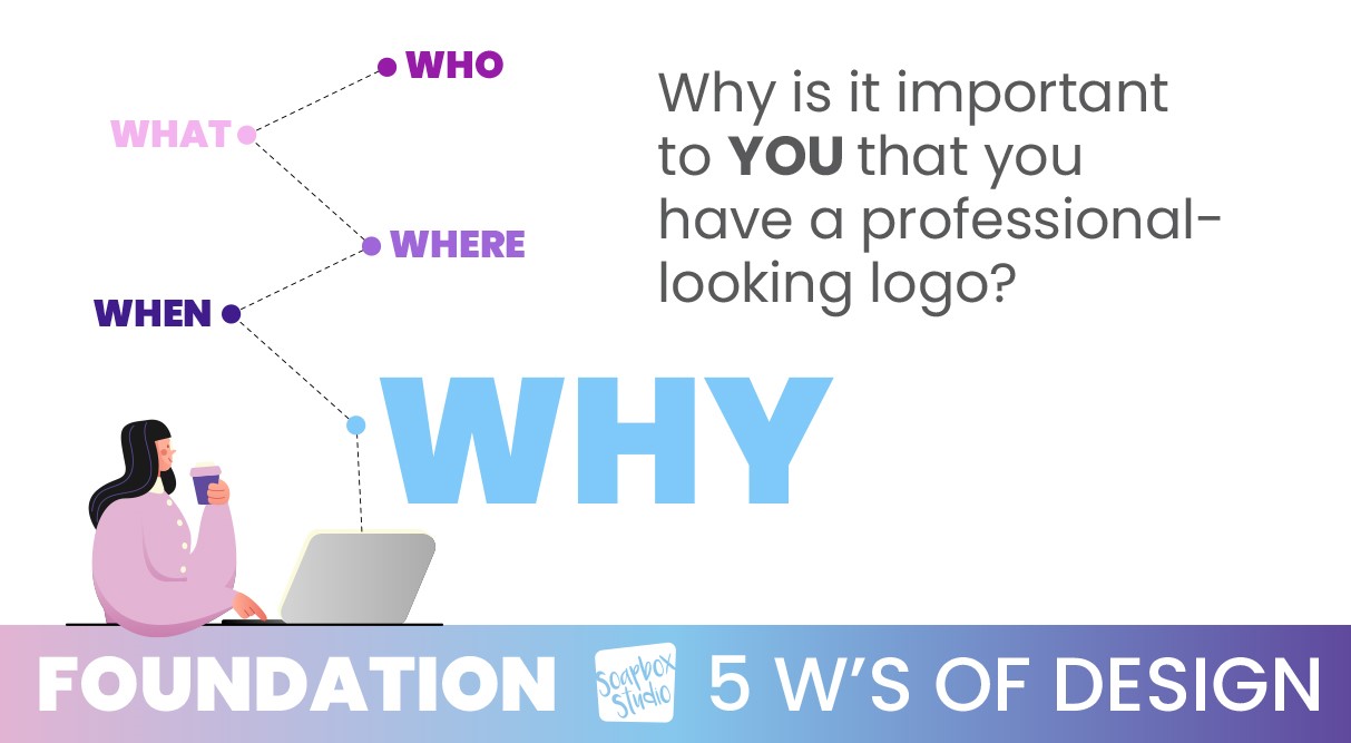
WHY: Why It’s Important to Have a Professional-Looking Logo?

5 W's of Design: Why

Finally, it’s time to look at why it’s important to have a professional-looking logo. Take a moment to recognize the impact of a professional logo on your business’s credibility. Consider the next steps in your business and how your branding supports these goals. Then take some time to evaluate the benefits of hiring a professional versus DIY options.

If you want to learn even more about the 5 W’s of design, read this post, 5 Things You Need to Know Before Designing a Logo.

Step 2 – Brainstorming: Gather All Your Ideas

As we continue on with our system of design, let’s move on to step 2, the brainstorming step. In this step you will spend a lot of time gathering all your ideas. It’s up to you where you want to gather these ideas, either a Google doc, or a Pinterest board, or even just pen and paper.

Fonts are First

If you have a company name and tagline, start by writing them out on paper. If you don’t have either of these yet, it’s a great time to start writing out any ideas you do have for the name and tagline.

Next, start looking at font combinations that you like and remember to also keep in mind all you decided during our Foundation Step. Refer back to the 5 W’s and keep them in the forefront of your mind as you look at fonts.

It’s important to note that you don’t want to just choose a font that you like, but instead, you want to choose a font that encompasses the 5 W’s and how you want your company to be represented to your potential customers.

Choose a Color Palette

Cohesive system of design color palette

After you have picked the right font combination, it’s time to choose colors. Colors are so much fun, but you can also spend more time choosing colors than is necessary. Just keep that in mind when you are playing with color palettes. Here are a few things to consider when you are trying to pick colors.

Colors can trigger different brain responses, so before you choose a color just because you personally like it, you’ll want to consider the psychological responses that some colors can trigger. For example, blue is a calming color and red can cause people to feel aggressive.

Take time to consider your ideal customer and what they are looking for and would hope to achieve with your business and then make color choices based off of that. If you want to attract a certain clientele, make sure your logo color choices won’t repel them. For example, if your business is targeting men in the financial advisory sector, you probably don’t want to choose a super feminine font and use a lot of pink and purple tones in your logo.

If you want to attract a certain client, you’ve got to research what color palettes speak to them. Don’t get stuck with trying to be trendy and realize your logo doesn’t look professional at all.

If you want to learn more about colors and what each one means, read this post: Drawing In Clients, a Guide to Creating an Irresistible Brand Color Palette.

Find Imagery

Next, you’ll want to find imagery that flows well with your branding. If you want to incorporate an icon or some imagery into your logo, now is the time to start looking for one. Jump on Google and do some image searches and collect the images that you like.

You can even spend some time looking at what your competition’s logos look like. You don’t want to steal their ideas, but it’s always a good idea to see what others are doing because often it can spur some great ideas of your own.

Step 3 – Coherency: Requires a Gauge To Get It Right

Listen To Your Customers

As you continue to create a system of design for your business, it’s important to listen to your customers. The best gauge you have on if you are getting stuff right, is your perfect client.

Have a handful of at least 10 customers that you poll in order to find out their preferences. Offer them a poll and give them a few logo design choices and see which one they like best. Ask for their feedback. If your perfect customer is repelled by the design you have made – whether it’s the colors or the fonts, it’s important to listen to that feedback.

The wrong colors can have a major impact on your brand and how your customers perceive your brand identity. Your brand might appear to be a cookie shop when you are really a hair salon. Another example of poor choice of color is using only feminine colors in branding when your business serves everyone—not just women.

Just carefully consider the message your colors convey to ensure they accurately reflect your brand’s identity and appeal to your target audience.

Rebranding Is Not Detrimental

If you’ve made it this far in this post and you know it’s time for a rebrand, it’s ok! Rebranding is not a detrimental decision. Sometimes it’s the best gift you can give your business.

Giving your business the gift of cohesiveness will give you confidence in return. Knowing your brand looks good will boost your ego to get out there and sell even more! You want to get to the point where you know you can sell stuff because you are positive your brand looks good.

Step 4 – Formulate: The LOGO Formula

Our next step in our system of design is to formulate a plan for your logo, and the plan we like to use is called the LOGO Formula. Each step of the LOGO Formula will teach you how to create a logo, just like we teach our clients at Soapbox Studio every day.

L=Layout

System of Design: Layout

Starting with layout is the first step of the LOGO Formula. Layout is maneuvering around the type and fonts. Start by writing out your company name and tagline on a blank page in Canva or Illustrator. As you start playing with fonts that you liked from your brainstorming step, you can change the words into all uppercase, or all lowercase. Try different variations until you find some you like.

O=Organize

System of Design: Organize

Our next step is to organize those elements and try different layouts. You can try tilting the letters or repositioning them by pulling out the first letter of each word. Move around the elements on your page and organize them in different ways.

G=Graphics

System of Design: Graphics

Next, you will need to work with the graphics and imagery you collected in the brainstorming step. You’ll start by using the low-resolution version of your images and then once you fall in love with your logo you can purchase the high-resolution version of the images you’ve chosen. Make sure you choose imagery that you have copyrights for – and by all means, do not choose free stock images.

O=Optimize

System of Design: Optimize

Finally, you will want to optimize and tighten everything up. This is the last step of evaluation you will do before you finalize your logo. Pull everything together from fonts to colors to images and then take a step back and evaluate what the work you’ve done. That’s it! Your logo is done.

These are the exact steps we take with each of our logo design clients. Normally this process takes a few hours. If you put the work into the front end of the process by completing the 5 W’s and the Brainstorming step, then your actual logo design time will go so much faster and smoother. If you decide to hire a designer to do the work, handing them this pre-work will make their job much faster and require less billable time.

Step 5 – Consistency: Clear Client Journey Across All Platforms

Ensuring a Seamless Experience

system of design

It’s important to make sure your customer has a clear and consistent client journey across all your platforms. Starting with your website, moving to your socials, and everything else, no matter what part of your business a potential customer sees, it should all be consistent.

Creating a brand guide to go along with your logo is a great way to make sure you have consistency across all your platforms. A brand guide will include your logo, but also your brand colors, fonts, font sizes, and imagery. It’s a great resource to give to anyone who works with your brand.

If you hire a designer to help you design your website, you can give them your brand guide to make sure the site is designed per your determined guidelines. If you hire help for any part of your system of design, they will be so happy you have a brand guide to follow for consistency.

Over time your branding consistency will pay off because your customers will begin to recognize your brand. They will see something and know for sure it’s from you and your brand and that’s when you know you have nailed this final step in your system of design.

If you know you need to work on your logo or branding and want help, feel free to check our packages. We’d love to help!

Building a Strong Brand Identity Through a Cohesive System of Design

In today’s competitive market, establishing a cohesive system of design is crucial for any new business owner aiming for long-term success. A well-structured design system not only enhances the aesthetic appeal of your brand but also ensures consistency across all platforms, building a strong foundation for your business.

By focusing on core elements such as your logo, color palettes, and typography, you can create a unified and recognizable brand identity.

By following the necessary steps to develop and implement a cohesive design system, including laying the foundation, brainstorming ideas, gauging coherency, working within the LOGO Formula, and maintaining consistency throughout your branding efforts, you will create an amazing brand identity.

Choosing the best classic colors for your brand can be overwhelming, especially if you need help knowing where to start or why classic colors are beneficial.

Why Choose Classic Colors For Your Brand?

Let’s start with the burning question: Why should you choose classic colors for your brand? The short answer is that they not only convey professionalism, trust, and relatability to your ideal audience but also provide a sense of timelessness and endurance.

These timeless hues help establish a solid and consistent brand identity that resonates with a broad range of customers, giving you confidence that your brand will stand the test of time.

If you find choosing a classic color palette challenging, keep reading for five easy steps.

How to Choose Classic Colors For Your Brand

Let’s go over the strategy of choosing classic colors for your brand with these topics:

Possible Pitfalls When Choosing Brand Colors

What is a Classic Color
Examples of Classic Color Palettes
Steps To Choose Classic Colors For Your Brand

Get Started – Choose Your Classic Colors

Possible Pitfalls When Choosing Brand Colors

While choosing brand colors is an exciting and creative process, it’s important to be aware of potential pitfalls to ensure it remains enjoyable and effective. By understanding these common mistakes, you can steer clear of them and make the process smoother and more successful.

Choosing the Wrong Colors for Your Ideal Audience

One of the most crucial aspects of choosing brand colors is to consider the preferences and expectations of your target audience. Colors have the power to evoke emotions and influence perceptions, making it essential to select colors that resonate with your ideal customers. This understanding is key to creating a brand that connects with your audience – you can learn more about this by reading this post: Crafting Credibility: The Secrets Of Good Graphic Design For Business.

The wrong colors can have a major impact on your brand and how your customers perceive your brand identity. Your brand might appear to be a cookie shop when you are really a hair salon. Another example of poor choice of color is using only feminine colors in branding when your business serves everyone—not just women.

Just carefully consider the message your colors convey to ensure they accurately reflect your brand’s identity and appeal to your target audience.

Not Having Contrast in Your Palette

Ensuring that your brand color palette has contrast is a big deal. What does it mean to have contrast in your palette? Contrast simply means not using all the same tones. There is a noticeable difference in brightness, hue, or saturation between different elements in your design.

If the contrast is too low, your potential client will not be able to read it clearly. There are websites like Constrast Checker that can check the contrast of your colors.

You can also use black and white in your color palette, especially on your website, to help alleviate accessibility issues.

Choosing Too Many Colors

While incorporating various colors into your brand can seem exciting and vibrant, it’s crucial to exercise restraint to avoid diluting your brand’s impact. When you use too many colors, your brand identity can become forgettable, which is the opposite of what you want to achieve.

how to choose classic colors

Limiting your color palette to no more than five main colors is a practical guideline to maintain coherence and memorability. This manageable selection ensures your brand remains visually consistent across various platforms and materials. Each color should serve a distinct purpose, whether it’s for primary branding elements, accents, or backgrounds.

If you are drawn to more than five colors you’d like to incorporate, consider using mdigi.tools to refine your classic color palette. This tool allows you to adjust the brightness or darkness of your chosen colors, providing subtle variations that offer contrast while maintaining overall cohesiveness.

By adhering to a concise color palette and utilizing tools to refine your selections, you can create a visually striking brand identity that leaves a lasting impression on your audience. Remember, it’s not about how many colors you use but how effectively you use them to communicate your brand’s message and values.

Choosing Only Trendy Colors

While it can be tempting to hop on the latest color trends, exercising caution and restraint is essential. Relying solely on trendy colors poses a significant risk to your brand identity because these trends are transient and subject to change with each passing season or fad.

Opting for trendy colors may give your brand a contemporary and fashionable appearance in the short term. However, your brand’s visual identity may become outdated and irrelevant as trends evolve. This frequent need for updates can lead to inconsistency and confusion among your audience.

Instead, prioritize selecting colors that transcend fleeting trends and stand the test of time. Your brand colors should evoke a sense of trust, professionalism, and reliability, regardless of the current fashion. Choosing timeless colors establishes a strong foundation for your brand identity that remains relevant and resonant over the long term.

Use trendy colors sparingly as accents or secondary elements, allowing your core colors to anchor your brand identity firmly.

What is a Classic Color?

Classic colors are timeless and enduring, maintaining relevance and appeal across generations and trends. Unlike trendy hues that come and go with changing fashion, classic colors possess a timeless quality that transcends fleeting fads.

Typically, classic colors are foundational shades that evoke a sense of stability, sophistication, and reliability. They are the backbone of your brand’s visual identity, providing a solid base to build your brand image.

Among the most widely recognized classic colors are black, blue, green, red, and gold. These hues have endured and continue to be embraced in various contexts, from fashion and design to branding and marketing.

Examples of Classic Color Palettes


Classic Palette #1 – Fun/Food

best classic colors for your brand

Our first classic color palette expresses a vibrant business, from food and drink to news and information. Taking a look at each individual color you will see different attributes.

#BB2009 – A bold and vibrant shade of red, giving a strong, energetic feel.

#F54D14 – A bright, warm orange that adds a lively and dynamic touch.

#F4B001 – A rich, sunny yellow, which brings a cheerful and optimistic vibe.

#F7E4E6 – A soft, pastel pink that provides a gentle and soothing contrast to the bolder colors.

#20688E – A deep, cool blue that offers a refreshing balance to the warm tones.

#221D1A – A dark, earthy brown, adding depth and grounding to the overall palette.

These colors together create a harmonious and visually appealing combination, perfect for a variety of businesses. The skateboard, sunglasses, and striped socks in the image utilize this palette, illustrating how these colors can be effectively used in practical, classic ways.

Classic Palette #2 – Finance/Business

classic color palette

This color palette is perfectly suited for the wealth and finance industry, conveying professionalism, stability, and trust. Let’s look closer at each color.

#345B36 – A deep green that signifies growth, stability, and prosperity.

#A6A6A6 – A neutral gray that adds a sense of balance, calmness, and professionalism.

#E5E7E9 – A very light gray, almost white, which conveys clarity, simplicity, and sophistication.

#8FCOE8 – A soft blue that evokes trust, dependability, and tranquility.

#2A4E6C – A muted blue that suggests strength, reliability, and intelligence.

#0D1D2E – A dark navy blue, giving a sense of authority, confidence, and formality.

These colors together create a refined and elegant palette, ideal for the financial sector. The deep greens and blues project a sense of reliability and trust, essential in the industry, while the grays and light blue add balance and clarity, making this combination visually appealing and highly functional for corporate branding and professional presentations.

The use of such a palette can help instill confidence in clients and stakeholders, reinforcing the stability and credibility of the financial institution.

Classic Palette #3 – Architecture

classic color palette

This color palette is ideal for an architecture or business company, reflecting a professional and sophisticated aesthetic. The palette consists of six distinct colors:

#C1282E – A bold red that conveys strength, determination, and professionalism. It can be used for accents to draw attention and highlight important elements.

#04399Z – A deep, rich blue that exudes trust, stability, and intelligence. This color works well as a primary color for backgrounds or large elements.

#7494BC – A soft, muted blue that adds a touch of calmness and reliability. It’s perfect for secondary elements or backgrounds to complement the primary colors.

#BAB5AD – A neutral light gray that brings a sense of balance and neutrality. It serves as a great background or base color to ensure other colors stand out.

#89857F – A darker gray that introduces depth and sophistication. It can be used for text, outlines, or smaller details to provide contrast.

#000000 – A classic black that is essential for sharpness and definition. It’s ideal for text, borders, and any elements that require high visibility and clarity.

These colors together create a cohesive and polished look that is perfect for an architectural or business context. The bold red and rich blue establish a strong visual identity, while the muted blue, light gray, and darker gray offer a balanced and professional backdrop.

The black provides the necessary contrast to ensure readability and clarity, making this palette versatile for both digital and print applications.

Classic Palette #4 – Tech

good classic color palette
This color palette is ideal for a technology company, reflecting a modern and sleek aesthetic. The palette consists of six distinct colors:

#1B6897 – A deep, vibrant blue that conveys trust, reliability, and professionalism. It can be used for primary elements to create a strong visual presence.

#4990B8 – A medium blue that exudes calmness and stability. It works well for secondary elements and provides a harmonious complement to the deeper blue.

#B7D8EF – A light blue that adds a sense of openness and freshness. It is perfect for backgrounds or large areas to maintain a clean and modern look.

#E5EEFB – An even lighter blue that brings a touch of softness and neutrality. It can be used for backgrounds or accents to create a sense of space and clarity.

#A6A6A6 – A neutral gray that adds balance and sophistication. This color is ideal for text, borders, or other elements where subtle contrast is needed.

#000000 – A classic black that ensures sharpness and definition. It’s essential for text, icons, and any elements requiring high visibility and clarity.

These colors together create a cohesive and contemporary look that is perfect for a technology context. The deep and medium blues establish a trustworthy and professional identity, while the light and very light blues provide a clean and modern backdrop.

The neutral gray offers balance and sophistication, and the black ensures high visibility and sharpness. This palette is versatile for both digital interfaces and print materials, making it ideal for a technology company’s branding and communication needs.

Classic Palette #5 – Natural Living

natural classic color palette

This color palette is ideal for a health and wellness, homesteading, or natural food company, reflecting a vibrant and earthy aesthetic. The palette consists of six distinct colors:

#765E3C – A rich brown that conveys stability, reliability, and a connection to the earth. It can be used for primary elements to ground the design and add warmth.

#AC8F70 – A soft, muted beige that exudes calmness and approachability. This color works well for secondary elements, providing a harmonious and natural feel.

#EBE481 – A light, pastel yellow that adds a touch of freshness and energy. It is perfect for accents or backgrounds to create a bright and welcoming atmosphere.

#91CB3E – A vibrant lime green that symbolizes growth, health, and vitality. This color is great for highlighting important elements and adding a pop of color.

#4C934C – A medium green that introduces balance and harmony. It can be used for larger areas or backgrounds to maintain a natural and soothing look.

#19381F – A deep, forest green that ensures depth and sophistication. It’s ideal for text, borders, or elements requiring high contrast and readability.

These colors together create a cohesive and refreshing look that is perfect for a health and wellness, homesteading, or natural food context. The rich brown and muted beige establish a grounded and approachable foundation, while the pastel yellow and lime green inject energy and vitality.

The medium green offers balance and harmony, and the deep forest green ensures readability and sharpness. This palette is versatile for both digital interfaces and print materials, making it ideal for branding and communication needs in the health and wellness, homesteading, or natural food industries.
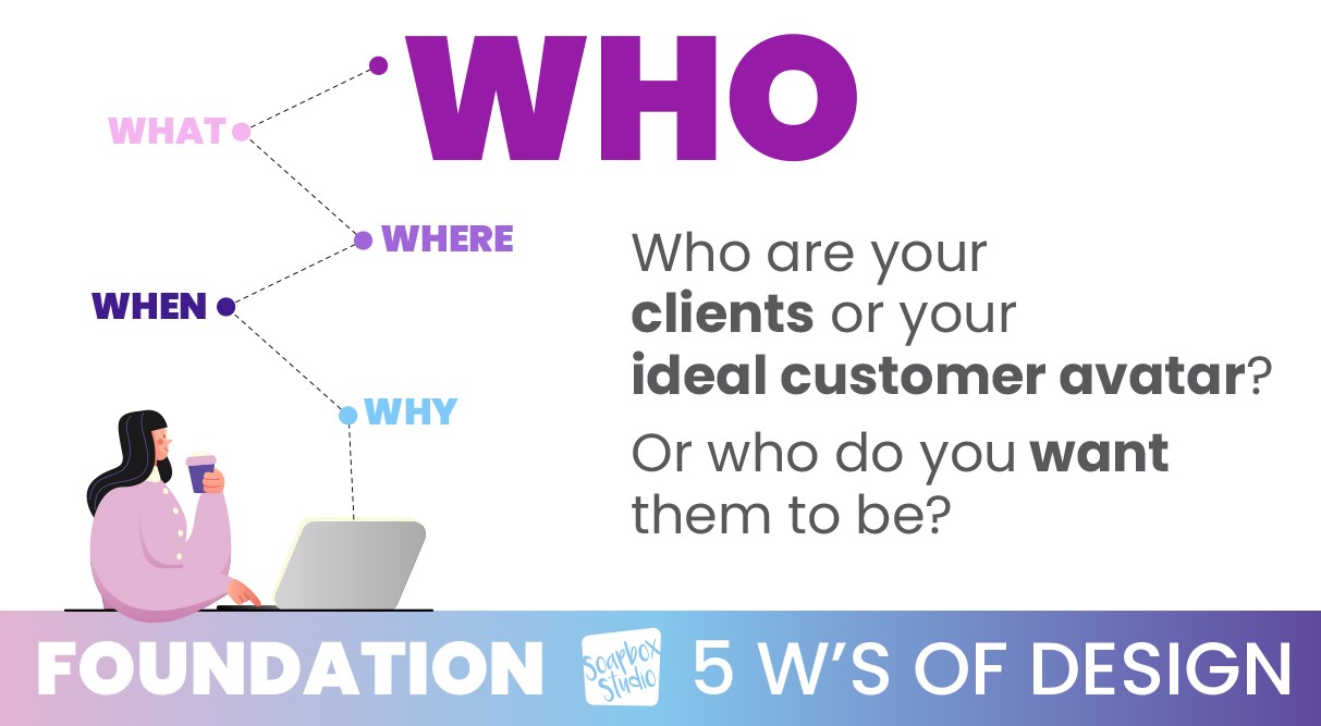
Steps to Choose Classic Colors For Your Brand

The steps to choose the best classic colors for your brand are not only effective but also easy and straightforward, providing you with a reassuring guide through the process.

Step 1: Identify Your Business

Start by empowering yourself with a clear understanding of your business. Spend a little time making a list of what your company does. This foundational step is crucial because understanding your business’s core activities, values, and mission will guide all your subsequent branding decisions, including color choices.
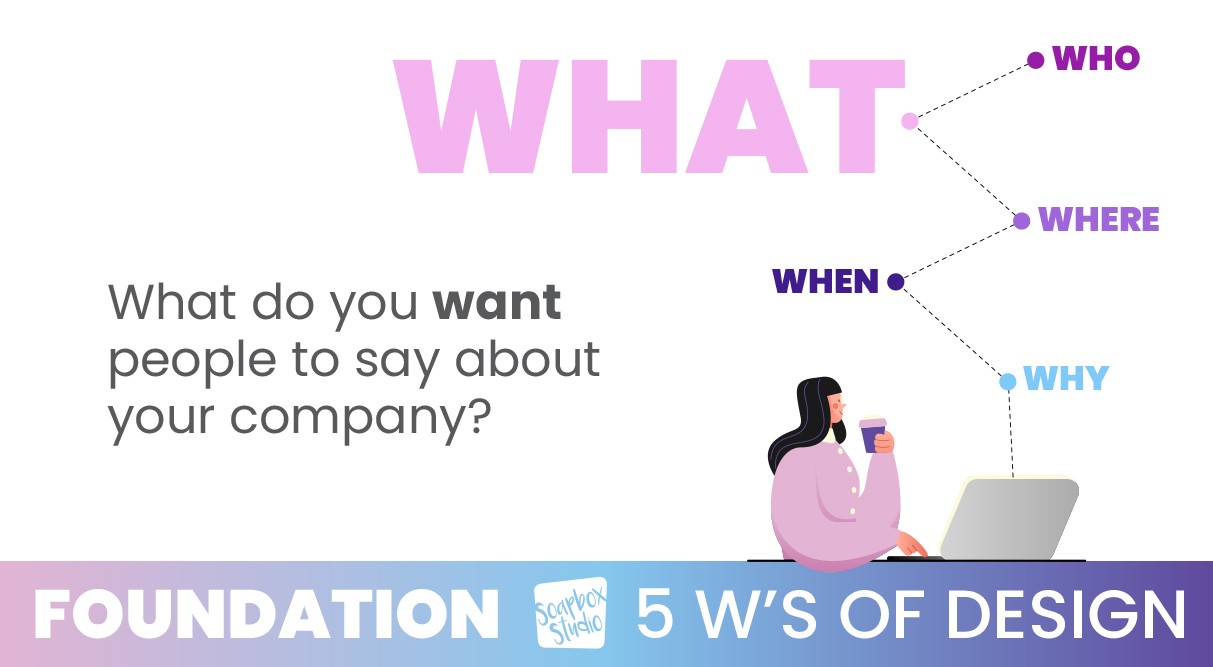
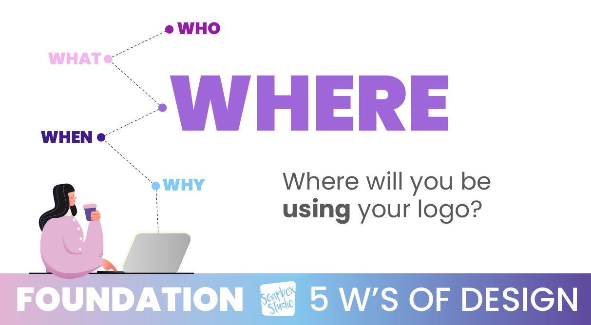
Clearly defining your business helps ensure that every element of your brand, including colors, aligns with and reinforces your brand identity, giving you the power to shape your brand’s perception.
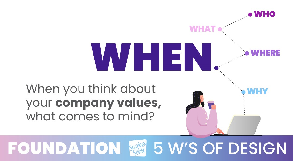
After you have a clear understanding of your business, think about the colors that are already associated with your brand. Evaluate these existing colors and consider incorporating them into your new palette instead of fighting them.

Additionally, color theory should be researched to understand better how different colors interact and the emotions they evoke. For more in-depth guidance on color theory, read this comprehensive post: Finding the Right Colors for Your Brand.

Step 2: Understand Your Ideal Customer

To effectively choose the best classic brand colors, it’s crucial to understand your ideal customer. Start by considering color preferences from the perspective of your target audience, not just your personal favorites. This ensures that your color choices resonate with your clients and don’t inadvertently repel them.

Choose colors that align with your product and industry to help your customers easily understand your brand. For instance, green might be ideal for a business in the food industry focused on salads, while pastel colors would be fitting for a company making custom baby blankets.

Additionally, consider the cultural and emotional impacts of your color choices, as different colors can evoke various meanings and associations in different cultures.

Testing your color palette and gathering feedback from a sample of your target audience can provide valuable insights into how your colors are perceived. By aligning your color choices with your audience’s preferences and the nature of your product, you can create a color palette that enhances brand recognition and appeal.

Step 3: Analyze Your Competition

Researching your competition’s colors is essential for developing your brand’s color palette. Start by identifying your main competitors and analyzing their branding to note the primary and secondary colors they use across various platforms. This analysis will help you identify industry trends and understand which colors are commonly associated with specific messages or emotions in your industry.

Recognizing these trends can guide you in selecting colors that convey the desired attributes of professionalism, trust, or innovation relevant to your brand.

While understanding industry standards is essential, differentiating your brand is equally crucial. Look for opportunities to stand out by choosing unique color combinations or shades that set your brand apart.

Step 4: Brainstorm Harmonious Colors

When brainstorming harmonious colors for your brand, first, let’s briefly examine what colors mean. Each color evokes different emotions and associations, significantly impacting how your brand is perceived.

For example, blue often conveys trust, professionalism, and calmness, making it a popular choice for corporate and tech brands. Red is associated with energy, passion, and urgency, which can be effective for brands looking to evoke excitement or stimulate action.

Green symbolizes health, tranquility, and nature, making it ideal for eco-friendly and wellness brands. Yellow represents happiness, optimism, and warmth, which can be great for brands aiming to appear friendly and approachable. Understanding these basic color meanings can help you craft a color palette that aligns with your brand’s core values and message.

However, to create a truly effective color palette, it’s crucial to research color meanings and how they specifically relate to your brand and industry.

Spend more time studying color theory, including how different colors interact and their psychological effects on your target audience. You can learn more about the psychology of color by reading this post: Drawing in Clients: A Complete Guide to Creating an Irresistible Brand Color Palette.

Step 5: Develop Your Color Palette

Developing your color palette is crucial in solidifying your brand’s visual identity. Experiment with color options using online tools like Developing your color palette is crucial in solidifying your brand’s visual identity. Experiment with color options using online tools like https://mdigi.tools/lighten-color. This tool allow you to adjust shades, create harmonious combinations, and visualize how different colors interact. They are invaluable for refining your choices and ensuring that the colors you select complement each other well.

If you find the process overwhelming or want a professional touch, consider hiring a designer or branding expert. Professional help can provide insights and expertise that ensure your color palette is visually appealing and strategically aligned with your brand’s identity and goals.

Soapbox designers can help interpret color theory and industry standards to craft a palette that stands out while resonating with your target audience – get in touch with us here.

Get Started – Choose Your Classic Colors

Now, it’s time to start choosing the best classic colors for your brand! To start creating your palette, choose your first classic color. This foundational step sets the tone for the rest of your color scheme. Your first color should embody your brand’s core values and personality. Once selected, use a color-picking tool to explore complementary and harmonious shades.

Remember the meanings and psychological impacts of colors and what works best for your industry. Based on this initial choice, add your second color. Continue this process, adding up to two or three more colors, until you’ve created a cohesive and balanced color scheme that you love and effectively represents your brand. You can ensure a solid and memorable visual identity by methodically developing your color palette with these tools and strategies.