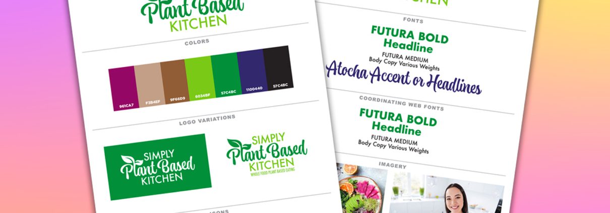
Are you a new business owner needing a simplified brand guide, but because you want to DIY your branding, are unsure where to start?

If you need a little guidance to nail it, you’re in the right place. In this post, we’ll show you how to easily create a simplified brand guide that you can confidently share with vendors, employees, and subcontractors.

With this brand guide in hand, you’ll ensure your branding stays on point and consistent across all your marketing channels, creating a polished, cohesive look that represents your business at its best—every time.

Why a Simplified Brand Guide is Better

Creating a brand guide can feel like a daunting task, but as a small business owner, it’s essential to keep things simple. You don’t need a 50-page document outlining every possible scenario where your brand could appear.

If you’re not managing a large-scale corporation with thousands of employees, a full-blown, comprehensive brand guide isn’t necessary. Fortune 500 companies might need extensive manuals to maintain brand consistency across multiple departments and offices, but as a small business owner, simplicity is key. Your brand guide should provide enough direction to keep things cohesive, while remaining flexible and easy to follow.

In fact, making your brand guide overly complicated can lead to confusion and be more of a burden than a helpful tool. A simplified brand guide can save you time, effort, and even money, allowing you to stay focused on what matters most—growing your business.

A simplified brand guide is perfect for small business owners who plan to DIY their branding but still need a framework to ensure consistency. The goal is to create a guide that’s both practical and user-friendly, so your brand always shows up the way you want it to.

Our Process To Create a Simplified Brand Guide

Let’s walk through the steps to create a simplified brand guide by covering these key topics:

What Your Brand Guide Should Include

Keeping your brand guide simple is essential, especially when you’re just starting out. A streamlined guide helps you stay organized and consistent without overwhelming you or your team. Ideally, your simplified brand guide should be no more than two pages in the beginning. As your business evolves, it can naturally expand, incorporating additional elements as you grow or introduce new products and services.

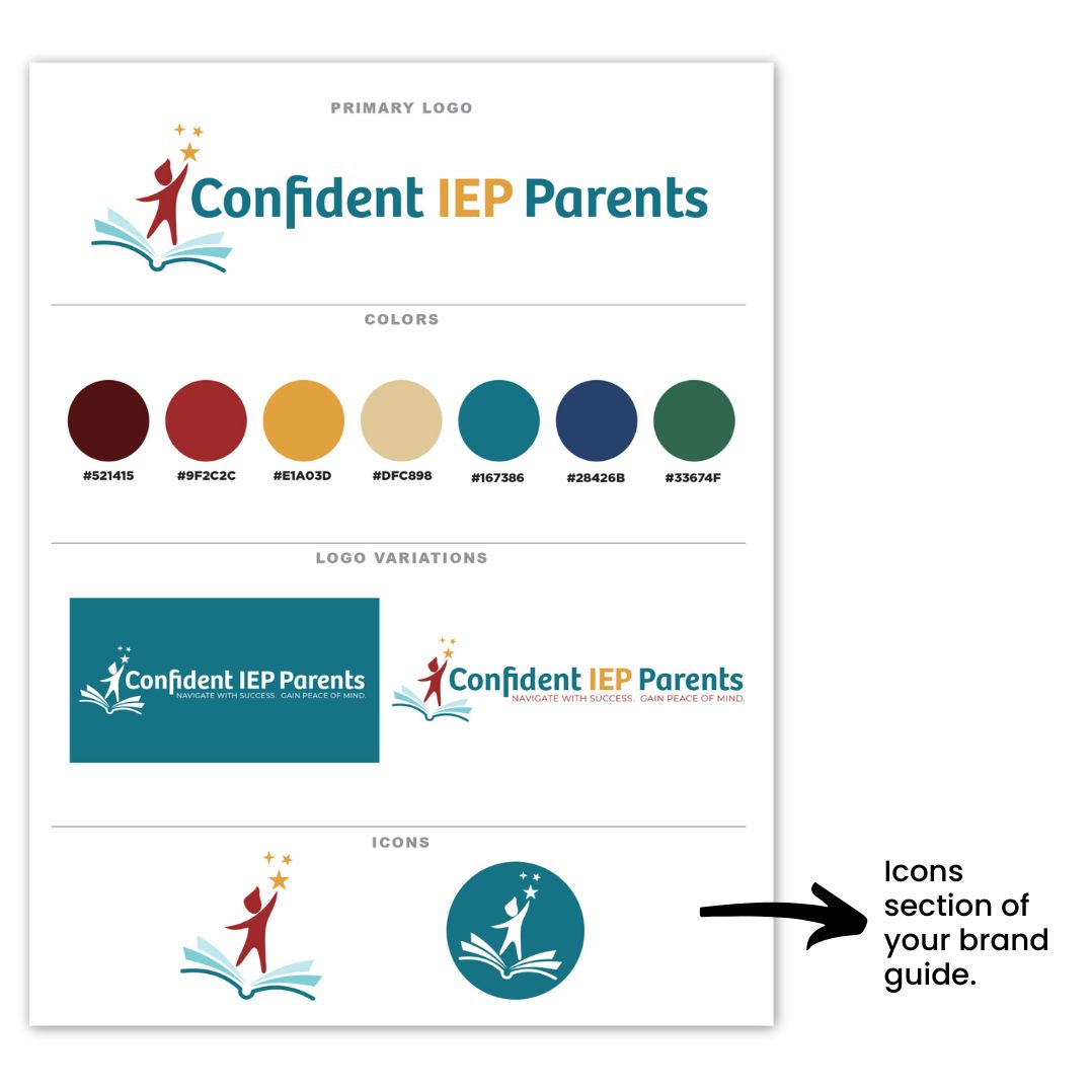
At the core, your brand guide should feature a few key components. First, include your main logo, which serves as the visual cornerstone of your brand. Alongside this, you’ll want to specify your color palette, ensuring your brand has a consistent and recognizable look across all platforms.

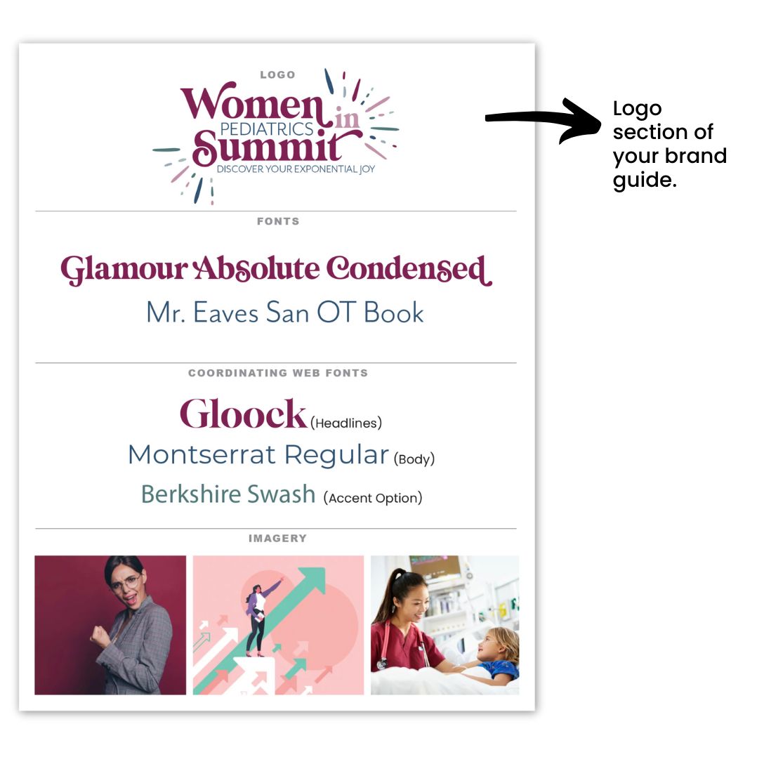
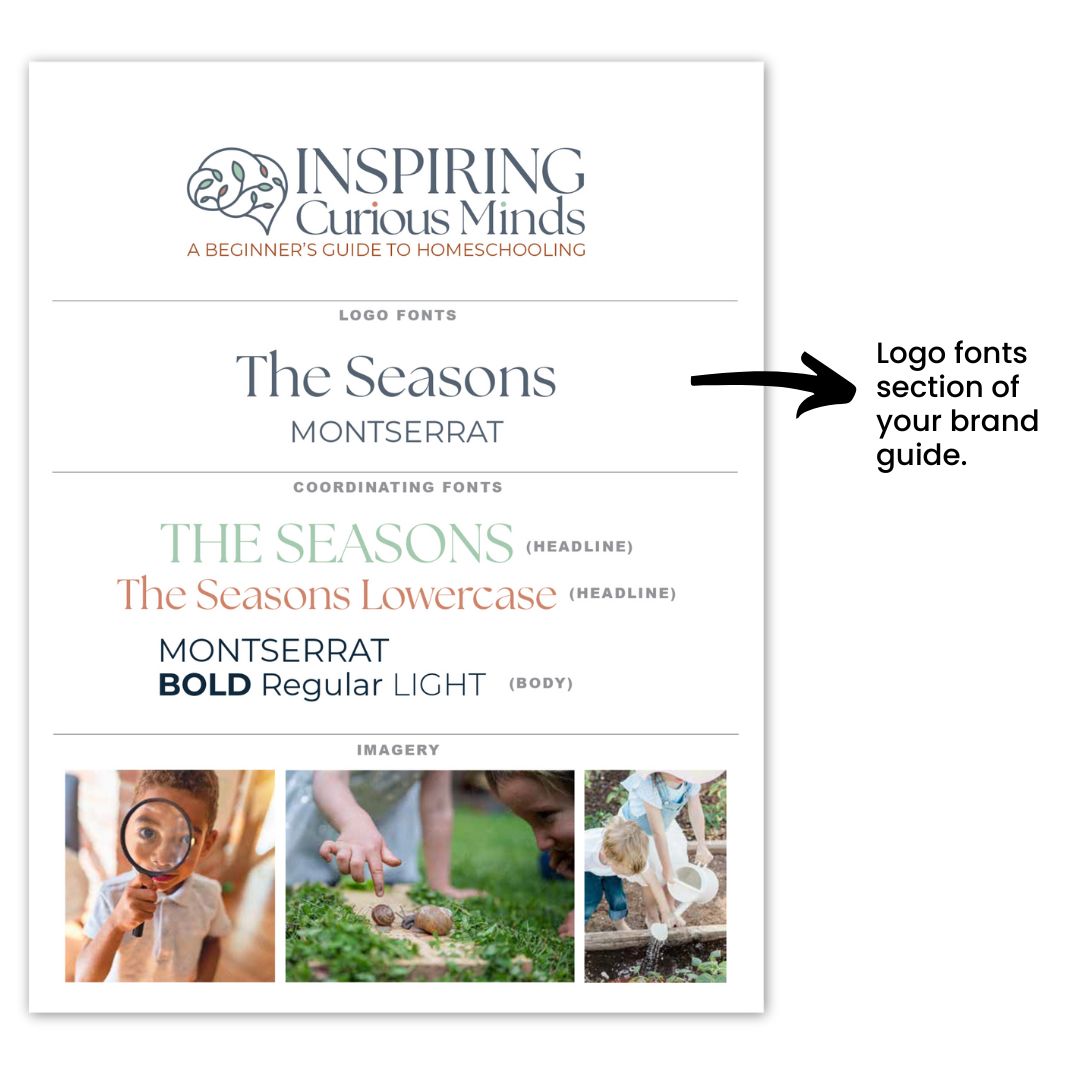
Don’t forget to include the fonts used in your logo, as well as any coordinating web fonts you’ll rely on for digital communication. Additionally, variations of your logo—whether in different color schemes or orientations—should be included, giving you flexibility while maintaining consistency.

Finally, icons and inspirational images that represent the style and mood of your brand will also help provide a visual reference for anyone working with your brand assets.

Now that you know what your brand guide should include, let’s dive deeper into each element, starting with the logo. Your logo is the heart of your brand—it’s the first impression customers get, the symbol that represents your business, and the foundation upon which the rest of your brand identity is built.

Getting your logo right is crucial… it sets the tone for everything else, from your website design to your packaging and social media presence. A well-designed logo not only makes your business instantly recognizable, but it also communicates your values and message at a glance.

Think of it as the face of your brand. Whether your brand is fun and playful or professional and sleek, your logo should reflect that personality and create a connection with your target audience.

Your logo is more than just a graphic; it’s a visual shortcut to your brand’s story. Whether you’re working with a designer or crafting it yourself, aim for simplicity, versatility, and timelessness.

The best logos are memorable, easy to understand, and work across various mediums and sizes—from business cards to your website. A strong logo will guide your future branding choices and provide assurance that your brand has a clear and cohesive visual identity from day one.

If you want to learn more about what makes a good logo design, read this post.

guide

Choose Colors Wisely

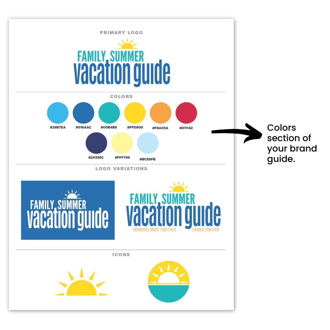
Choosing your brand colors is essential for creating a simplified brand guide. Start with a main color palette that includes 5-7 coordinating colors, with at least 5 as your initial focus. As your business expands, you may require additional colors to represent specific products or services, but this range gives you a strong foundation for your branding efforts.

It’s important to understand the meanings and associations behind different colors, as they can significantly influence how your brand is perceived. For instance, blue often conveys feelings of calm and productivity, while orange can evoke feelings of happiness and enthusiasm. By choosing the right colors that align with your company’s values and message, you can create a stronger emotional connection with your audience.

You can read more about what colors mean and how to find the right colors for your brand by reading this post.

Additionally, ensure your color palette includes sufficient contrast to prevent accessibility issues online. A well-thought-out color scheme not only enhances the aesthetic appeal of your brand but also ensures that all users can engage with your content effectively. If you want to know more about how colors are perceived in business, take a moment to watch this video.

simplified brand guide

Understand Logo Variations & Why You Need Them

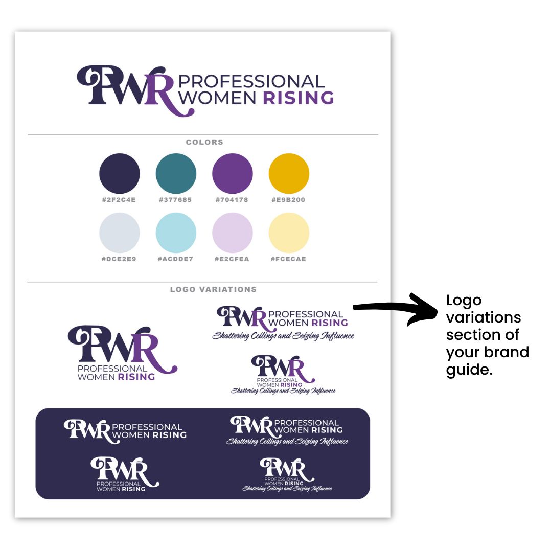
The next component to creating a simplified brand guide is to understand and recognize the different types of logo variations and why they are essential for your brand. We recommend you  include one-color, full-color, and a white version, as well as options with and without a tagline.

The one-color version is typically black or a very dark shade in your color palette. , Although this variation isn’t always necessary, it can be beneficial to have in your toolkit.

Understanding how to use each logo variation is key to maintaining a consistent brand presence across various platforms and materials. For instance, your full-color logo is ideal for most applications, while the one-color version can be used for simplicity and clarity in certain contexts.

Additionally, having an all-white version—sometimes referred to as a reversed logo—is crucial for use on dark backgrounds, ensuring your brand remains visible and recognizable in any setting. By leveraging these logo variations effectively, you can adapt your branding to different environments while preserving its integrity.

brand guide

Necessary Icons for Your Brand

The next part of your simplified brand guide is your icons. Icons play a vital role in reinforcing your brand identity and are often used for favicons, profile images, and various other applications.

Typically, these icons are derived from your logo, transformed into a simplified icon format that remains recognizable at smaller sizes. This ensures that your brand is consistently represented across different platforms, even when space is limited.

When creating your icons, it’s important to ensure they align with your overall branding. Ideally, your icons should be variations of your logo or incorporate elements such as a piece of the logo or even the first letter of your brand name. By maintaining visual coherence between your icons and logo, you strengthen your brand’s recognition and create a more unified brand experience for your audience.

brand guide

Be Strategic When Picking Logo Fonts

When selecting fonts for your logo, it’s important to strike a balance between readability and making a statement. Your logo font should be easy to read at a glance, but it should also convey your brand’s personality.

However, it’s easy to go overboard with font choices, which is why it’s best to limit yourself to no more than two fonts in your logo (three fonts if absolutely necessary). This keeps the design visually appealing and prevents it from looking cluttered or confusing.

Your primary logo font will likely carry the most weight, representing the bulk of your brand’s personality, while a secondary font can be used for supporting text or taglines. This balance allows you to add depth to your logo without sacrificing clarity. For instance, pairing a bold, eye-catching font with a simpler, cleaner font can create an effective contrast while maintaining harmony in your design.

Remember, your logo is often displayed in various sizes and formats, so readability is key. A font that looks great in large print may not be as legible in smaller applications like business cards or social media profiles. Opt for fonts that are versatile and can be easily scaled without losing their impact or clarity. Your logo fonts will be a cornerstone of your brand identity, so it’s worth taking the time to select fonts that not only look great but also are cohesive with your brand identity.

simplified brand guide

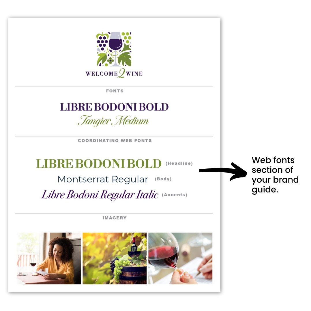
Select Coordinating Web Fonts With Care

Selecting coordinating webs fonts is crucial, especially in ensuring they coordinate with your logo fonts. Choosing web-ready fonts—preferably Google or web-safe fonts—is essential for proper display across all browsers and devices.

If you opt for a custom font that isn’t web-ready, it may be replaced by a default web-safe font, leading to a look that doesn’t align with your brand’s identity. To avoid this, it’s best to select fonts designed for online use, ensuring a consistent representation of your brand across digital platforms.

Aim for two, or at most three, coordinating web fonts that align seamlessly with your logo fonts. Typically, you’ll want a bold or distinctive font for titles and headlines to draw attention, while your body or copy font should prioritize readability. Ensure that these fonts complement your logo fonts in style and tone, creating a harmonious visual experience for your audience.

Additionally, utilize the varied weights—such as light, regular, bold, and italic—within the same font family. This approach allows you to create visual contrast while maintaining a cohesive look throughout your website.

brand guide

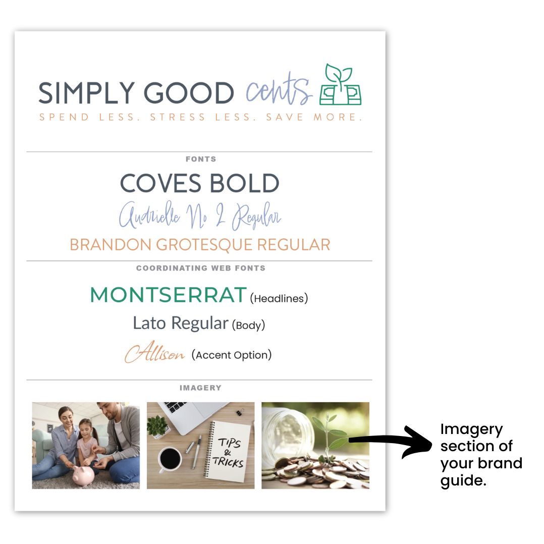
Pick Imagery That Represents Your Brand

Choosing the right imagery is vitally important for showcasing what your business represents inside your simplified brand guide. These images act as a visual representation, effectively communicating your brand’s identity and values.

They can also be the exact images you plan to use across your marketing materials, so it’s important to select them thoughtfully.

We recommend curating a collection of 2-4 images that truly exude what your business is all about. These visuals should capture the feel and aesthetic that resonate with your ideal client, drawing them in and making a lasting impression.

Whether it’s through vibrant photography, engaging graphics, or powerful  illustrations, these images should align with your brand identity and create an emotional connection with your audience.

By choosing images that reflect your brand’s core message and appeal to your target market, you’ll enhance your overall branding strategy and create a more compelling narrative for your business.

brand guide

Tips To Create a Professional Brand Guide

Creating a professional brand guide doesn’t have to be overwhelming if you follow all that you learned so far today and keep these three tips in mind:

Tip 1: Keep it Simple

Aim for a concise guide that spans just 1 or 2 pages. This simplicity will make it easier for you and others to reference your brand guidelines without getting lost in excessive details.

Tip 2: Include Key Elements

Ensure your brand guide encompasses the following items: your logo, selected fonts, imagery, color palette, logo variations, and icons. These components will serve as the foundation for your brand identity and provide clear direction for consistent usage.

Tip 3: Utilize Professional Resources

Consider obtaining a professional brand guide template to streamline the process. Templates can help you organize your brand elements effectively and maintain a polished look. You can find great templates available inside our Soapbox Subscribed membership, so be sure to check it out!

Once you’ve settled on the key elements of your brand guide, you’ll find that it becomes much easier to maintain consistency across all your marketing materials.

However, if you need additional support in developing or refining your brand guide, our Soapbox Subscribed membership is here to help. We provide the guidance and resources necessary to keep your brand cohesive and polished, allowing you to focus on what you do best—all in less time than you might be spending now! Join us today and let’s elevate your brand together!

In today’s competitive world, building trust and brand confidence is vital for your business. Branding has become a critical component of success for businesses and individuals. While we often associate branding with logos, taglines, and marketing strategies, visuals are another equally powerful tool. Your logo can significantly enhance your brand’s trust and your confidence, and impact personal and businesses performance.

In this post, we will explore the profound influence of visuals on brand trust and confidence and how this boost can positively affect your future personal achievements. So, let’s dive in and discover the remarkable connection between visuals, confidence, trust and personal performance!

Let’s explore brand trust and confidence with these topics:

Visual Communication and Brand Confidence

Visual communication is a timeless and powerful tool throughout history to convey messages and ideas. It can uniquely transcend language barriers and communicate directly to our emotions, making it a universally understood expression.

We are inherently drawn to visual stimuli, and our brains are wired to process images much faster than text or spoken words. This innate inclination towards visual information makes it an incredibly effective means of communication, particularly in branding and marketing.

When branding, visual communication is vital in establishing a solid and memorable identity for a company or organization. By harnessing the power of visuals, businesses can effectively communicate their brand’s values, personality, and essence to their target audience.

Through carefully curated visual language, including colors, fonts, and imagery, a brand can evoke specific emotions and create a lasting impression that resonates with people on a deeper level.

In the age of social media and digital marketing, where attention spans are shorter, and competition for engagement is fierce, the power of visual communication becomes even more critical. Compelling visuals can captivate an audience’s attention, making a brand stand out in a crowded online landscape.

Your visuals are more likely to be remembered, shared, and leave a lasting impression, increasing brand recognition and fostering a stronger connection with the target audience.

Building Brand Trust and Confidence

In branding, establishing brand confidence is crucial for gaining potential customers’ or clients’ trust and loyalty. Visual elements are pivotal in this process, shaping perceptions and creating a lasting impression.

When individuals encounter a visually cohesive and appealing brand, they are more likely to perceive it as professional, trustworthy, and reliable. Consistency in visual communication is vital to building brand confidence.

The visual properties, such as fonts, colors, and imagery, are consistent across various platforms and products, creating a sense of familiarity. It reinforces the brand’s identity in the minds of the audience. A consistent identity serves as a visual anchor that customers can rely on, enhancing their confidence in the brand.


A well-designed logo is a fundamental element of visual communication that contributes to brand trust and confidence. A logo serves as the visual representation of a brand, encapsulating its values, personality, and essence.

When a logo is thoughtfully designed, visually appealing, and aligned with the brand’s identity, it becomes a powerful symbol that instantly conveys professionalism and reliability. Seeing a recognizable logo can evoke a sense of trust in potential customers, making them more inclined to choose your brand over competitors.

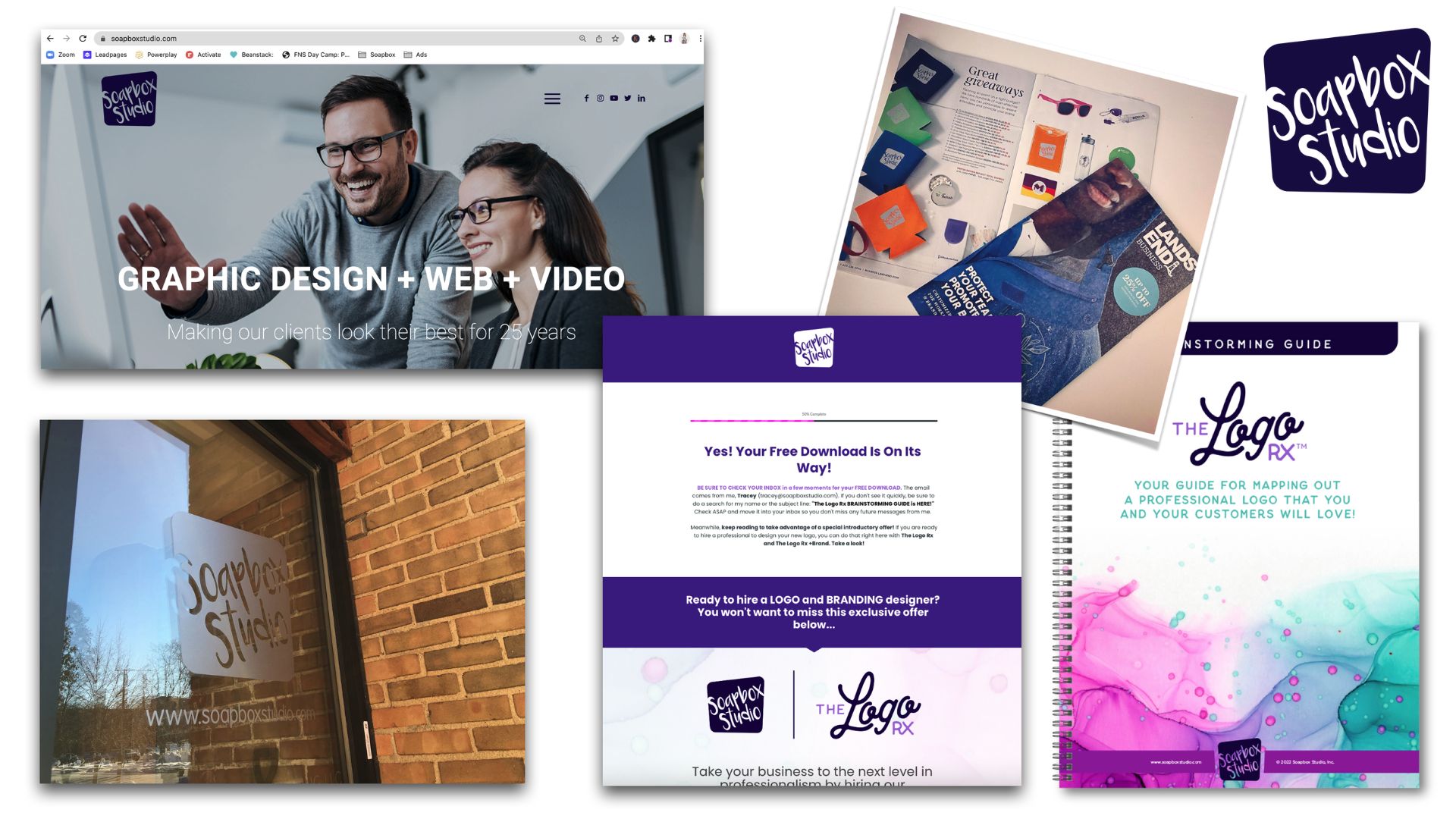
Beyond the logo, other components, such as a visually stunning website and eye-catching social media graphics, also significantly build brand confidence. In the modern digital age, a website is often the first point of contact between a brand and its potential customers.

A visually appealing and well-designed website creates a positive first impression and conveys the brand’s commitment to quality and professionalism. It signals that the brand is invested in delivering a seamless and enjoyable user experience, which instills confidence in visitors.

Similarly, social media platforms have become powerful channels for brand communication. Eye-catching graphics and visuals on social media help brands capture attention and engage with their audience.
brand visuals

Delivering appealing content that aligns with the brand’s identity can reinforce their professionalism and build trust with their followers. This can translate into increased brand confidence and a higher likelihood of individuals choosing the brand over its competitors.

The Psychology of Visuals and Confidence

Another way to build brand trust and confidence is through the psychology of visuals. Psychology has long recognized the strong connection between visuals and human emotions.

Understanding this connection allows brands to tap into the power of visuals to shape how their audience perceives them. By strategically utilizing visual elements, brands can influence the emotional response of their audience and ultimately build confidence.

Colors, in particular, profoundly impact human psychology and can evoke different emotional associations. Each color carries its psychological meaning and can elicit specific feelings and reactions. For example, warm colors like red and orange are often associated with energy, excitement, and passion.
brand trust and confiden

They can create a sense of urgency or enthusiasm, making them ideal for brands that want to evoke these emotions in their audience. On the contrary, cool colors like blue and green are often associated with calmness, trust, and nature. They can convey a sense of reliability and tranquility.

Strategically selecting colors that align with a brand’s personality, values, and emotions they want to evoke, can create a visual language that resonates with their target audience. Consistency in using these colors across various touchpoints reinforces the emotional associations and enhances the audience’s perception of the brand.

If you want to read more about colors and how to choose the best colors for your brand, read this post: How To Choose the Best Classic Colors For Your Brand.

The Ripple Effect: Boosting Personal Performance

The impact of brand confidence extends beyond its influence on customers; it also has a remarkable effect on personal performance. When your brand exudes confidence through its visuals, it attracts customers and inspires you and your team to reach new heights of personal and professional achievement.

A visually appealing and cohesive brand can give you a sense of pride, instill self-assurance, and motivate you to deliver your best work.When you witness the positive response to your visuals and see how they resonate with your target audience, it creates a sense of validation and satisfaction.

This newfound confidence in your brand’s image permeates every aspect of your professional life. It shapes your mindset, influences your behavior, and boosts your overall performance.

brand trust and confidence

Another way brand confidence impacts personal performance is through enhanced stakeholder engagement. When your brand exudes confidence and professionalism, it creates a positive impression on stakeholders, including clients, partners, and investors. A cohesive brand is a powerful tool for building trust and credibility.

It enhances your ability to communicate effectively, negotiate confidently, and build strong relationships. This, in turn, opens doors to new opportunities, collaborations, and partnerships that align with your vision and contribute to your personal growth and success.

Reinforcing Brand Confidence Through Performance

Brand confidence and personal performance are deeply interconnected, forming a continuous cycle that propels success. Your visuals play a crucial role in instilling confidence in your audience, and their positive response, in turn, boosts your confidence and drives your performance to new heights.

This cycle establishes a positive feedback loop, where each success reinforces the other, leading to more remarkable achievements.

When your visuals evoke a sense of professionalism, trustworthiness, and reliability, they create a foundation of confidence in the minds of your audience. As your audience responds positively to your brand through increased engagement, sales, or positive feedback, their validation fuels your confidence.

That confidence acts as a catalyst for personal performance. Seeing your brand resonate with your target audience and gaining their trust inspires you to push your boundaries and strive for even more significant achievements. It instills a belief in your abilities and fuels your motivation to deliver high-quality work consistently.

This cycle works hand in hand to drive growth and success. The more confidence your audience has in your brand, the more they will engage with your products or services, refer others to your brand and become loyal advocates. This increased support and engagement allow you to excel and demonstrate your expertise, amplifying brand confidence.

It is important to note that this cycle requires consistency and a commitment to delivering high-quality work. By consistently meeting or exceeding expectations, you reinforce your brand’s positive image and maintain your audience’s confidence.

Take Confident Action

Visual communication is a powerful tool that plays a vital role in branding, building brand confidence, and enhancing personal performance. By effectively utilizing visuals, brands can establish a solid and memorable identity, conveying their values and personality to the target audience.

Consistency in visual communication reinforces identity and creates familiarity, fostering confidence. Moreover, the psychology of visuals allows brands to evoke emotional responses and build a positive perception strategically.

Brand confidence, in turn, boosts personal performance and opens doors to new opportunities, driving growth and success. The symbiotic relationship between brand confidence and personal performance creates a virtuous cycle that propels individuals and brands towards incredible achievements and long-term success.

If you need a little VIP treatment to up-level your brand and in turn your brand confidence, our VIP Days will be a massive asset to you. Graphic design VIP Days can be a valuable investment for companies that want to create custom designs in a tight timeframe so your business can stand out and look professional.

If you’re tired of the constant back and forth in a traditional model and don’t have months to spend tweaking revisions, this option is a great way to accomplish every task on your graphic design to-do list in a single day. In just one afternoon, you’ll have professional, ready-to-use graphics.

If your business needs this, contact Soapbox Studio to book your VIP Day now. Claim your spot and enjoy the VIP Day treatment!

The Systems & Workflow Magic Podcast Featuring Tracey Albrecht

Are you a new business owner wondering how to create a systemm of design that not only looks great but also stands the test of time? In today’s competitive market, achieving a consistent and cohesive system of design is essential for your brand’s success.

Today we will guide you through the strategies to develop a system of design that leads to a cohesive brand. By focusing on cohesion, you can ensure that your brand remains consistent and impactful across all your design platforms, helping you to build a strong foundation for your business.

Recently, we had the pleasure of being featured on Dolly DeLong on her The Systems & Workflows Magic Podcast, where we discussed these very topics.

system of design podcast

Join us as we explore the steps to creating a design that truly stands out. You can keep reading to learn how to implement these strategies for your own business, or you can listen to the full episode here.

How To Create a Cohesive System of Design

Let’s go over how you can create a cohesive system of design for your business with these topics:

Lay the Foundation: Begin Building A System of Design

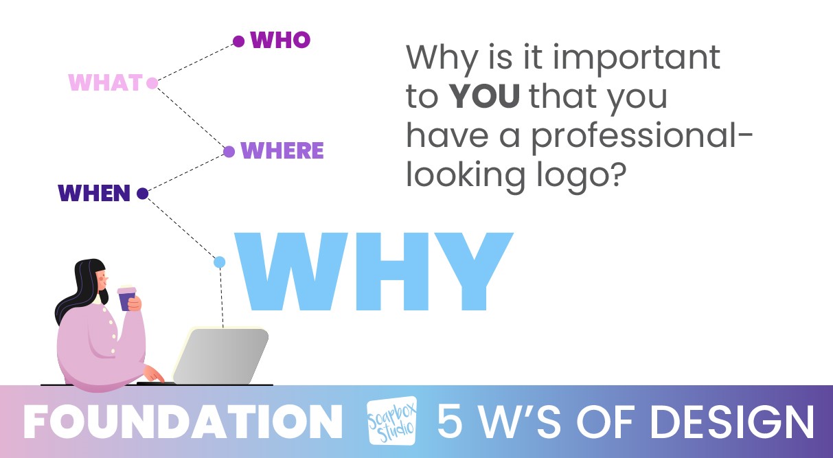
As you begin to establish your system of design, it’s important to lay the correct foundation. The first step in our streamlined logo design process is the same for both our in-person clients and also our Logo RX clients and is called the 5 W’s. The 5 W’s were created to help our clients lay a solid design foundation for their business. Once you have all 5 W’s confirmed and written down on paper, then you can move on to the next level of the design process.

Foundation Step 1: The 5 W’s of Logo Design

As you begin to build the foundation of your logo or branding, or even product branding, you will need to consider these 5 W’s. This foundation step of your system of design does not include any actual design work. This step is just about considering, collecting, and writing down information. As you start working on the 5 W’s, take no more than 45 minutes to complete your answers for all 5 of the W’s.

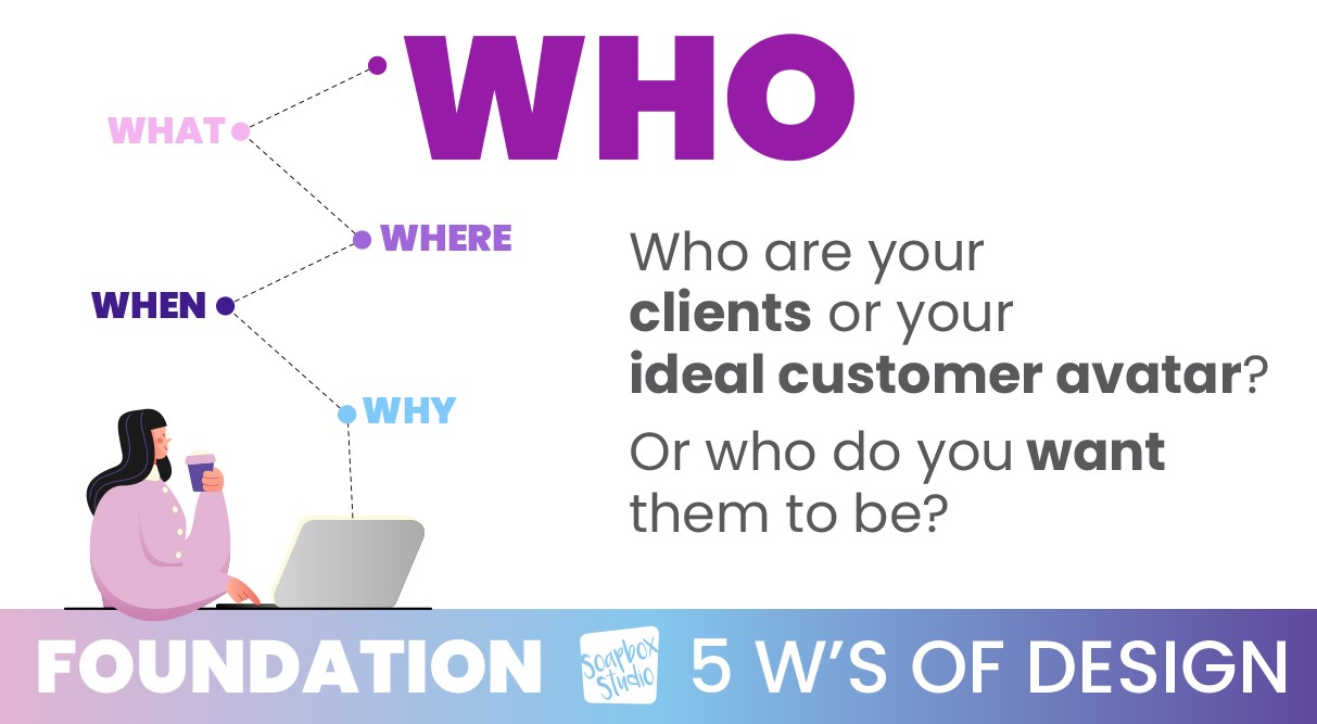
WHO: Who are Your Ideal Clients?

5 W's of Design: Who

Who are your ideal clients is a great place to start. Think about who you want your perfect target audience to be and what their needs and preferences are. Go ahead and write that down.

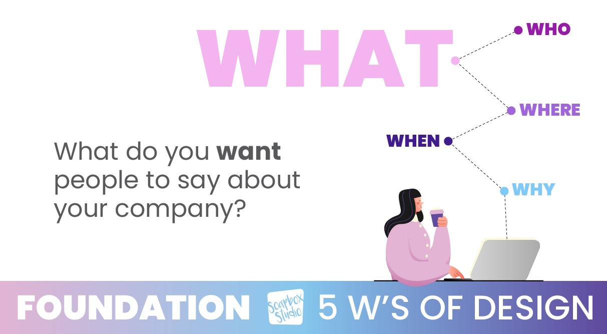
WHAT: What Do You Want People to Say About Your Company?

5 W's of Design: What

Moving on to what do you want people to say about your company? Determine the key messages and values your brand should convey. As you reflect on your company’s mission and vision, think about the emotions you want your brand to evoke in your potential customers. What thoughts and emotions should your brand trigger in your audience?

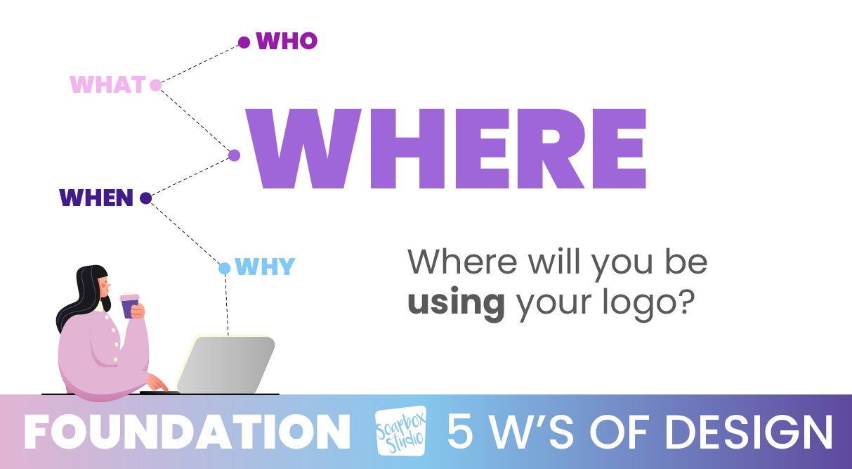
WHERE: Where Will You Use Your Logo?

5 W's of Design: Where

Next, you need to think about where you will use your logo. Identify all the places where your logo will be displayed (e.g., website, social media, signage). Ensure the logo design is versatile and adaptable to various mediums. Some of the best logos are very simple and easy to recognize in different formats.

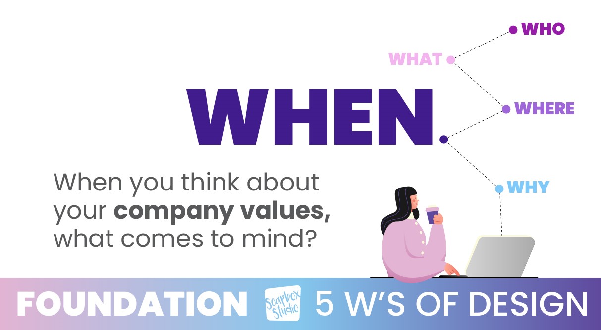
WHEN: When You Think About Your Company, What Comes To Mind?

5 W's of Design: When

Moving on, it’s time to think about your company values, and how you can integrate those values into your branding. You’ll want to ensure consistency between your values and how you visually want to represent those values.

WHY: Why It’s Important to Have a Professional-Looking Logo?

5 W's of Design: Why

Finally, it’s time to look at why it’s important to have a professional-looking logo. Take a moment to recognize the impact of a professional logo on your business’s credibility. Consider the next steps in your business and how your branding supports these goals. Then take some time to evaluate the benefits of hiring a professional versus DIY options.

If you want to learn even more about the 5 W’s of design, read this post, 5 Things You Need to Know Before Designing a Logo.

Step 2 – Brainstorming: Gather All Your Ideas

As we continue on with our system of design, let’s move on to step 2, the brainstorming step. In this step you will spend a lot of time gathering all your ideas. It’s up to you where you want to gather these ideas, either a Google doc, or a Pinterest board, or even just pen and paper.

Fonts are First

If you have a company name and tagline, start by writing them out on paper. If you don’t have either of these yet, it’s a great time to start writing out any ideas you do have for the name and tagline.

Next, start looking at font combinations that you like and remember to also keep in mind all you decided during our Foundation Step. Refer back to the 5 W’s and keep them in the forefront of your mind as you look at fonts.

It’s important to note that you don’t want to just choose a font that you like, but instead, you want to choose a font that encompasses the 5 W’s and how you want your company to be represented to your potential customers.

Choose a Color Palette

Cohesive system of design color palette

After you have picked the right font combination, it’s time to choose colors. Colors are so much fun, but you can also spend more time choosing colors than is necessary. Just keep that in mind when you are playing with color palettes. Here are a few things to consider when you are trying to pick colors.

Colors can trigger different brain responses, so before you choose a color just because you personally like it, you’ll want to consider the psychological responses that some colors can trigger. For example, blue is a calming color and red can cause people to feel aggressive.

Take time to consider your ideal customer and what they are looking for and would hope to achieve with your business and then make color choices based off of that. If you want to attract a certain clientele, make sure your logo color choices won’t repel them. For example, if your business is targeting men in the financial advisory sector, you probably don’t want to choose a super feminine font and use a lot of pink and purple tones in your logo.

If you want to attract a certain client, you’ve got to research what color palettes speak to them. Don’t get stuck with trying to be trendy and realize your logo doesn’t look professional at all.

If you want to learn more about colors and what each one means, read this post: Drawing In Clients, a Guide to Creating an Irresistible Brand Color Palette.

Find Imagery

Next, you’ll want to find imagery that flows well with your branding. If you want to incorporate an icon or some imagery into your logo, now is the time to start looking for one. Jump on Google and do some image searches and collect the images that you like.

You can even spend some time looking at what your competition’s logos look like. You don’t want to steal their ideas, but it’s always a good idea to see what others are doing because often it can spur some great ideas of your own.

Step 3 – Coherency: Requires a Gauge To Get It Right

Listen To Your Customers

As you continue to create a system of design for your business, it’s important to listen to your customers. The best gauge you have on if you are getting stuff right, is your perfect client.

Have a handful of at least 10 customers that you poll in order to find out their preferences. Offer them a poll and give them a few logo design choices and see which one they like best. Ask for their feedback. If your perfect customer is repelled by the design you have made – whether it’s the colors or the fonts, it’s important to listen to that feedback.

The wrong colors can have a major impact on your brand and how your customers perceive your brand identity. Your brand might appear to be a cookie shop when you are really a hair salon. Another example of poor choice of color is using only feminine colors in branding when your business serves everyone—not just women.

Just carefully consider the message your colors convey to ensure they accurately reflect your brand’s identity and appeal to your target audience.

Rebranding Is Not Detrimental

If you’ve made it this far in this post and you know it’s time for a rebrand, it’s ok! Rebranding is not a detrimental decision. Sometimes it’s the best gift you can give your business.

Giving your business the gift of cohesiveness will give you confidence in return. Knowing your brand looks good will boost your ego to get out there and sell even more! You want to get to the point where you know you can sell stuff because you are positive your brand looks good.

Step 4 – Formulate: The LOGO Formula

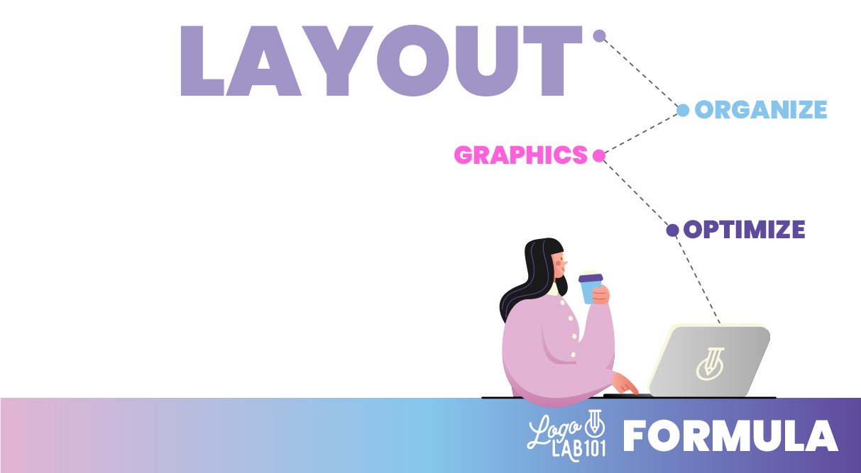
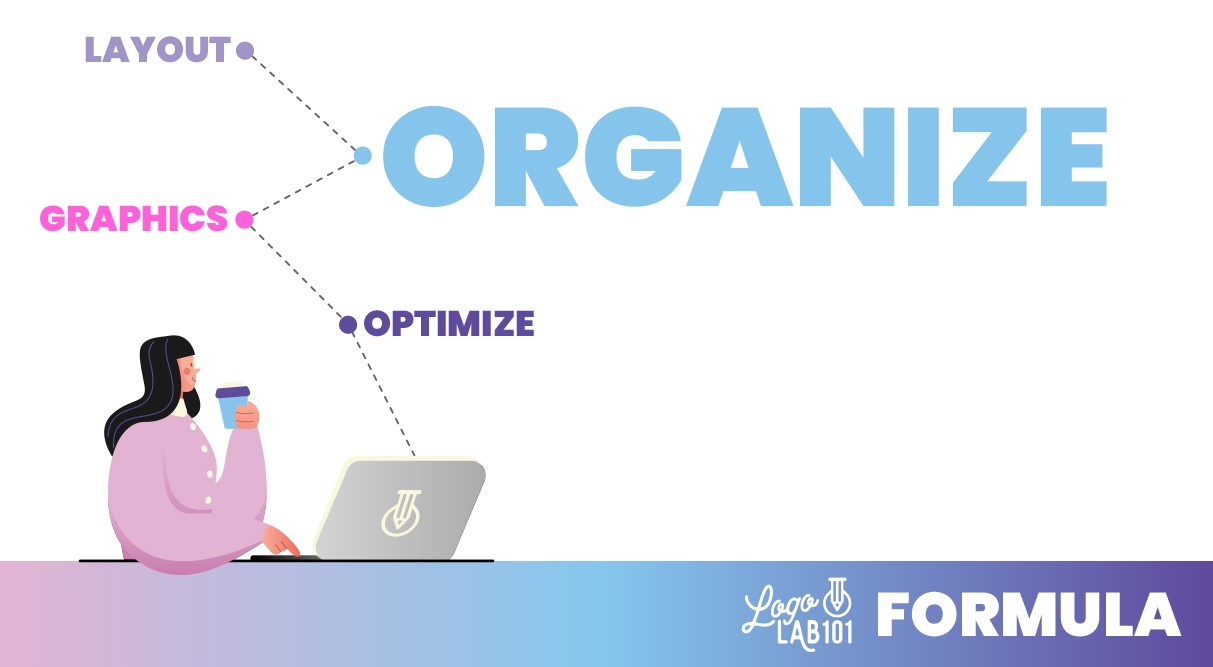
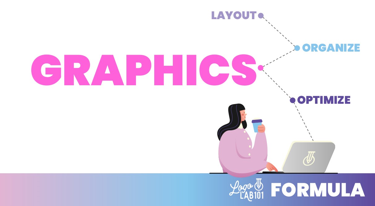
Our next step in our system of design is to formulate a plan for your logo, and the plan we like to use is called the LOGO Formula. Each step of the LOGO Formula will teach you how to create a logo, just like we teach our clients at Soapbox Studio every day.

L=Layout

System of Design: Layout

Starting with layout is the first step of the LOGO Formula. Layout is maneuvering around the type and fonts. Start by writing out your company name and tagline on a blank page in Canva or Illustrator. As you start playing with fonts that you liked from your brainstorming step, you can change the words into all uppercase, or all lowercase. Try different variations until you find some you like.

O=Organize

System of Design: Organize

Our next step is to organize those elements and try different layouts. You can try tilting the letters or repositioning them by pulling out the first letter of each word. Move around the elements on your page and organize them in different ways.

G=Graphics

System of Design: Graphics

Next, you will need to work with the graphics and imagery you collected in the brainstorming step. You’ll start by using the low-resolution version of your images and then once you fall in love with your logo you can purchase the high-resolution version of the images you’ve chosen. Make sure you choose imagery that you have copyrights for – and by all means, do not choose free stock images.

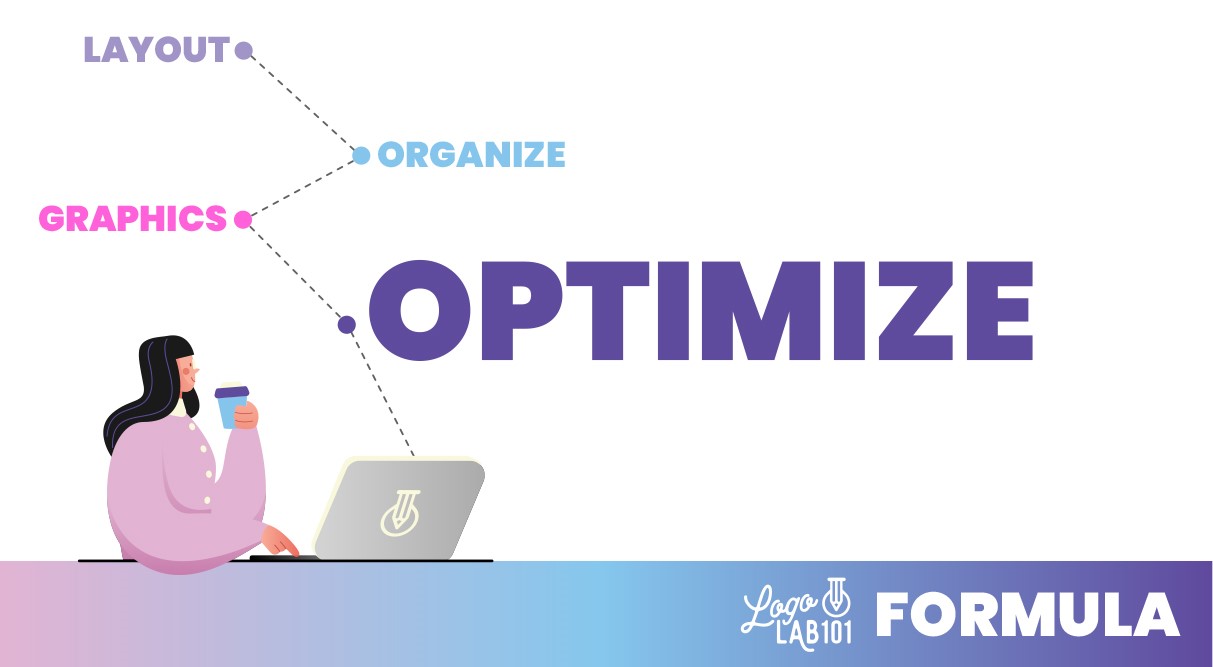
O=Optimize

System of Design: Optimize

Finally, you will want to optimize and tighten everything up. This is the last step of evaluation you will do before you finalize your logo. Pull everything together from fonts to colors to images and then take a step back and evaluate what the work you’ve done. That’s it! Your logo is done.

These are the exact steps we take with each of our logo design clients. Normally this process takes a few hours. If you put the work into the front end of the process by completing the 5 W’s and the Brainstorming step, then your actual logo design time will go so much faster and smoother. If you decide to hire a designer to do the work, handing them this pre-work will make their job much faster and require less billable time.

Step 5 – Consistency: Clear Client Journey Across All Platforms

Ensuring a Seamless Experience

system of design

It’s important to make sure your customer has a clear and consistent client journey across all your platforms. Starting with your website, moving to your socials, and everything else, no matter what part of your business a potential customer sees, it should all be consistent.

Creating a brand guide to go along with your logo is a great way to make sure you have consistency across all your platforms. A brand guide will include your logo, but also your brand colors, fonts, font sizes, and imagery. It’s a great resource to give to anyone who works with your brand.

If you hire a designer to help you design your website, you can give them your brand guide to make sure the site is designed per your determined guidelines. If you hire help for any part of your system of design, they will be so happy you have a brand guide to follow for consistency.

Over time your branding consistency will pay off because your customers will begin to recognize your brand. They will see something and know for sure it’s from you and your brand and that’s when you know you have nailed this final step in your system of design.

If you know you need to work on your logo or branding and want help, feel free to check our packages. We’d love to help!

Building a Strong Brand Identity Through a Cohesive System of Design

In today’s competitive market, establishing a cohesive system of design is crucial for any new business owner aiming for long-term success. A well-structured design system not only enhances the aesthetic appeal of your brand but also ensures consistency across all platforms, building a strong foundation for your business.

By focusing on core elements such as your logo, color palettes, and typography, you can create a unified and recognizable brand identity.

By following the necessary steps to develop and implement a cohesive design system, including laying the foundation, brainstorming ideas, gauging coherency, working within the LOGO Formula, and maintaining consistency throughout your branding efforts, you will create an amazing brand identity.

Confidence is one of the many driving forces behind a successful brand, influencing customer trust and satisfaction. Therefore, understanding the factors that enhance confidence becomes essential. This article will explore how bolstering confidence in your brand can foster customer trust and attract prospective customers.

Communication and Transparency

Effective communication and transparency are vital in developing and nurturing trust and confidence in your brand. When you prioritize open and honest communication, keeping your customers well-informed about any challenges, delays, or changes that may impact their expectations, you showcase a strong commitment to transparency and build a foundation of trust. This proactive approach fosters trust even in challenging situations, as customers appreciate a company that goes the extra mile to keep them informed.

By embracing open communication channels, such as regular updates, clear and concise messaging, and responsive customer support, you establish your brand’s integrity and dedication to customer satisfaction. These actions convey transparency and genuine concern for your customer’s needs and preferences. When customers feel valued and included in the communication process, they are likelier to develop a deeper loyalty toward your brand.

Furthermore, transparent communication extends beyond simply addressing challenges or changes; it encompasses sharing your brand’s vision, values, and goals with your audience. Being transparent about your mission allows your customer base to align themselves with your brand more meaningfully. This shared understanding fosters a sense of connection and belonging, cultivating a loyal community that actively supports and advocates for your brand.

In addition, effective communication and transparency create a feedback loop that benefits both your brand and your customers. You genuinely desire to improve and evolve by actively seeking and listening to customer feedback. This approach enables you to identify areas for growth, refine your products or services, and deliver an exceptional experience. When customers see that their opinions are valued and acted upon, they feel empowered and become more invested in the success of your brand.

Communication and transparency are essential cornerstones for building a solid brand. You cultivate trust, confidence, and a lasting connection by prioritizing open communication, demonstrating transparency in all aspects of your business and actively engaging with your customers. This commitment enhances satisfaction and positions your brand as a reliable and trustworthy partner.

Learning from Mistakes

No brand is immune to mistakes; however, handling and addressing those mistakes truly matters. Now and then, even the most reputable brands encounter situations where they need to meet customer expectations. But instead of viewing these instances as failures, they can be transformed into valuable opportunities for growth and development.

When a promise made by a brand falls short, it presents a chance to demonstrate integrity and a commitment to customer satisfaction. Taking ownership of mistakes is crucial to rebuilding trust with your customers. By acknowledging the error and accepting responsibility, you showcase your brand’s humility and willingness to admit imperfections.

Promptly resolving any issues is another crucial aspect of effective damage control. Customers appreciate brands that respond swiftly and efficiently when issues occur. By promptly addressing the situation, you show that you value your customers’ time and concerns and are committed to making things right.

In addition, it’s equally important to demonstrate a commitment to continuous improvement. Brands that actively seek feedback and implement necessary changes are more likely to regain and retain customers, who can be reassured that you prioritize their satisfaction and are determined to provide the best possible experience.

Ultimately, by embracing mistakes as opportunities for growth, you position your brand as one that learns, evolves, and continuously strives for excellence. This proactive approach not only rebuilds customer trust but also reinforces your brand’s reputation as one that takes responsibility, delivers on promises, and is dedicated to constant improvement. Learning from mistakes sets the foundation for a successful brand that can navigate challenges gracefully and emerge more resilient than ever.

Going Above and Beyond

Confidence in your brand must be accompanied by action. You must actively go above and beyond to fulfill promises to maintain a positive feedback loop and strengthen customer trust.

One of the critical aspects of building confidence in your brand is consistently exceeding expectations. You can reinforce this by consistently delivering exceptional products, services, and experiences. Customers expect quality, but when you consistently surpass their expectations, you create a lasting impression that resonates with them.

Going above and beyond also means taking proactive steps to ensure customer delight. It’s about anticipating their needs, addressing concerns before they arise, and providing personalized experiences. When customers feel that you genuinely care about their satisfaction, their trust in your brand deepens. This encourages them to stay loyal brand advocates, sharing their positive experiences with others.

Furthermore, going above and beyond builds a reputation for reliability. When customers consistently receive exceptional value and outstanding service from your brand, they perceive you as a dependable partner.

In summary, confidence in your brand goes hand in hand with taking meaningful action. By going above and beyond, consistently exceeding expectations, ensuring customer delight, and building a reputation for reliability, you create a strong foundation of trust and confidence in your brand that propels your success in the long run.

Fulfilling the Transformation You Promise

Building a confident brand requires delivering on customer promises. Meeting deadlines, providing quality solutions, and delivering on your brand’s value proposition is vital for maintaining customer trust. Consistently honoring commitments creates a reputation for reliability, reinforcing confidence in your brand and solidifying your brand’s integrity, and continued confidence.

One of the fundamental aspects is fulfilling the promises you make to your customers. These promises are the foundation of your relationship with them. By setting realistic expectations and then consistently meeting or exceeding them with quality solutions, you demonstrate your commitment to customer satisfaction.

A crucial element of fulfilling these promises is meeting deadlines. Timeliness is essential in today’s fast-paced world, and customers expect businesses to deliver on time. Whether it’s providing products, services, or support, adhering to agreed-upon timelines showcases your professionalism and dedication. This punctuality fosters a sense of reliability and ensures that your customers can promptly rely on you to fulfill their needs.

At the heart of fulfilling promises lies your brand’s value proposition. Your promise to deliver this value to your customers, in turn, sets you apart from the competition. Aligning your actions with your value proposition is crucial for building a confident brand. By consistently delivering on the promises you make regarding your value proposition, you establish yourself as a reliable partner in fulfilling your customers’ needs.

When you consistently honor your commitments, you create satisfied customers who receive what they expect become more likely to advocate for your brand and recommend it to others. This word-of-mouth promotion helps expand your customer base and solidifies your brand’s reputation for reliability and trustworthiness.

Building a confident brand requires fulfilling your promises to your customers. By meeting deadlines, providing quality solutions, and delivering on your brand’s value proposition, you establish a reputation for reliability.

Conclusion

Confidence in your brand is closely intertwined with many things, effective communication, learning from mistakes, going above and beyond, fulfilling promises, and your brand’s appearance. By taking action and combining these essential elements, you can strengthen customer trust and your own, attract new potential customers, and foster a positive feedback loop. Prioritizing customer satisfaction and consistently delivering on your brand’s transformation will nurture a self-reinforcing loop that benefits your customers and your brand’s growth and success.