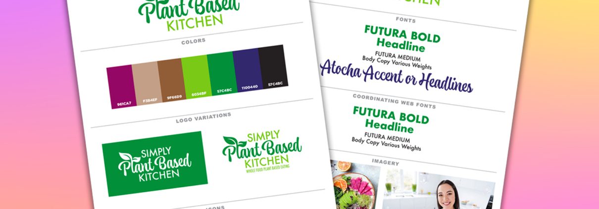
This is the Way to Create a Simplified Brand Guide
Are you a new business owner needing a simplified brand guide, but because you want to DIY your branding, are unsure where to start?
If you need a little guidance to nail it, you’re in the right place. In this post, we’ll show you how to easily create a simplified brand guide that you can confidently share with vendors, employees, and subcontractors.
Brainstorm Your Logo Creation Today!
This guide will walk you through the steps I use as a professional designer, to create beautiful logos for all my clients. I am sharing my steps for FREE, so you can use this secret sauce on your own logos.
With this brand guide in hand, you’ll ensure your branding stays on point and consistent across all your marketing channels, creating a polished, cohesive look that represents your business at its best—every time.
Why a Simplified Brand Guide is Better
Creating a brand guide can feel like a daunting task, but as a small business owner, it’s essential to keep things simple. You don’t need a 50-page document outlining every possible scenario where your brand could appear.
If you’re not managing a large-scale corporation with thousands of employees, a full-blown, comprehensive brand guide isn’t necessary. Fortune 500 companies might need extensive manuals to maintain brand consistency across multiple departments and offices, but as a small business owner, simplicity is key. Your brand guide should provide enough direction to keep things cohesive, while remaining flexible and easy to follow.
In fact, making your brand guide overly complicated can lead to confusion and be more of a burden than a helpful tool. A simplified brand guide can save you time, effort, and even money, allowing you to stay focused on what matters most—growing your business.
A simplified brand guide is perfect for small business owners who plan to DIY their branding but still need a framework to ensure consistency. The goal is to create a guide that’s both practical and user-friendly, so your brand always shows up the way you want it to.
Our Process To Create a Simplified Brand Guide
Let’s walk through the steps to create a simplified brand guide by covering these key topics:
- What Your Brand Guide Should Include
- Design Your Logo First
- Choose Colors Wisely
- Understand Logo Variations & Why You Need Them
- Necessary Icons For Your Brand
- Be Strategic When Picking Logo Fonts
- Select Coordinating Web Fonts With Care
- Pick Imagery that Represents Your Brand
- Tips to Create a Professional Brand Guide
What Your Brand Guide Should Include
Keeping your brand guide simple is essential, especially when you’re just starting out. A streamlined guide helps you stay organized and consistent without overwhelming you or your team. Ideally, your simplified brand guide should be no more than two pages in the beginning. As your business evolves, it can naturally expand, incorporating additional elements as you grow or introduce new products and services.
At the core, your brand guide should feature a few key components. First, include your main logo, which serves as the visual cornerstone of your brand. Alongside this, you’ll want to specify your color palette, ensuring your brand has a consistent and recognizable look across all platforms.
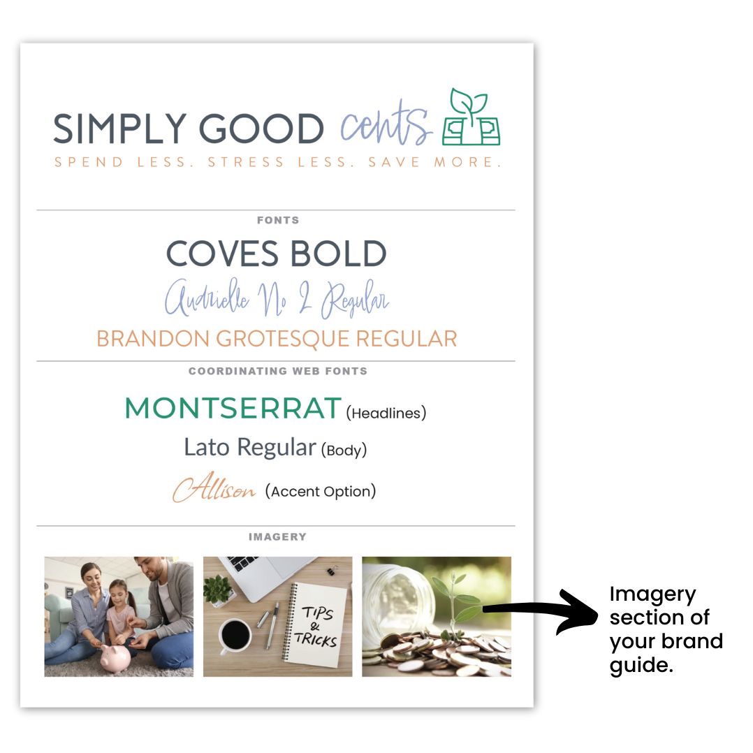
Don’t forget to include the fonts used in your logo, as well as any coordinating web fonts you’ll rely on for digital communication. Additionally, variations of your logo—whether in different color schemes or orientations—should be included, giving you flexibility while maintaining consistency.
Finally, icons and inspirational images that represent the style and mood of your brand will also help provide a visual reference for anyone working with your brand assets.
Design Your Logo First
Now that you know what your brand guide should include, let’s dive deeper into each element, starting with the logo. Your logo is the heart of your brand—it’s the first impression customers get, the symbol that represents your business, and the foundation upon which the rest of your brand identity is built.
Getting your logo right is crucial… it sets the tone for everything else, from your website design to your packaging and social media presence. A well-designed logo not only makes your business instantly recognizable, but it also communicates your values and message at a glance.
Think of it as the face of your brand. Whether your brand is fun and playful or professional and sleek, your logo should reflect that personality and create a connection with your target audience.
Your logo is more than just a graphic; it’s a visual shortcut to your brand’s story. Whether you’re working with a designer or crafting it yourself, aim for simplicity, versatility, and timelessness.
The best logos are memorable, easy to understand, and work across various mediums and sizes—from business cards to your website. A strong logo will guide your future branding choices and provide assurance that your brand has a clear and cohesive visual identity from day one.
If you want to learn more about what makes a good logo design, read this post.
Choose Colors Wisely
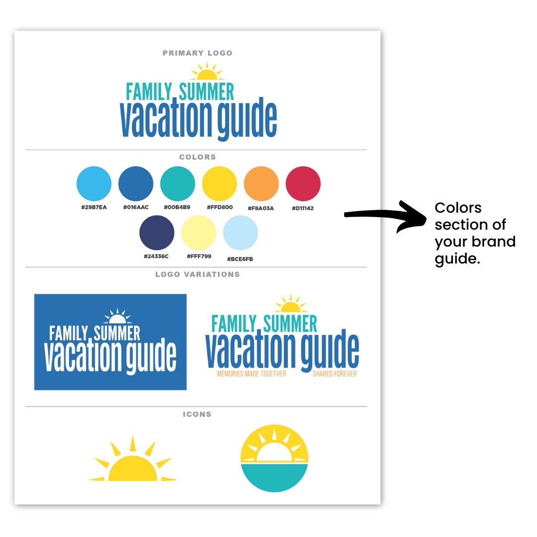
Choosing your brand colors is essential for creating a simplified brand guide. Start with a main color palette that includes 5-7 coordinating colors, with at least 5 as your initial focus. As your business expands, you may require additional colors to represent specific products or services, but this range gives you a strong foundation for your branding efforts.
It’s important to understand the meanings and associations behind different colors, as they can significantly influence how your brand is perceived. For instance, blue often conveys feelings of calm and productivity, while orange can evoke feelings of happiness and enthusiasm. By choosing the right colors that align with your company’s values and message, you can create a stronger emotional connection with your audience.
You can read more about what colors mean and how to find the right colors for your brand by reading this post.
Additionally, ensure your color palette includes sufficient contrast to prevent accessibility issues online. A well-thought-out color scheme not only enhances the aesthetic appeal of your brand but also ensures that all users can engage with your content effectively. If you want to know more about how colors are perceived in business, take a moment to watch this video.
Understand Logo Variations & Why You Need Them
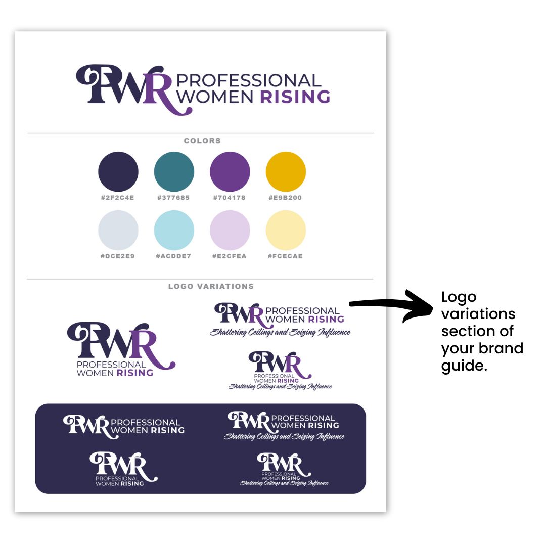
The next component to creating a simplified brand guide is to understand and recognize the different types of logo variations and why they are essential for your brand. We recommend you include one-color, full-color, and a white version, as well as options with and without a tagline.
The one-color version is typically black or a very dark shade in your color palette. , Although this variation isn’t always necessary, it can be beneficial to have in your toolkit.
Understanding how to use each logo variation is key to maintaining a consistent brand presence across various platforms and materials. For instance, your full-color logo is ideal for most applications, while the one-color version can be used for simplicity and clarity in certain contexts.
Additionally, having an all-white version—sometimes referred to as a reversed logo—is crucial for use on dark backgrounds, ensuring your brand remains visible and recognizable in any setting. By leveraging these logo variations effectively, you can adapt your branding to different environments while preserving its integrity.
Necessary Icons for Your Brand
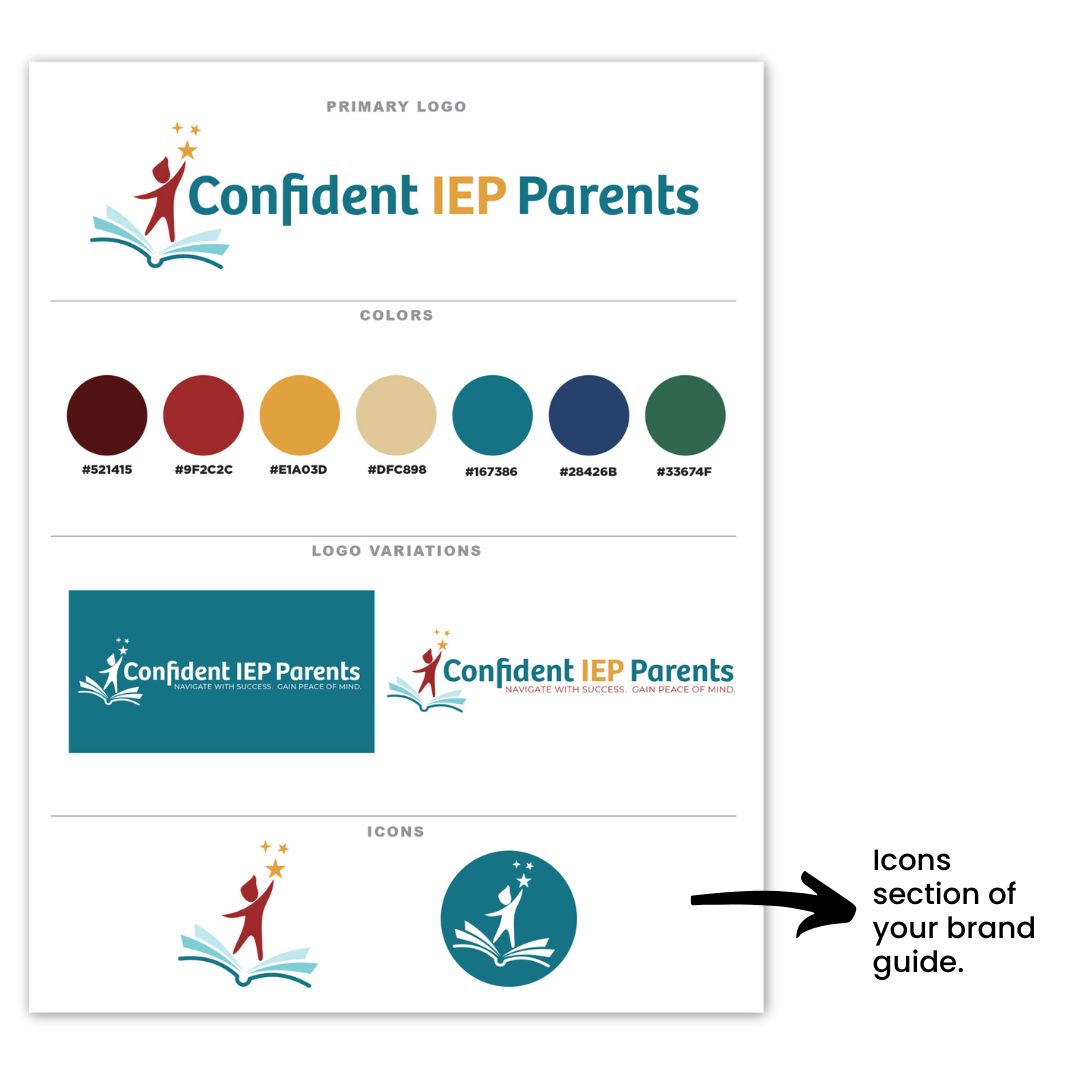
The next part of your simplified brand guide is your icons. Icons play a vital role in reinforcing your brand identity and are often used for favicons, profile images, and various other applications.
Typically, these icons are derived from your logo, transformed into a simplified icon format that remains recognizable at smaller sizes. This ensures that your brand is consistently represented across different platforms, even when space is limited.
When creating your icons, it’s important to ensure they align with your overall branding. Ideally, your icons should be variations of your logo or incorporate elements such as a piece of the logo or even the first letter of your brand name. By maintaining visual coherence between your icons and logo, you strengthen your brand’s recognition and create a more unified brand experience for your audience.
Be Strategic When Picking Logo Fonts
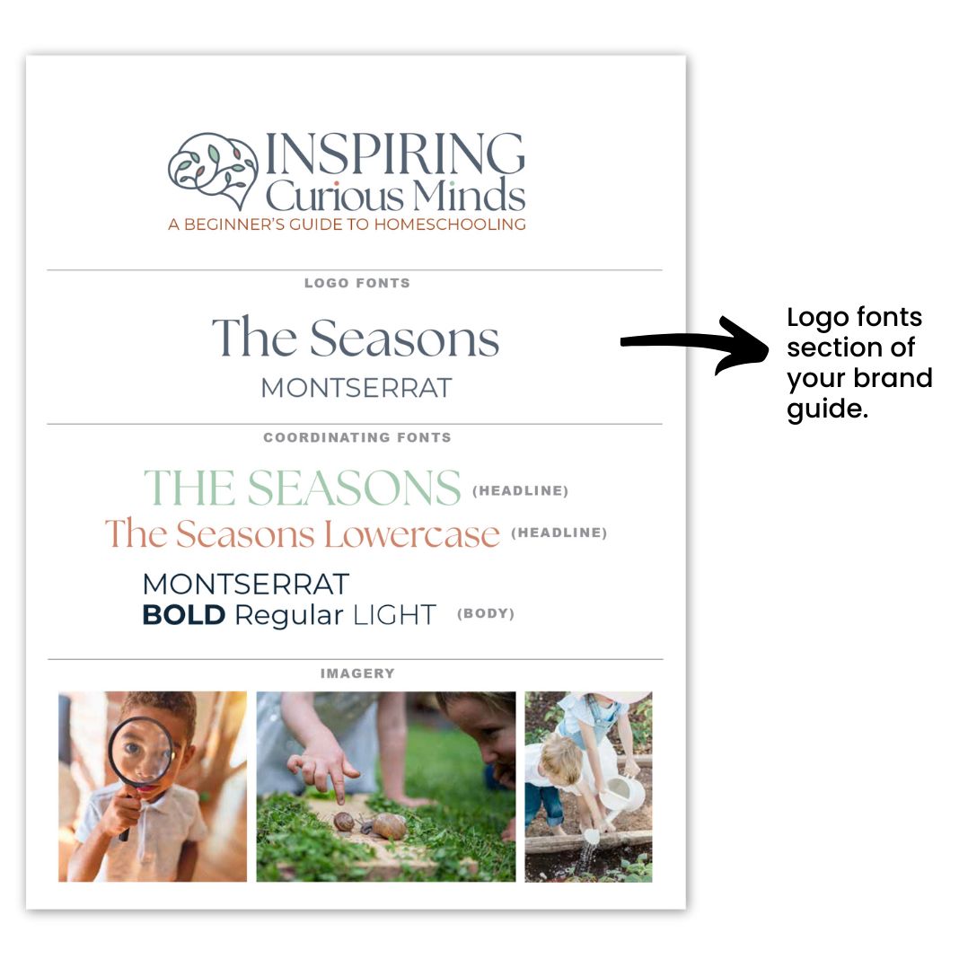
When selecting fonts for your logo, it’s important to strike a balance between readability and making a statement. Your logo font should be easy to read at a glance, but it should also convey your brand’s personality.
However, it’s easy to go overboard with font choices, which is why it’s best to limit yourself to no more than two fonts in your logo (three fonts if absolutely necessary). This keeps the design visually appealing and prevents it from looking cluttered or confusing.
Your primary logo font will likely carry the most weight, representing the bulk of your brand’s personality, while a secondary font can be used for supporting text or taglines. This balance allows you to add depth to your logo without sacrificing clarity. For instance, pairing a bold, eye-catching font with a simpler, cleaner font can create an effective contrast while maintaining harmony in your design.
Remember, your logo is often displayed in various sizes and formats, so readability is key. A font that looks great in large print may not be as legible in smaller applications like business cards or social media profiles. Opt for fonts that are versatile and can be easily scaled without losing their impact or clarity. Your logo fonts will be a cornerstone of your brand identity, so it’s worth taking the time to select fonts that not only look great but also are cohesive with your brand identity.
Select Coordinating Web Fonts With Care
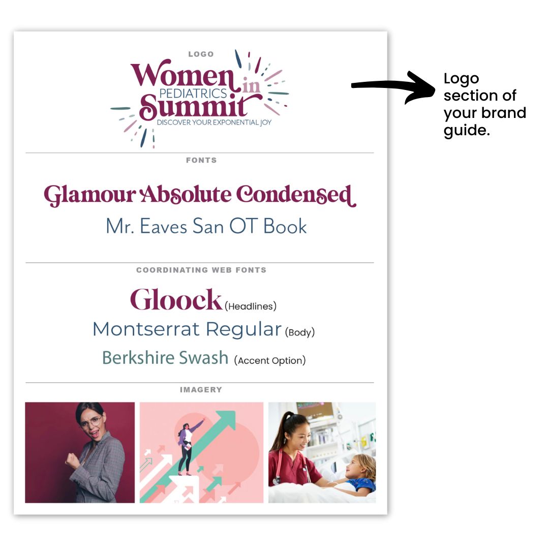
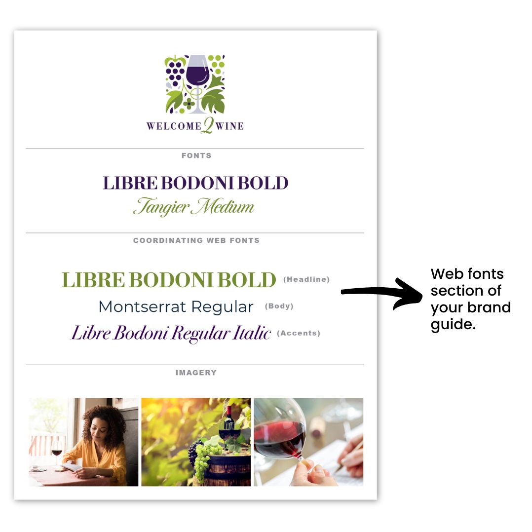
Selecting coordinating webs fonts is crucial, especially in ensuring they coordinate with your logo fonts. Choosing web-ready fonts—preferably Google or web-safe fonts—is essential for proper display across all browsers and devices.
If you opt for a custom font that isn’t web-ready, it may be replaced by a default web-safe font, leading to a look that doesn’t align with your brand’s identity. To avoid this, it’s best to select fonts designed for online use, ensuring a consistent representation of your brand across digital platforms.
Aim for two, or at most three, coordinating web fonts that align seamlessly with your logo fonts. Typically, you’ll want a bold or distinctive font for titles and headlines to draw attention, while your body or copy font should prioritize readability. Ensure that these fonts complement your logo fonts in style and tone, creating a harmonious visual experience for your audience.
Additionally, utilize the varied weights—such as light, regular, bold, and italic—within the same font family. This approach allows you to create visual contrast while maintaining a cohesive look throughout your website.
Pick Imagery That Represents Your Brand
Choosing the right imagery is vitally important for showcasing what your business represents inside your simplified brand guide. These images act as a visual representation, effectively communicating your brand’s identity and values.
They can also be the exact images you plan to use across your marketing materials, so it’s important to select them thoughtfully.
We recommend curating a collection of 2-4 images that truly exude what your business is all about. These visuals should capture the feel and aesthetic that resonate with your ideal client, drawing them in and making a lasting impression.
Whether it’s through vibrant photography, engaging graphics, or powerful illustrations, these images should align with your brand identity and create an emotional connection with your audience.
By choosing images that reflect your brand’s core message and appeal to your target market, you’ll enhance your overall branding strategy and create a more compelling narrative for your business.
Tips To Create a Professional Brand Guide
Creating a professional brand guide doesn’t have to be overwhelming if you follow all that you learned so far today and keep these three tips in mind:
Tip 1: Keep it Simple
Aim for a concise guide that spans just 1 or 2 pages. This simplicity will make it easier for you and others to reference your brand guidelines without getting lost in excessive details.
Tip 2: Include Key Elements
Ensure your brand guide encompasses the following items: your logo, selected fonts, imagery, color palette, logo variations, and icons. These components will serve as the foundation for your brand identity and provide clear direction for consistent usage.
Tip 3: Utilize Professional Resources
Consider obtaining a professional brand guide template to streamline the process. Templates can help you organize your brand elements effectively and maintain a polished look. You can find great templates available inside our Soapbox Subscribed membership, so be sure to check it out!
Once you’ve settled on the key elements of your brand guide, you’ll find that it becomes much easier to maintain consistency across all your marketing materials.
However, if you need additional support in developing or refining your brand guide, our Soapbox Subscribed membership is here to help. We provide the guidance and resources necessary to keep your brand cohesive and polished, allowing you to focus on what you do best—all in less time than you might be spending now! Join us today and let’s elevate your brand together!

