How to Create a Cohesive System of Design For Your Business
The Systems & Workflow Magic Podcast Featuring Tracey Albrecht
Are you a new business owner wondering how to create a systemm of design that not only looks great but also stands the test of time? In today’s competitive market, achieving a consistent and cohesive system of design is essential for your brand’s success.
Today we will guide you through the strategies to develop a system of design that leads to a cohesive brand. By focusing on cohesion, you can ensure that your brand remains consistent and impactful across all your design platforms, helping you to build a strong foundation for your business.
Brainstorm Your Logo Creation Today!
This guide will walk you through the steps I use as a professional designer, to create beautiful logos for all my clients. I am sharing my steps for FREE, so you can use this secret sauce on your own logos.
Recently, we had the pleasure of being featured on Dolly DeLong on her The Systems & Workflows Magic Podcast, where we discussed these very topics.
Join us as we explore the steps to creating a design that truly stands out. You can keep reading to learn how to implement these strategies for your own business, or you can listen to the full episode here.
How To Create a Cohesive System of Design
Let’s go over how you can create a cohesive system of design for your business with these topics:
- Lay the Foundation: Begin Building a Design System
- Foundation Step 1: The 5 W’s of Logo Design
- Brainstorming: Gather All Your Ideas
- Fonts are First
- Choose a Color Palette
- Find Imagery
- Coherency: Requires a Gauge to Get It Right
- Listen to Your Customers
- Rebranding is Not Detrimental
- Formulate: The LOGO Formula
- Consistency: Clear Client Journey Across All Platforms
- Ensuring a Seamless Experience
- Building a Strong Brand Identity Through a Cohesive System of Design
Lay the Foundation: Begin Building A System of Design
As you begin to establish your system of design, it’s important to lay the correct foundation. The first step in our streamlined logo design process is the same for both our in-person clients and also our Logo RX clients and is called the 5 W’s. The 5 W’s were created to help our clients lay a solid design foundation for their business. Once you have all 5 W’s confirmed and written down on paper, then you can move on to the next level of the design process.
Foundation Step 1: The 5 W’s of Logo Design
As you begin to build the foundation of your logo or branding, or even product branding, you will need to consider these 5 W’s. This foundation step of your system of design does not include any actual design work. This step is just about considering, collecting, and writing down information. As you start working on the 5 W’s, take no more than 45 minutes to complete your answers for all 5 of the W’s.
WHO: Who are Your Ideal Clients?
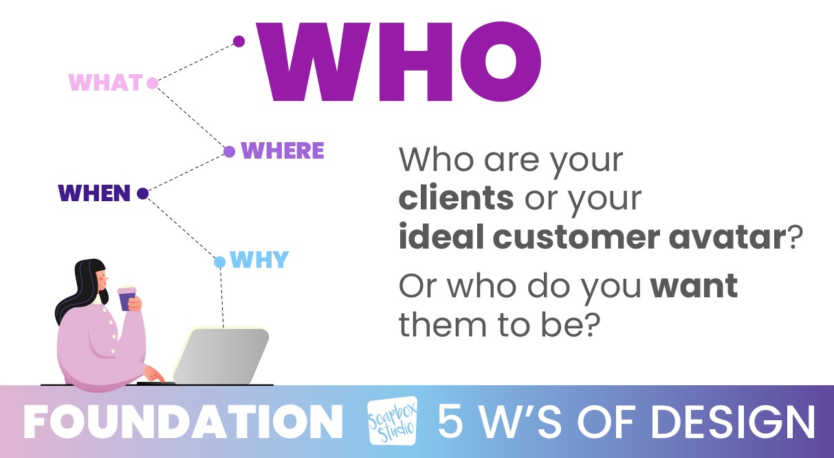
Who are your ideal clients is a great place to start. Think about who you want your perfect target audience to be and what their needs and preferences are. Go ahead and write that down.
WHAT: What Do You Want People to Say About Your Company?
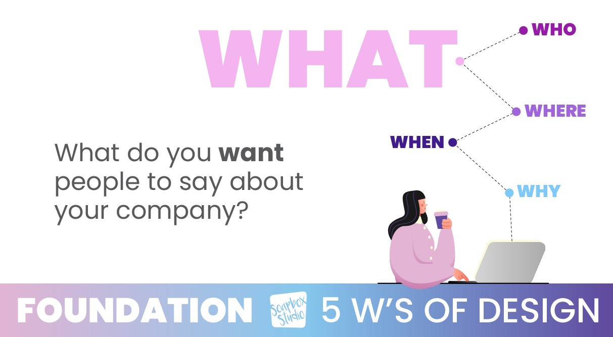
Moving on to what do you want people to say about your company? Determine the key messages and values your brand should convey. As you reflect on your company’s mission and vision, think about the emotions you want your brand to evoke in your potential customers. What thoughts and emotions should your brand trigger in your audience?
WHERE: Where Will You Use Your Logo?
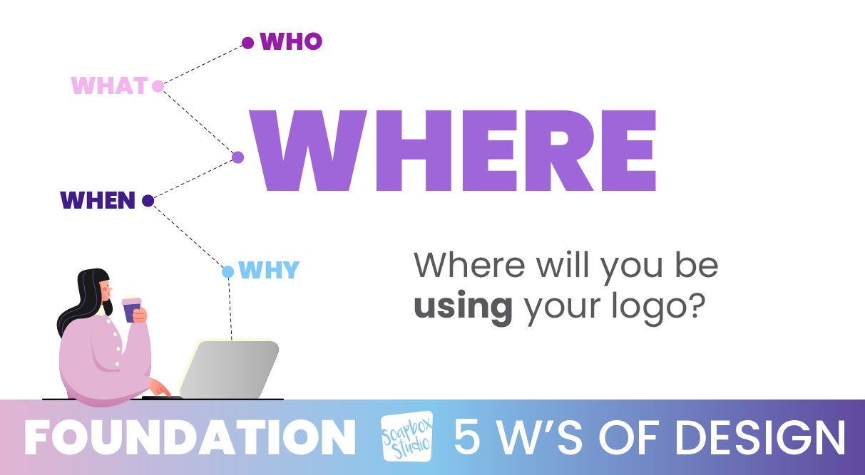
Next, you need to think about where you will use your logo. Identify all the places where your logo will be displayed (e.g., website, social media, signage). Ensure the logo design is versatile and adaptable to various mediums. Some of the best logos are very simple and easy to recognize in different formats.
WHEN: When You Think About Your Company, What Comes To Mind?
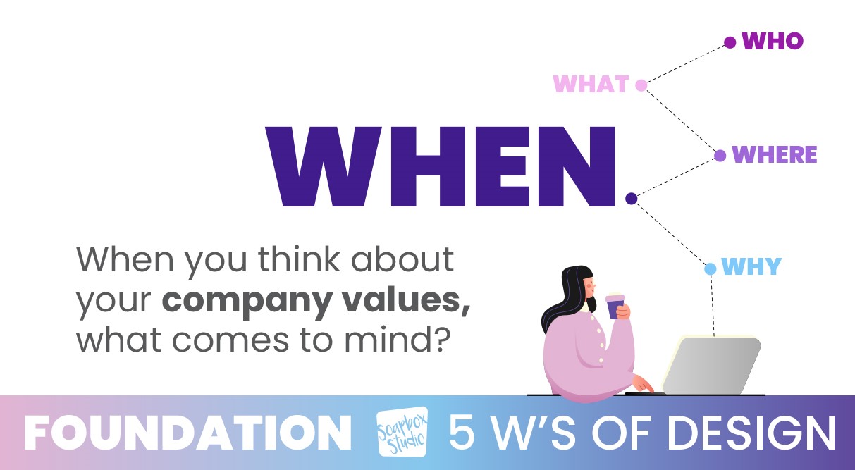
Moving on, it’s time to think about your company values, and how you can integrate those values into your branding. You’ll want to ensure consistency between your values and how you visually want to represent those values.
WHY: Why It’s Important to Have a Professional-Looking Logo?
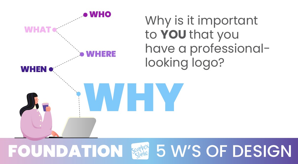
Finally, it’s time to look at why it’s important to have a professional-looking logo. Take a moment to recognize the impact of a professional logo on your business’s credibility. Consider the next steps in your business and how your branding supports these goals. Then take some time to evaluate the benefits of hiring a professional versus DIY options.
If you want to learn even more about the 5 W’s of design, read this post, 5 Things You Need to Know Before Designing a Logo.
Step 2 – Brainstorming: Gather All Your Ideas
As we continue on with our system of design, let’s move on to step 2, the brainstorming step. In this step you will spend a lot of time gathering all your ideas. It’s up to you where you want to gather these ideas, either a Google doc, or a Pinterest board, or even just pen and paper.
Fonts are First
If you have a company name and tagline, start by writing them out on paper. If you don’t have either of these yet, it’s a great time to start writing out any ideas you do have for the name and tagline.
Next, start looking at font combinations that you like and remember to also keep in mind all you decided during our Foundation Step. Refer back to the 5 W’s and keep them in the forefront of your mind as you look at fonts.
It’s important to note that you don’t want to just choose a font that you like, but instead, you want to choose a font that encompasses the 5 W’s and how you want your company to be represented to your potential customers.
Choose a Color Palette
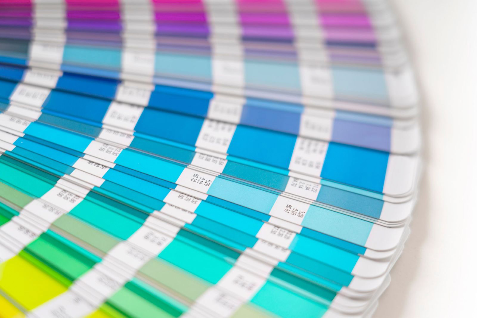
After you have picked the right font combination, it’s time to choose colors. Colors are so much fun, but you can also spend more time choosing colors than is necessary. Just keep that in mind when you are playing with color palettes. Here are a few things to consider when you are trying to pick colors.
Colors can trigger different brain responses, so before you choose a color just because you personally like it, you’ll want to consider the psychological responses that some colors can trigger. For example, blue is a calming color and red can cause people to feel aggressive.
Take time to consider your ideal customer and what they are looking for and would hope to achieve with your business and then make color choices based off of that. If you want to attract a certain clientele, make sure your logo color choices won’t repel them. For example, if your business is targeting men in the financial advisory sector, you probably don’t want to choose a super feminine font and use a lot of pink and purple tones in your logo.
If you want to attract a certain client, you’ve got to research what color palettes speak to them. Don’t get stuck with trying to be trendy and realize your logo doesn’t look professional at all.
If you want to learn more about colors and what each one means, read this post: Drawing In Clients, a Guide to Creating an Irresistible Brand Color Palette.
Find Imagery
Next, you’ll want to find imagery that flows well with your branding. If you want to incorporate an icon or some imagery into your logo, now is the time to start looking for one. Jump on Google and do some image searches and collect the images that you like.
You can even spend some time looking at what your competition’s logos look like. You don’t want to steal their ideas, but it’s always a good idea to see what others are doing because often it can spur some great ideas of your own.
Step 3 – Coherency: Requires a Gauge To Get It Right
Listen To Your Customers
As you continue to create a system of design for your business, it’s important to listen to your customers. The best gauge you have on if you are getting stuff right, is your perfect client.
Have a handful of at least 10 customers that you poll in order to find out their preferences. Offer them a poll and give them a few logo design choices and see which one they like best. Ask for their feedback. If your perfect customer is repelled by the design you have made – whether it’s the colors or the fonts, it’s important to listen to that feedback.
The wrong colors can have a major impact on your brand and how your customers perceive your brand identity. Your brand might appear to be a cookie shop when you are really a hair salon. Another example of poor choice of color is using only feminine colors in branding when your business serves everyone—not just women.
Just carefully consider the message your colors convey to ensure they accurately reflect your brand’s identity and appeal to your target audience.
Rebranding Is Not Detrimental
If you’ve made it this far in this post and you know it’s time for a rebrand, it’s ok! Rebranding is not a detrimental decision. Sometimes it’s the best gift you can give your business.
Giving your business the gift of cohesiveness will give you confidence in return. Knowing your brand looks good will boost your ego to get out there and sell even more! You want to get to the point where you know you can sell stuff because you are positive your brand looks good.
Step 4 – Formulate: The LOGO Formula
Our next step in our system of design is to formulate a plan for your logo, and the plan we like to use is called the LOGO Formula. Each step of the LOGO Formula will teach you how to create a logo, just like we teach our clients at Soapbox Studio every day.
L=Layout
Starting with layout is the first step of the LOGO Formula. Layout is maneuvering around the type and fonts. Start by writing out your company name and tagline on a blank page in Canva or Illustrator. As you start playing with fonts that you liked from your brainstorming step, you can change the words into all uppercase, or all lowercase. Try different variations until you find some you like.
O=Organize
Our next step is to organize those elements and try different layouts. You can try tilting the letters or repositioning them by pulling out the first letter of each word. Move around the elements on your page and organize them in different ways.
G=Graphics
Next, you will need to work with the graphics and imagery you collected in the brainstorming step. You’ll start by using the low-resolution version of your images and then once you fall in love with your logo you can purchase the high-resolution version of the images you’ve chosen. Make sure you choose imagery that you have copyrights for – and by all means, do not choose free stock images.
O=Optimize
Finally, you will want to optimize and tighten everything up. This is the last step of evaluation you will do before you finalize your logo. Pull everything together from fonts to colors to images and then take a step back and evaluate what the work you’ve done. That’s it! Your logo is done.
These are the exact steps we take with each of our logo design clients. Normally this process takes a few hours. If you put the work into the front end of the process by completing the 5 W’s and the Brainstorming step, then your actual logo design time will go so much faster and smoother. If you decide to hire a designer to do the work, handing them this pre-work will make their job much faster and require less billable time.
Step 5 – Consistency: Clear Client Journey Across All Platforms
Ensuring a Seamless Experience

It’s important to make sure your customer has a clear and consistent client journey across all your platforms. Starting with your website, moving to your socials, and everything else, no matter what part of your business a potential customer sees, it should all be consistent.
Creating a brand guide to go along with your logo is a great way to make sure you have consistency across all your platforms. A brand guide will include your logo, but also your brand colors, fonts, font sizes, and imagery. It’s a great resource to give to anyone who works with your brand.
If you hire a designer to help you design your website, you can give them your brand guide to make sure the site is designed per your determined guidelines. If you hire help for any part of your system of design, they will be so happy you have a brand guide to follow for consistency.
Over time your branding consistency will pay off because your customers will begin to recognize your brand. They will see something and know for sure it’s from you and your brand and that’s when you know you have nailed this final step in your system of design.
If you know you need to work on your logo or branding and want help, feel free to check our packages. We’d love to help!
Building a Strong Brand Identity Through a Cohesive System of Design
In today’s competitive market, establishing a cohesive system of design is crucial for any new business owner aiming for long-term success. A well-structured design system not only enhances the aesthetic appeal of your brand but also ensures consistency across all platforms, building a strong foundation for your business.
By focusing on core elements such as your logo, color palettes, and typography, you can create a unified and recognizable brand identity.
By following the necessary steps to develop and implement a cohesive design system, including laying the foundation, brainstorming ideas, gauging coherency, working within the LOGO Formula, and maintaining consistency throughout your branding efforts, you will create an amazing brand identity.


