What Makes a Good Logo Design?
You need a good logo if you’re starting a new business or refining your brand identity. But what makes a logo “good”? Unfortunately, there’s an infinite amount of information on the internet with conflicting messages about this, so it can feel overwhelming.
But as graphic design professionals with over 50 combined years of experience creating compelling logos for all industries, we’ve assembled everything you need to know about what makes a successful logo in one place!
Brainstorm Your Logo Creation Today!
This guide will walk you through the steps I use as a professional designer, to create beautiful logos for all my clients. I am sharing my steps for FREE, so you can use this secret sauce on your own logos.
Let’s go over what makes a good logo design with these topics:
A Simplistic Logo Is Best
A logo isn’t supposed to explain your brand’s whole story in one glance. Think about how simple and recognizable the logos for Adidas, Google, or Mastercard are. Your logo should be easy to understand and remember. Making it too complicated will just confuse people.
A Good Logo Is Memorable

You might not be able to instantly remember a company’s tagline, mission, or advertising campaign – but if it’s done right, you should remember its logo. Apple’s logo is unmistakable. You can identify Target’s red circles without a single word.
Likewise, it would be effortless if I asked you to remember the Starbucks logo. That’s because these logos are memorable. You need your logo to have its own distinct style so that when people think of your company, they remember your logo.
An Identifying Logo Is Key
The Burger King logo tells you that you can expect a burger. The YouTube logo indicates that you will be pressing play on a video. Not only do these logos indicate what the brand is about, but they encapsulate the company’s identity.
If you want your company to be known as the best option within your industry, your logo can have the power to make people think of you when their specific need arises. For example, when someone wants to watch an engaging football game, they know they can go to the NFL every time.
Make Your Logo Timeless
If you want your brand to stand the test of time, you need your logo to be timeless. You don’t want to have to rebrand every five years. Apart from wasting money, that can also confuse customers or clients about your identity.
For example, if Superman’s “S” had changed all the time, he wouldn’t seem like such a timeless superhero. Part of a timeless logo is choosing fonts and colors that will not feel outdated in a few years. Our designers are well-versed in color theory and can help you pick a color palette that feels both modern and timeless.
Font Specificity
If every logo was written in Comic Sans, you might not take the brands very seriously. However, if a kid’s crayon or chalk brand was written like that, you would better understand their niche. Choosing your font carefully can help your brand stand out from the rest. When you get a Subway sandwich, you don’t see bread on the sign anywhere.
But you know that “Subway” will always be written the same way, so their sign makes you think of a sandwich. Walmart’s identity wouldn’t be the same without its font, either. It is important to use a font that pairs well with your company’s story, whether it feels modern, elegant, colorful, feminine, rustic, or bold.
Color Palette
Choosing a color palette for your logo requires more than just picking a collection of favorite colors. Color theory dictates that different colors can activate different emotions in people.
For example, using pale blue communicates something very different from neon blue. And knowing how to combine colors to complement each other and work together is essential, especially in logo design.
If you want to learn more about colors and what each one means, read this post: Drawing In Clients, a Guide to Creating an Irresistible Brand Color Palette.
Distinction Communicates Identity
A good logo communicates your company identity. But it’s a great logo if it sets you apart from your competition. Your logo can show your customers who you are and distinguish your company from others in the industry that provide similar products or services.
Not only will it help people think of you as their best option, but it’s a great marketing tool. Think of all the free advertising that could come from a product with your logo. More people buy Adidas clothing when people see others walking around wearing Adidas.
When you drive your Toyota truck through the mud, people start to associate the Toyota logo with a durable and dependable product.
Relevance Brings In Customers
While you don’t want your logo to look outdated, it must be timeless by appearing relevant to current needs and events. People want to depend on a brand or company that solves their everyday problems.
A relevant logo can ensure that they come to you. Creating a logo that feels fresh and modern without sacrificing its timelessness will gain credibility with your customers. If they see a logo design that feels rudimentary or amateur, one glance will tell them that you’re not proficient at what you do and are not equipped to help them fill their needs.
Adaptability Is Good
We want your company to grow and change without feeling locked in or limited. A versatile logo can help you do this without rebranding as you grow. We deliver your logo in various formats so you can use it in every form you need. Sometimes you just need the image.
You may also want to pair your logo image with your company name or slogan. And if you want it to look less like clip art and more like a professional design, you’ll need a variety of formats to fit your needs.
Professionally Designed Logo
To be taken seriously by your customers, you need a professional logo designed well. If you’ve had a picture in your mind of what you want but don’t have the time or skills to design it yourself, Soapbox Studio can help.
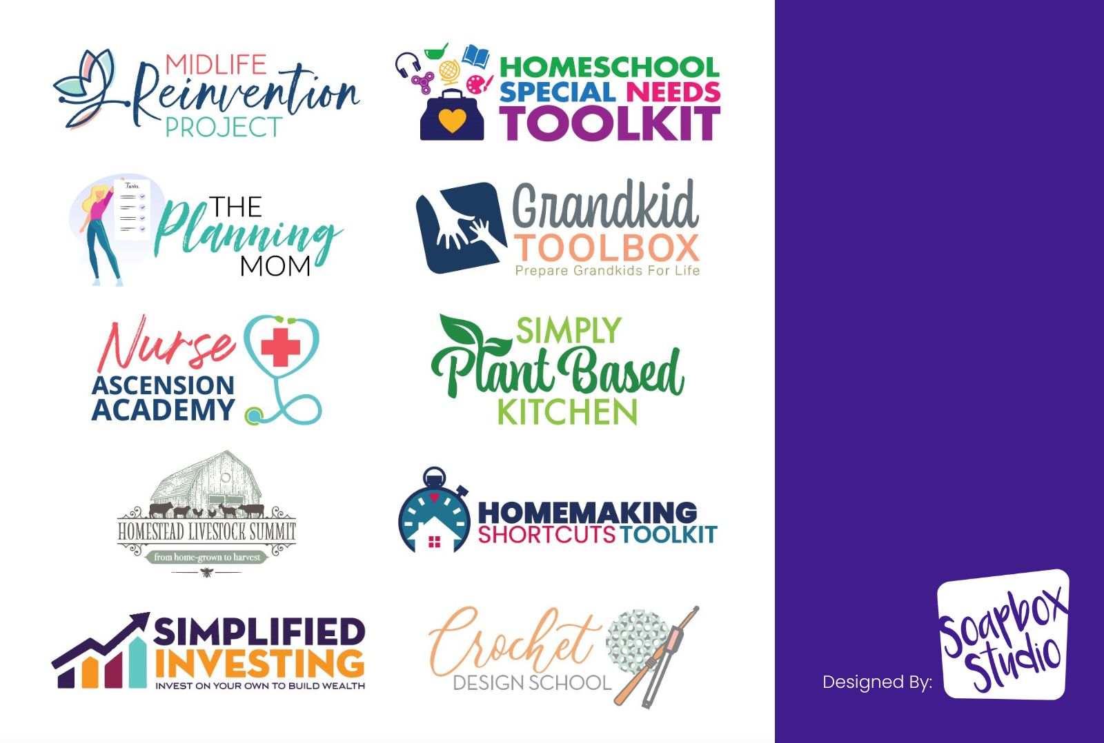
Rather than resorting to primitive design tools or amateur results, we will work with you to create the logo you’ve been dreaming of without all the frustration of napkin pencil sketches and late-night Google searches. So leave it to us, and we’ll develop everything your company needs to stand out and look professional and credible.
Who Are We?
Soapbox Studio is comprised of two designers, Tracey and Justin. Tracey founded the company in 1997, and together with Justin, they have over 50 years of combined experience producing excellent designs for every demand.
When you work with Soapbox, you have the assurance that you will be working directly with the designer from start to finish without going through a middleman. You know your designer’s name, and you’re working with a US-based team you can trust.
We prioritize a personalized experience based on collaboration to achieve your vision. Curious what makes a good logo design? Contact us to get started if this experience sounds like what you’ve been looking for. A professionally designed logo will make you look as good as you really are.

