Being an entrepreneur or business owner isn’t what it used to be. Back in the day, business owners just had to worry about the everyday logistics of keeping the business running. Occasionally an ad might run in the local newspaper, or a sale might bring customers to your brick and mortar storefront. But with the growth of the online marketplace, everything has changed.

In some ways, it has changed for good. Now, people can run businesses remotely from all over the world or connect with clients from the comfort of home. The ease of being an online entrepreneur offers opportunities that didn’t exist fifty years ago. But with all these benefits, some advancements can still feel overwhelming and out of reach. Without any background in web design or social media, it’s hard to keep up with the ever-shifting market trends. And without someone tech-savvy to help, sometimes it can feel like the online marketplace is moving faster than you can keep up with. Sound relatable?

Today’s consumers have come to expect a certain aesthetic and ease of use when they arrive at your website or interact with your brand. If they don’t capture the heart of who you are in just a few clicks, they will go to someone else. Clunky logos and amateur graphic design can be deal-breakers.

We Can Help!

As professionals with over 50 years of combined experience in the graphic design industry, we know the struggle. At Soapbox Studio, Inc. We are passionate about helping brands find their perfect look to HELP and not HURT their company growth. We help brands replace their amateur designs with a professionally curated logo, so their credibility doesn’t crumble.

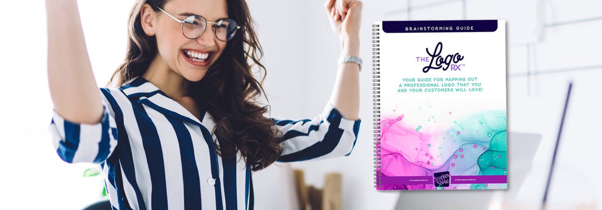
With decades of experience catalyzing company sales with seamless designs, we have collected all the best tips to answer the right questions about your unique logo and brand identity in our Logo Rx Brainstorming Guide. This free download walks you through every element you need to think about, especially if you don’t know where to start. Through this guide, you can establish a brand identity that is polished and credible enough to draw in your dream customers with a single glance.

So many brands take shortcuts and skimp on budgets that cause their company to suffer. Why hire your friend who has no graphic design training to tackle this problem when industry professionals have free resources just a click away?

What is included in the Logo Rx Brainstorming Guide?


How to Make an Excellent First Impression

A first impression is sometimes all the time you have to draw in your ideal customer, so making a good one matters. Within this guide, you’ll find a list of the most important elements to ensure you make the best first impression possible.

Brand Identity Brainstorming Exercises

Do you know the right questions to ask yourself? With this brain dump exercise, you’ll be able to get all your thoughts out on paper, so you know where to start. By brainstorming with some questions from industry professionals, you will be able to dream big about the right things instead of getting lost in the abstract.

Refining Your Company Name

Are you confident that your name draws in the right customers? This segment will help you put your name and all identifying characteristics on paper to make sure your brand identity is being communicated clearly and articulately.

Your Brand Tagline

Do you have a tagline? Do you know the importance of a slogan? This is one of those little details that most people forget but can make a big difference. If you’re creating a logo, your graphic designer will want to create some logo options that include your tagline and some options without, communicating your identity in more ways than one. This provides you with a versatile brand package for any situation that arises, so you don’t have to Photoshop your tagline in as an afterthought.

Your Website

If you have a website set up, that’s a great start. But, depending on your goals, you may want more than a home page. For example, a landing page for your product can help increase sales, and a variety of web pages with more information can build your credibility. In addition, listing all your web pages can help you identify where you want to send potential customers, so they are engaged with your brand from the first click.

Choosing Your Brand Colors

If you don’t yet have brand colors, this exercise will help you research trending palettes to see what options exist. The guide also includes a breakdown of the emotions, connotations, and benefits of using each color. This segment will help you identify which colors express the essence of your brand so that your colors will work with your tagline, title, and logo design instead of against it.

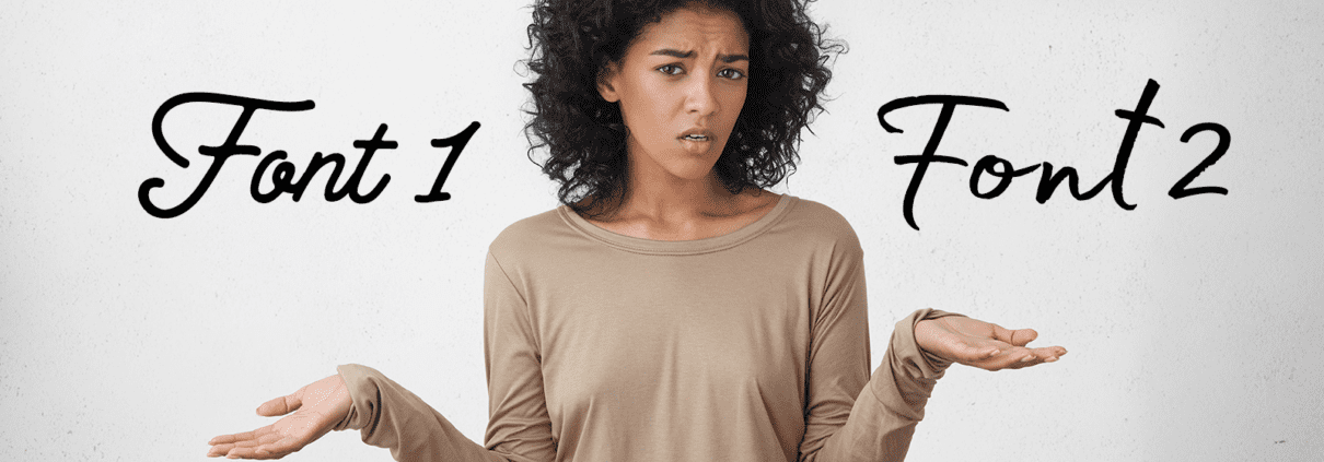
Thinking Through Fonts

Fonts are another small detail that is easy to overlook. This segment will inspire you to research and select the perfect fonts for your headline, tagline, body copy, and other copy on your website or print materials. Instead of getting overwhelmed by all the options, this section of our guide will encourage you to keep it simple.

Finding Your Perfect Logo Design

While you may not be a graphic design guru, you probably know what kinds of logos you like and don’t like. This segment encourages you to copy your favorite logos and put them all in one place so you can see what they have in common. Once you see which logos catch your eye, you’ll have a better idea of what elements you’d like included in your company logo.

With this brainstorming guide in your toolbelt, you’ll be able to communicate what you want so a graphic designer can create precisely the logo your company needs. Then, instead of feeling stumped or overwhelmed, you’ll already have examples to show your favorite options. Download our brainstorming guide HERE to get started.

Or, if you’ve already done your own brainstorming, you can skip right to hiring our designers so you can have your own professional logo in no time! If you feel confident in what you want but don’t have the skills to make your vision a reality, we can help. Hire our designers HERE to catapult your brand’s credibility and help you draw in your dream clients. When it comes to more money in the bank, there’s no reason to wait. In about a week, you can have your logo launched, and your company’s look polished to perfection so that a customer never wants to click over to your competitor’s website again!

Branding requires consistency. When you have a defined identity, communicating that identity clearly every time, is what makes branding important. As fun as it might be to change up your look, it can confuse your customers and make them wonder if they came to the right place. As you’re establishing your brand colors and designs, it’s crucial not to forget the significance of fonts in establishing the tone of your company. If this seems complicated, we’ve compiled all the information you need to know on how to choose the right font for your brand.

If you’re just at the beginning of establishing your brand identity, you’ll need to decide a few things before you find fonts:

  • The name of your brand or company
  • Who your target audience is
  • What you do
  • What sets you apart
  • The tone of your brand
  • Colors that represent what you stand for
  • A logo design that encapsulates this identity

To help you think through these elements, we’ve created a downloadable pdf called Logo RX. This guide will walk you through every question you need to be asking yourself so you don’t miss any crucial details while you establish your company’s brand identity.

Fonts as identity

The last two items on the list are not necessarily prerequisites to find the right font, but they help you choose elements representing your brand identity. As you establish the tone of your brand, it’s important not to pick the colors and fonts that you personally prefer. Just because you like the look of a font doesn’t mean it communicates your brand identity well. Of course, your preferences can be a part of your design, as long as they align well with the company’s core values. Combined with a solid logo and website design, the tone of your font can make your branding feel more consistent, streamlined, and clear.

So, do you know what tone communicates your brand identity best?

Some words to choose from might be:

  • Accessible
  • Ambitious
  • Approachable
  • Beauty-centric
  • Bold
  • Bright
  • Calm
  • Casual
  • Cheerful
  • Classic
  • Conservative
  • Contemporary
  • Convenient
  • Cool
  • Creative
  • Cultured
  • Custom
  • Cutting-edge
  • Delicate
  • Delightful
  • Dynamic
  • Easy
  • Efficient
  • Elegant
  • Enduring
  • Energetic
  • Exclusive
  • Familiar
  • Fashion-forward
  • Fearless
  • Flexible
  • Formal
  • Fresh
  • Friendly
  • Fun
  • Functional
  • Generous
  • Gentle
  • Harmonious
  • Helpful
  • Honorable
  • Human
  • Industrious
  • Informal
  • Instinctive
  • Innovative
  • Inviting
  • Knowledgable
  • Lovely
  • Mature
  • Modern
  • Natural
  • Noble
  • No-nonsense
  • Original
  • Peaceful
  • Personable
  • Plain
  • Playful
  • Polished
  • Professional
  • Quirky
  • Reflective
  • Reliable
  • Romantic
  • Rustic
  • Secure
  • Serious
  • Sincere
  • Sleek
  • Sophisticated
  • Spiritual
  • Thoughtful
  • Thrifty
  • Timeless
  • Trendy
  • Trustworthy
  • Unique
  • Unconventional
  • Vivacious
  • Versatile
  • Warm
  • Wise
  • Witty
  • Zany


Once you’ve identified a few of these words to describe your brand’s identity, you will want to browse through different fonts to find a type format that communicates this tone. Every brand needs the fonts they choose to be easy-to-read, not too familiar, and operational in all colors.

Easy-to-Read

If you choose a font that is too thin, too thick, too spread apart, too italicized, too swirly, or too artistic, it may not be the right font for your brand. If a font is too hard to read, you will not clearly communicate your identity. You want someone to tell exactly what your wording says, whether it’s plastered on a billboard or written in 10—point font on a business card. To check if a font is easy to read, you can significantly increase and decrease the font size. You may have a different font for headlines or titles than you have for subtitles or slogans. In fact, many brands do. But in either case, you need to choose a font that is easy to read.

Not Too Common

Obviously, you don’t need to select a crazy font with a strange look to stand out, but if it’s too common, it might look like a third-grader chose it. Think of the most common fonts like Arial, Calibri, New Times Roman, Georgia, Cambria, Impact, and Comic Sans. These are fonts easily accessible in Word processors and frequently used for education, writing, and everyday purposes. If you select one of these fonts for your brand, you will be perceived as ordinary and uncreative. It may also make people think you are less credible because you used the first font on the list.

Works in All Colors

Some fonts have cutouts or utilize negative space as part of the design. These fonts can look cool but are often designed to be black with a white background. If you change the background color or the font color, are the words still legible? Does the design still look cool? Or is it evident that the font was not created with this purpose in mind? Little details like this can make a difference for your audience. If you make a glaring mistake like this, they may not think you care about the details or can provide a professional-quality product or result.

Why Does Font Impact Credibility?

Your credibility as a company is one of your most valuable assets. There will always be external influences that impact how people view you. These might be out of your control. However, you want to be certain every choice you make improves your credibility. Choosing the right font has the power to do this.

If your company gives people legal advice or helps them produce contracts to minimize liabilities, using comic sans as a font could destroy your credibility. People will think of your company as childish, unprofessional, immature, and unpolished. These words confuse your audience and oppose your company’s core values.

If you own a fashion company that is simple, feminine, modern, and dainty, you should not use a thick or rustic font. Using Impact or Roboto Mono will create the wrong impression. People will take one look at your text and make decisions about whether they like your brand based on text that is giving off the wrong connotations. Similarly, if you are a masculine and rigged brand, using a cursive and curly font will communicate the opposite message.

While these are extreme examples, they do extend to more subtle fonts. In addition, there are different font categories that you can choose from, and each carries connotations that can help or hurt your brand, it all comes down to whether or not it’s right for your brand.


Serif and Sans Serif Fonts

Serif is a title that refers to the tiny “feet” at the ends of letters. Sans Serif is “without feet” and is the category of fonts we use on this site. A typewriter font is a serif font because it includes these extra strokes. Many Serif fonts are perceived as more formal, classic, and official. Without the extra strokes, Sans serif fonts are viewed as more simple, modern, informal, and elegant. We typically try and stay away from using serif fonts as all caps in headlines because it makes the copy harder to read. If you want to use all caps to capture attention in that way stick with a sans serif font.

Bold or Italicized

While many basic fonts have bold or italicized options, some fonts were created with these features in mind. A bold font gives a strong impression that is perceived as unyielding and confident. On the other hand, an italicized font can be perceived as more fancy, suggestive, quoted copy and elegant. Write out your title or slogan and see how it looks with these different features applied.

Script or Handwritten Fonts

Fonts that were designed to look like handwriting can be a fun addition, but should be used sparingly. These fonts are better to use as accent than a main staple. They are good for logos but not for large amounts of copy. By using a handwriting accent, your brand can be perceived as more creative or eye catching. However, with these kinds of fonts less it more. Never use one with all caps or letter spacing because it makes you look unprofessional.

Boxy or Curvy

For some of the more subtle fonts, you’ll want to pay attention to the lines. Are they straight and boxy, or curved and rounded? Each type of line communicates differently about your brand. Straight lines are more modern and straightforward. Curved fonts are more unique and creative. The boxiest fonts look technical and robotic, while the most rounded fonts mimic handwriting and feel more casual. Try some fonts out and see how your brand title looks in different font styles.

All Caps, Lowercase, Sentence Case, and Title Case

This might not even be something you’ve thought about, but different brands utilize this element to communicate their brand identity all the time. Using all caps is bold, unapologetic, and easy to read. Using all lowercase is a bit unconventional, informal, and casual. It would be best to avoid all lowercase with an older audience. Sentence case, with the first letter capitalized and everything else lowercase, is very standard and classic and commonly used in body copy. Title case is when all words except for articles, conjunctions, and short prepositions are capitalized and most commonly used in longer headlines or sometimes bullet points. In this paragraph, the title “All Caps, Lowercase, Sentence Case, and Title Case” is Title Case and the rest of the paragraph is Sentence Case.

Font Combinations

Most brands utilize more than one font in their brand guidelines. For example, they might use one or two fonts in their logo, and another one or two for their standard font on the website or print materials. You don’t necessarily have to use your logo font on your print material. In fact, many companies do not since their logo is very specialized or sometimes custom created. So the logo font is kept special for the logo. You can work with a graphic designer or brand specialist to help identify what fonts are appropriate for your communications. If you’re curious, try a few different font combinations out and see how they look together. A good rule of thumb is not to use more than two fonts in a logo. If you have one really unique font, you’ll want the others to be simple so that people don’t feel visually overwhelmed.

Fonts can be powerful

Your font can be a powerful communicator of your brand identity in combination with your logo design, brand colors, and website design. With the right font choice, you can communicate your company’s tone and establish credibility with your target audience. With one glance, your customers or clients will understand who you are, what you do, and how you can help them. Instead of using fonts and colors that work against you, the right choices will build trust and set you apart from the competition.

If you are still stuck on how to choose the right font, talk with a designer to identify how to tie those fonts in with the colors and designs that your brand is already using. Ultimately, communication is in so much more than the words you use, and a font will build credibility for your brand in more ways than one! For targeted help choosing the elements that will work best for your brand, check out our Logo RX brainstorming guide. This free downloadable guide will help you think through all elements of your logo and brand identity from the colors to the design to the fonts. For more specialized help, check out our Logo Rx program to develop a professional logo and brand design with the help of a professional so you don’t get lost in the details.