Why Design Mistakes Are Costing You Summit Registrations
Design might not be the first thing you think about when planning your summit, but it should be. Because let’s be real: even the best speaker lineup won’t matter if your visuals send the message that your event was thrown together last minute.
After years of watching summit hosts pour their heart into the content and tech side of things (and still struggle to convert), I was thrilled when Krista Miller, the creator of Summit In a Box and host of the Summit Host Hangout podcast, invited me on the podcast to talk about the part that often gets overlooked: design.
Brainstorm Your Logo Creation Today!
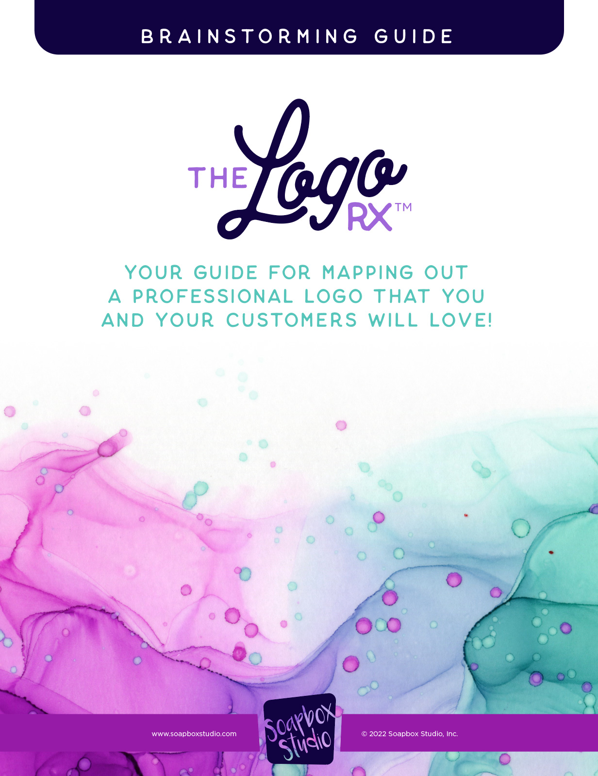
This guide will walk you through the steps I use as a professional designer, to create beautiful logos for all my clients. I am sharing my steps for FREE, so you can use this secret sauce on your own logos.
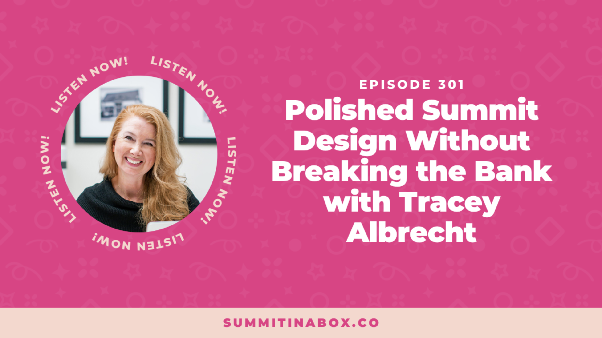
In this Summit Host Hangout podcast episode, Polished Summit Design Without Breaking the Bank, I’m sharing how the look of your summit can either attract your dream speakers and paying attendees, or quietly sabotage your results. You’ll walk away with practical ways to upgrade your visuals (even if you’re not a designer), build trust with your audience, and help your summit feel polished, professional, and high-value from the first click.
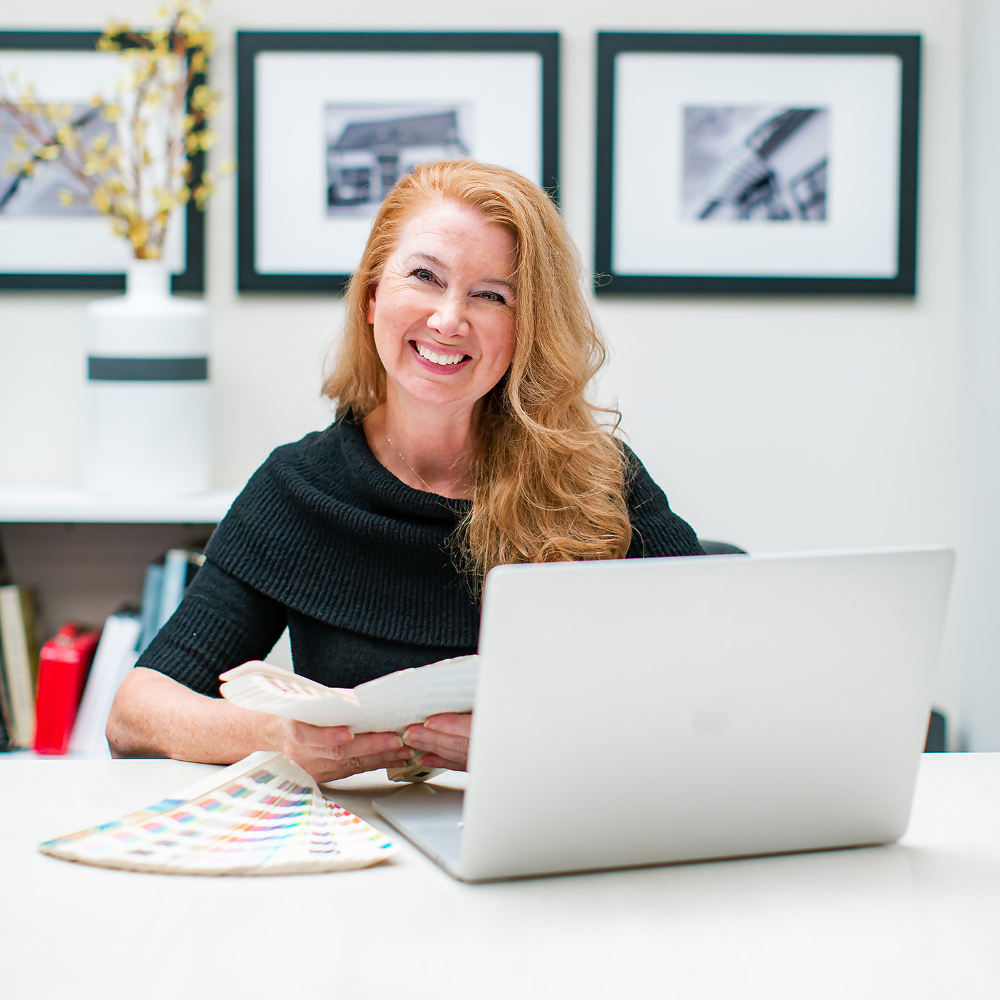
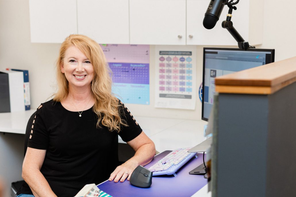
I’m Tracey Albrecht, founder and lead designer at Soapbox Studio, where we specialize in branding and design for online entrepreneurs and digital events. Below, I’m breaking down the key takeaways from my conversation with Krista, and of course, the full interview is available at the end of this post.
- Meet Tracey Albrecht
- Why Polished Summit Design Matters
- Common Summit Design Mistakes
- Why Design Impacts Conversions
- DIY Tips for Polished Summit Design
- What Makes a Design Look Polished
- Affordable Design Help for Summit Hosts
- Hear the Full Interview
Meet Tracey Albrecht
Krista: Welcome to the Summit Host Hangout Podcast. I’m so excited to be talking about something a little different today – design and branding for your summit. We haven’t talked about visuals since 2019, and it’s time. When a summit flops, design is one of the first things I look at. I’m thrilled to have Tracey Albrecht from Soapbox Studio here with us. Welcome, Tracey!
Tracey: Hi! Thanks so much for having me.
Krista: I hesitated to bring another designer on, but after partnering with you recently and seeing how you worked with our summit hosts, I knew we needed to have this conversation. People loved your session, because this topic is so important.
Tracey: I’m excited to be here. I’ve loved drawing and creating since I was a kid. Before computers, I just wanted to be an artist. Now I get to live that dream every day and help business owners feel more confident with a polished look. In the past five years, we’ve focused on online business owners. Many start with a DIY logo in Canva, and that’s fine for the beginning but it doesn’t always attract the right audience. Eventually, you outgrow DIY and need something more professional.
Why Polished Summit Design Matters
Krista: That’s perfect. I totally agree with you. When you’re ready to attract a higher level of client or customer, your visuals have to match that level. A logo can make such a strong first impression. The more experienced your audience is with hiring or working with online businesses, the quicker they are to make snap judgments. They’ll decide in an instant whether or not they’re willing to spend thousands of dollars with you based on how professional your overall design and branding looks.
Tracey: Yes. Amateur branding costs you money. I’ve had clients say getting a professional logo changed everything – they felt legit. One said, “I got my logo on a hat – now I’m official!”
Krista: I love that. So let’s talk summit design mistakes. What are the biggest ones you see?
Common Summit Design Mistakes
Tracey: One major mistake is creating a summit logo that doesn’t match your main brand. It feels disconnected. Another is using low-resolution images or having too many visuals cluttering the registration page. Then there’s using too many fonts or colors. All of it creates visual chaos and confuses your audience.
Krista: I see that too – people use templates but don’t customize them. Or they use clashing stock photos. And then wonder why the page doesn’t convert.
Tracey: Right. Your summit should still look like it’s from your brand. Keep things consistent. Ask yourself: would your audience be drawn to this design? If not, it’s time to simplify.
Why Design Impacts Conversions
Krista: Why do you think these design details matter so much?
Tracey: Because they determine whether someone registers. I’ve skipped summits that looked too messy. One had this awkward speaker collage that made me question the event’s quality. We all get so many opportunities to sign up for things – if it looks amateur, we pass. And that means fewer signups and sales.
DIY Tips for Polished Summit Design
Krista: So true. And not everyone can hire a designer right away. What’s your advice for the DIYers?
Tracey: Keep it simple. Use your existing brand fonts and colors. Maybe add one extra color if needed. Don’t use complicated icons. Stick to templates if they’re available – just make sure to update them with your own visuals. And give your text some breathing room. Avoid cramming text up to the edges.
What Makes a Design Look Polished
Krista: What makes a design look polished?
Tracey: Polished design is clean and simple. It has hierarchy, space, and consistency. Unpolished design usually has too many icons, cluttered elements, or inconsistent fonts. Use just one or two fonts, and vary the weight to create interest. Use overlays on photos to keep text readable.
Krista: Yes! Photos with overlays in your brand color can be a great workaround. It helps the page feel personal without needing the perfect image.
Tracey: Exactly. We do that a lot. It helps images blend with your brand. And if you use templates, be sure to customize them so they don’t all look the same.
Krista: I also see a lot of designs with no whitespace. Everything is pushed to the edge – it feels stressful to look at.
Tracey: That’s a big one. Breathing room is so important. It helps guide the eye and gives your message space to land.
Affordable Design Help for Summit Hosts
Krista: I hope people are feeling encouraged that simpler is better. You can always hire a designer when you’re ready. Speaking of – can you tell us about your logo design packages?
Tracey: Absolutely. We’ve streamlined the process so much. Clients fill out a form with all the key info: business name, colors, fonts, audience, and style preferences. It’s fast and efficient, and we’re able to offer it at a price point that makes sense for online business owners. We’ve done hundreds of logos this way.
Krista: And it’s so affordable – not four digits! Plus, you also have a free brainstorming guide?
Tracey: Yes! The guide is great for anyone starting out. It includes font pairings and prompts to help clarify your logo vision. Even if you’re not ready to hire us, it’s a solid first step.
Krista: Thank you for making design feel approachable and doable. I appreciate you so much, Tracey!
Tracey: Thank you! I love helping people feel proud of their brand.
Hear the Full Interview
Want to hear the full conversation? Krista and I dive deeper into all of this in the episode, Design Mistakes That Are Costing You Summit Registrations. You’ll hear more real examples, mistakes to avoid, and tips for getting your summit visuals on track—even if you’re not a designer.
▶️ Click here to listen to the full episode on Apple, Spotify, YouTube
Or read the show notes here.