Our Favorite WordPress Theme
Ahh… WordPress Themes.
Were you so inclined, you could spend literal days searching out the perfect WordPress theme to fit every nook and cranny of any given industry. Trust us, we’ve done it. And in the end, it was semi-pointless endeavor that resulted in frustration, confusion, and most importantly, lost time & money.
Brainstorm Your Logo Creation Today!

This guide will walk you through the steps I use as a professional designer, to create beautiful logos for all my clients. I am sharing my steps for FREE, so you can use this secret sauce on your own logos.
Now we want to preface this post by saying that everyone’s needs are different, so this is by no means a “one-size-fits-all” situation, and you should really try to look at the big picture and consider your website’s goals before landing on any one particular theme. But… here are a few things we’ve learned along the way when it comes to finding a reliable, flexible and well-built theme.
Don’t Be Fooled by “Pretty” Site Theme Samples
This is one concept we can’t stress enough! A number of years back, it was very common for people to seek out themes that played to their specific audience. Own a car wash? Gotta start off by finding a theme that’s designed specifically for car washes! Starting a wellness blog? Better find a theme that’s full of attractive fonts, pleasing color schemes, and Instagram-worthy lifestyle photos!
We can tell you from experience this is NOT the best approach.
While it’s tempting to search out a theme that appears close to what you want for the final product, it’s not the most important consideration. Oftentimes, these themes are built with a clunky foundation, making the install process challenging to a newcomer (or at times a seasoned professional!); or worse yet, poorly designed, where the user interface is an afterthought (making general maintenance or customization challenging).
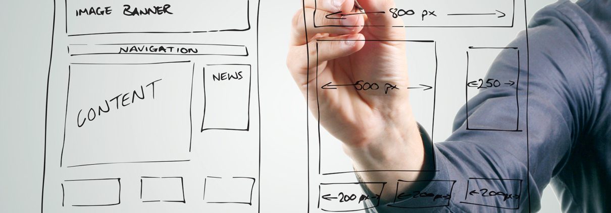
Sadly, there’s no quick and easy way to determine a nice theme from a poorly-made one (every theme has a unique learning curve depending on how it was built). But it’s best not to be swayed by “pretty” or convenient theme samples. Take time to consider the site layout options, special features (and how they might apply to you), and most importantly, the user-interface.
There are a lot of nice, flexible options out there that make site development and maintenance a breeze… themes like Avada or Betheme, or themes that utilize content/page builders like Elementor or Divi. With these well-built UI/maintenance tools, you can create a beautiful, professional looking site and be able to maintain it with relative ease.
Good Documentation and Support Are Key
Let’s be honest… learning WordPress (and any given theme) can be difficult, time-intensive and frustrating at times. Good theme developers are known for several reasons… namely, they are reliable and spend the time with their documentation and theme support. As mentioned previously, we learned the hard way that choosing themes based on esthetics is not the best approach. We worked with several themes that had poor documentation, little or no customer support, and left us with more challenging and expensive fixes that needed to be made in order to get the proper end result.
Tech support from a developer is absolutely worth researching when investing in a particular theme. If you have a Dev that’s willing to help answer questions, has an easily searchable forum, and/or can even offer to fix minor problems, it should really increase their consideration… especially if they’ve been around for awhile.
Again, it can be tough to get a read on solid developers from the rest, but looking at popular themes on themeforest.net is a great place to start.
Do You Really Need All the Bells and Whistles?
Another good question to ask yourself is… “do I really need all these fancy features?”
Website technology is advancing quickly, and with it comes an ever-changing array of options… Advanced Sliders, Content Animation, Header Builders, Next Gen Blocks, Visual Editors, etc. Plenty of themes out there (especially the well built ones) offer a plethora of features… most of which you may never touch (and many of which just add to the site bulk and steepen the learning curve).
The best advice we can give here? Quality over quantity.
Try not to be swayed by having every special feature available, but instead focus on ones that have good user reviews (especially from beginners), good documentation, and seem to fit your overall site needs. Good developers are always refining their themes and will release new and improved features as they are tried and tested. Don’t worry about those fancy content animations, unless they are a crucial component that your site needs to function properly or convey your message.
So Which Theme Do You Recommend?
We get asked this a lot, but as mentioned earlier… there’s no right answer. The theme that’s best is the one that works for your specific needs and site goals. But… for our time and money, the best theme we’ve come across is Kriesi’s Enfold.
We’ll be the first to admit, we may be stuck in our ways, but Enfold has been our go-to theme for years now. Here’s a few reason why:
– It may not have some of the newer features that other (more popular) themes do, but that’s okay…
Chances are you (or your customers) don’t want to spend time learning features probably don’t need or won’t use.
– Kriesi has great documentation and support.
We can’t tell you how many times we’ve run into an issue that we’ve been able to easily solve with a quick search of their support forums. Failing that, their staff is happy to answer questions or even offer low-level fixes to problems we’ve run into… usually within a day’s time or less.
– Enfold has a variety of demo site samples that are a great launchpad.
While we don’t use this feature often, it’s definitely helpful for a beginner as a starting point. A one-click install of demo material will give you a leg up on creating a nice, professional looking site (again, don’t worry if a demo is designed for a different industry or with a different color scheme, etc… all of those components are easily customizable, and shouldn’t hinder you from considering what the layout and page formatting can do for you).
– Enfold’s Advanced Layout Editor is well-built and easy to use.
Besides their excellent support, this may be Enfold’s biggest strength. While not as fancy or flexible as some of the others, Enfold’s Layout UI is user-friendly, and hands-down the best we’ve come across for building pages and managing site content. Page Builders like Divi and Elementor are great and can do virtually anything you’d like, but there’s definitely a “less is more” approach that makes Enfold a much easier and more straight-forward option (especially when it comes to problem-solving… which is ~95% of your time when building out a site LOL).
While it may not be the answer to everyone’s site development woes, Enfold is a great choice for beginners and advanced users alike. It’s flexible, well-built, well-documented, reliable, and should allow for most customization you would need. Just take the time to review their samples and consider how the layouts, functionality and special features would apply to your project.
Good luck, and if you have any questions or need a hand, you can always feel free to drop us a line.


